Color psychology home decor Guide to Choosing Mood-Boosting Colors

The colors around you can completely change how your home feels. A simple shade on the wall or a carefully chosen accent can create calm, energy, comfort, or inspiration. Color psychology home decor helps you understand how different tones influence the mood and atmosphere of each room, making it easier to design spaces that feel beautiful and personal.
Choosing the right colors is not only about following trends; it is about creating an environment that supports your lifestyle. Whether you want a peaceful bedroom, an uplifting workspace, or a welcoming living area, thoughtful color choices can make a meaningful difference. I’ve noticed that even small color updates, like changing textiles or adding new accents, can refresh a room and improve how people experience the space. This guide explores practical ways to use color with confidence while creating a home that feels balanced, stylish, and emotionally connected.
1. Calming Blue Palette
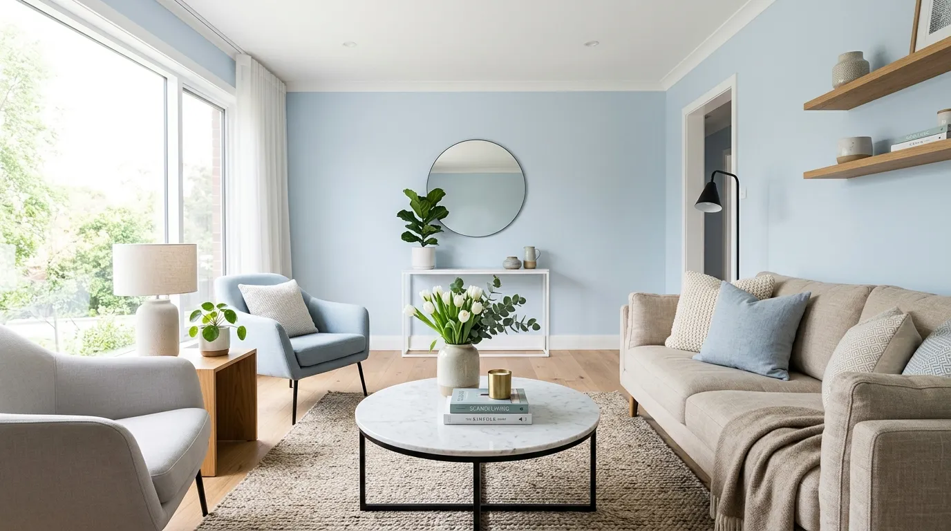
A calm color choice can instantly change how a room feels the moment you walk inside. Soft blue tones create a peaceful atmosphere while making spaces appear fresh, open, and balanced. This approach works beautifully in bedrooms, living rooms, and quiet corners where relaxation matters most. I’ve noticed that gentle shades often help homes feel more comfortable without requiring major renovations or expensive updates. Pairing blue with warm neutrals adds softness and prevents the room from feeling cold, creating a welcoming look that feels modern and timeless for everyday living.
The right blue variations can support different moods, from airy coastal-inspired spaces to elegant contemporary interiors. Light shades reflect natural light while deeper tones add sophistication and visual depth. When using these colors, balance is important because too much intensity can overpower the room. A thoughtful mix of fabrics, wall colors, and decorative accents creates harmony throughout the space. These choices are a simple way to explore color psychology home decor principles while building an environment that feels relaxing, stylish, and personally connected and easy to maintain for years ahead.
2. Warm Neutral Layers
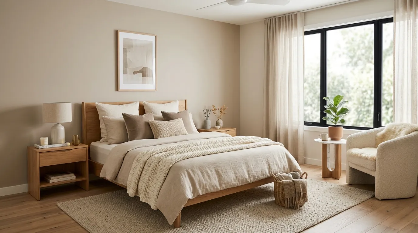
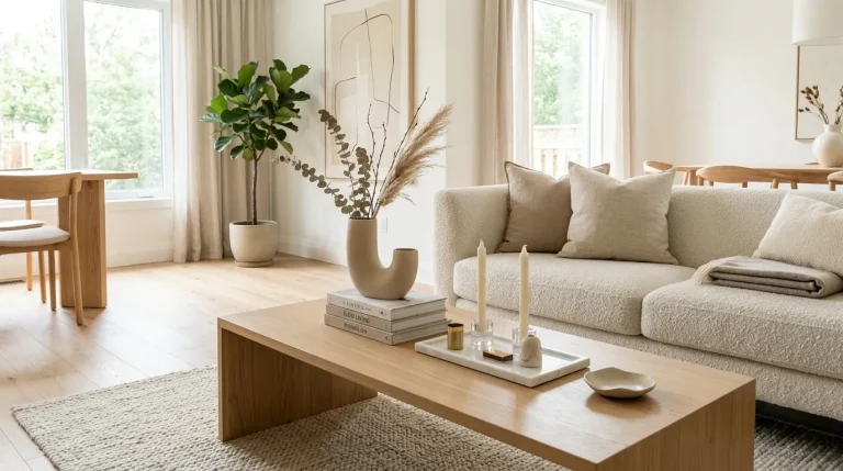
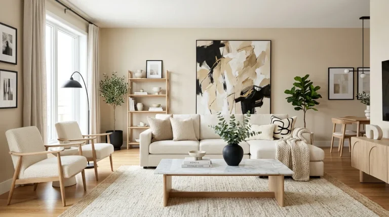
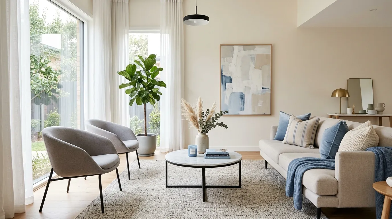
Colors have the power to shape emotions, and warm neutrals create an instantly inviting foundation. Beige, cream, and soft taupe tones bring comfort while allowing furniture and decor pieces to stand out naturally. This palette is especially helpful in busy homes where a peaceful visual flow is needed. I’ve seen this work well in many homes because neutral backgrounds make seasonal updates easier and keep rooms feeling fresh. Adding textured fabrics and subtle contrasts prevents the space from looking flat while maintaining a refined, modern appearance with lasting appeal.
A warm neutral scheme creates a flexible backdrop that adapts to different design styles without losing its calming effect. These shades work beautifully with natural materials like light wood, stone, and matte finishes. The goal is not to make a room plain but to create balance through thoughtful layering. Small additions such as cushions, artwork, and decorative objects can introduce personality while keeping the overall mood soothing. This approach helps homeowners create spaces that feel organized, comfortable, and visually connected throughout their living environment every single day.
3. Bold Accent Moments
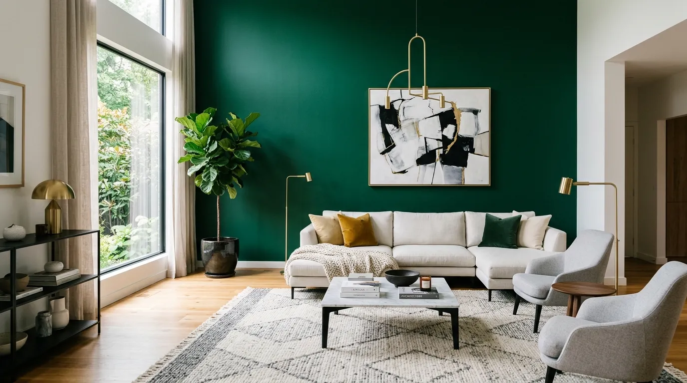
Bold colors can transform ordinary rooms into expressive spaces filled with personality and energy. A carefully chosen accent wall, statement chair, or decorative feature can create a memorable focal point without overwhelming the entire design. Rich emerald, deep navy, or muted terracotta tones often add depth when balanced with softer surroundings. In my experience, using stronger shades in small areas gives homeowners confidence to experiment while keeping the room elegant. The result is a stylish environment that feels intentional, creative, and visually engaging for modern homes.
Strategic color placement allows vibrant shades to enhance a home without making the atmosphere feel too busy. Designers often recommend pairing dramatic colors with simple furniture and clean layouts to maintain harmony. These thoughtful combinations can highlight architectural details, define areas, and create emotional impact. Whether adding a colorful artwork piece or painting a single wall, small changes can completely refresh a space. This method supports a personalized approach to color psychology home decor while making interiors feel unique, balanced, and inspiring for daily life with effortless visual charm.
4. Energizing Green Touches
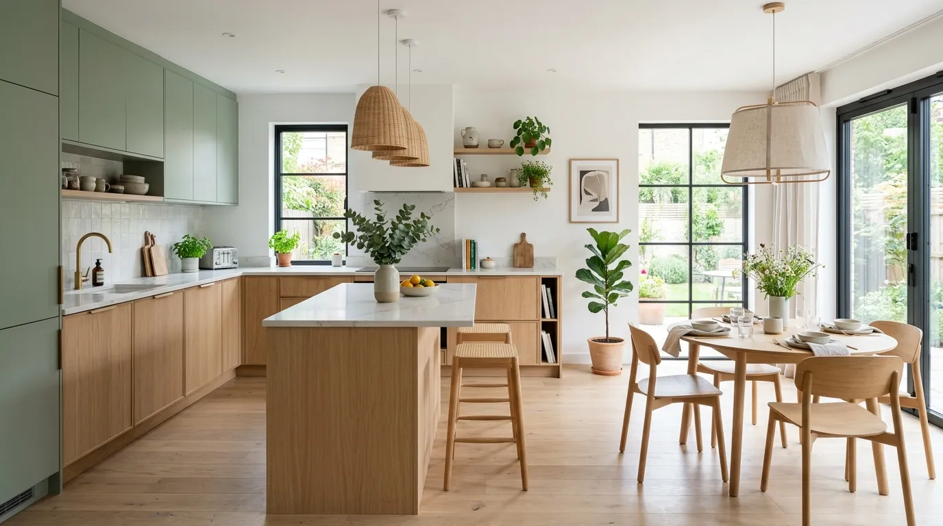
Green tones can bring a sense of freshness and balance into a home, making spaces feel more connected to nature. Soft sage, olive, and muted green shades work beautifully in kitchens, bedrooms, and living areas because they create a calming yet uplifting atmosphere. I’ve noticed that homeowners often feel more relaxed when natural-inspired colors are introduced through walls, furniture, or small decorative details. Combining green with light woods and neutral finishes creates a modern look that feels peaceful, welcoming, and effortlessly stylish without becoming overwhelming.
The beauty of green accents is their ability to refresh a room while maintaining a sophisticated appearance. Unlike brighter shades that can dominate a space, softer greens provide gentle color without losing the clean feel of contemporary interiors. Adding green through cabinets, cushions, artwork, or plants can instantly change the energy of a room. These choices allow homeowners to create a balanced environment where visual comfort and modern design work together. A thoughtful use of natural shades can make everyday spaces feel more relaxing, organized, and connected.
5. Cheerful Yellow Details
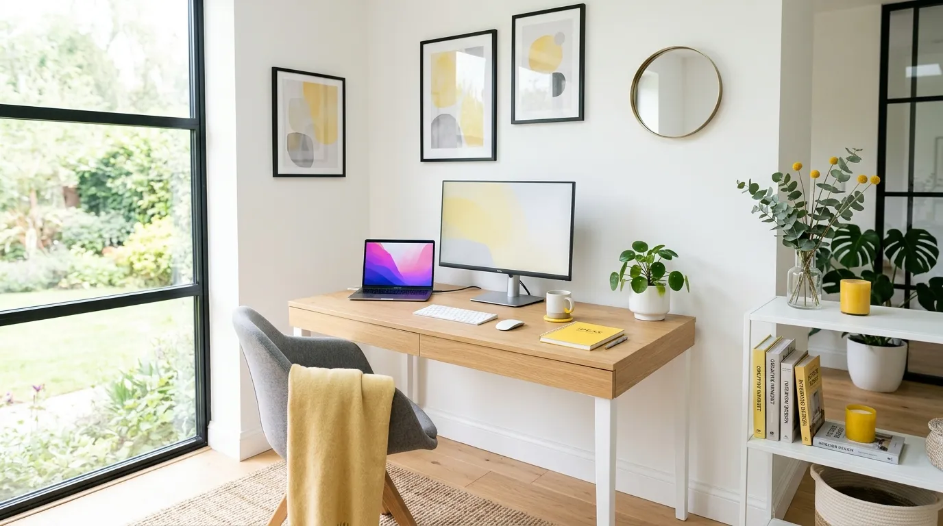
Small touches of yellow can instantly bring brightness and optimism into a space. This energetic color works especially well when used carefully through accessories, artwork, lighting elements, or furniture details. Instead of covering an entire room with intense yellow, modern interiors often use softer variations to create a welcoming atmosphere. I’ve seen this approach help dull spaces feel more lively while still maintaining a sophisticated style. When paired with white, beige, or gray tones, yellow creates a beautiful contrast that feels fresh, cheerful, and visually appealing.
The secret to using yellow successfully is choosing the right amount and placement. A few carefully selected pieces can create a noticeable emotional impact without making the room feel too energetic. This color is ideal for areas where creativity and motivation are important, such as offices, kitchens, and reading spaces. By adding warm yellow accents against simple backgrounds, homeowners can create interiors that feel happier and more inviting. These small updates show how thoughtful color choices can influence the mood and personality of a home.
6. Elegant Dark Tones
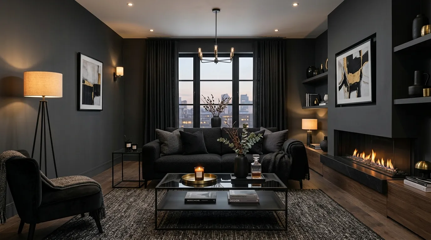
Dark colors can completely change the character of a room by adding depth, elegance, and a sense of luxury. Shades like charcoal, deep navy, and soft black create a sophisticated foundation when combined with warm lighting and modern furniture. These tones work especially well in living rooms, dining areas, and feature walls where a dramatic effect is desired. I’ve seen designers use darker palettes to create cozy spaces that still feel contemporary. The key is balancing them with lighter textures, reflective surfaces, and thoughtful lighting choices.
Using deeper shades does not mean a room will feel smaller or less welcoming. When applied correctly, dark tones can create a comfortable atmosphere that feels stylish and intentional. Materials like glass, marble, and metallic finishes help reflect light and maintain visual balance. Adding soft fabrics and warm accessories prevents the space from becoming too heavy. This approach allows homeowners to explore richer colors while keeping their interiors modern, inviting, and beautifully layered. A carefully planned dark palette can become one of the most memorable features in any home.
7. Soft Pink Accents
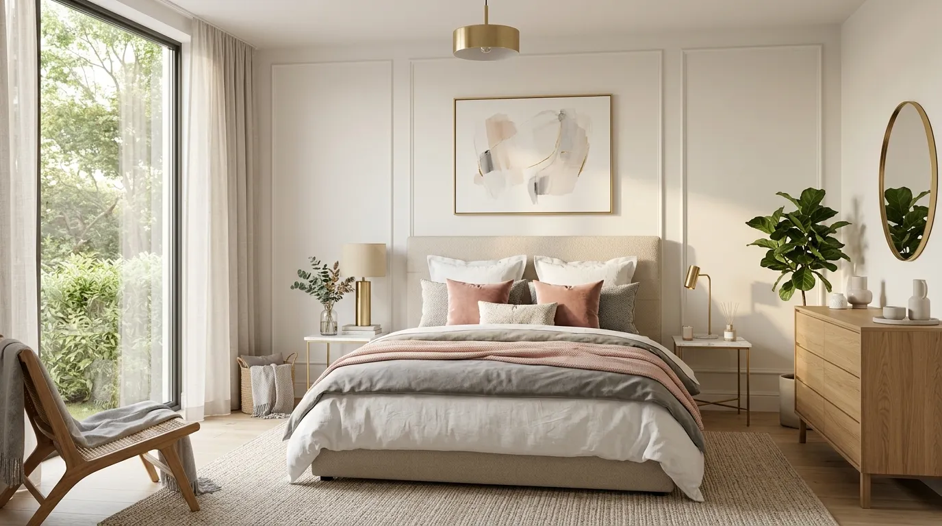
Soft pink shades can introduce warmth, comfort, and elegance when used with a modern design approach. Instead of overwhelming a room, muted blush tones create a gentle visual balance that feels sophisticated and calming. This color works especially well in bedrooms, bathrooms, and relaxing corners where a peaceful atmosphere is important. I’ve noticed that combining pink with beige, white, or gray creates a timeless look that feels both stylish and welcoming. Small touches like cushions, artwork, or accent chairs can completely change the mood without requiring a full redesign.
The most effective way to use pink is through thoughtful layering rather than relying on one strong element. Soft fabrics, subtle wall colors, and carefully chosen accessories can add emotional warmth while maintaining a clean contemporary style. Pairing pink with natural materials like marble, wood, and textured fabrics creates a balanced appearance that feels luxurious yet comfortable. These gentle tones show how color can influence the feeling of a room, helping homeowners create spaces that feel personal, relaxing, and visually beautiful without appearing too dramatic or trendy.
If you enjoyed this, Home Decor Style Guide is a good next step.
8. Balanced Gray Shades
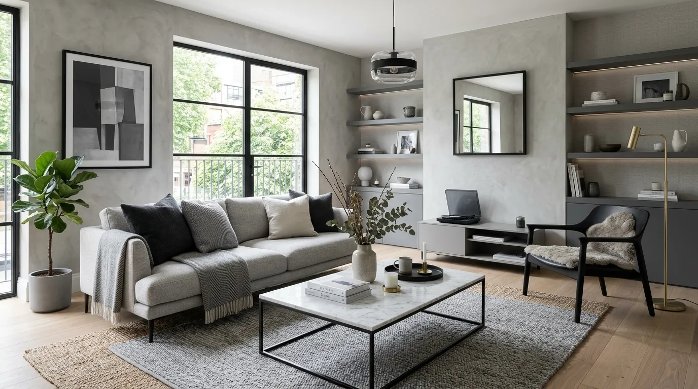
Gray is one of the most versatile colors for creating a refined and balanced home environment. From soft silver shades to deeper charcoal tones, gray can adapt to many modern interior styles while maintaining a clean appearance. It provides a peaceful backdrop that allows furniture, artwork, and decorative pieces to become more noticeable. In my experience, gray works especially well for homeowners who want a sophisticated look without using bold colors. When combined with warm textures and natural lighting, gray spaces can feel inviting instead of cold or plain.
A successful gray palette depends on adding layers, contrast, and warmth throughout the room. Mixing different shades of gray with wood elements, soft fabrics, and subtle metallic details creates visual depth. This prevents the space from feeling flat while keeping the overall design elegant. Many contemporary homes use gray because it creates flexibility and allows seasonal decor changes without major adjustments. By understanding how different tones affect the atmosphere, homeowners can create rooms that feel peaceful, modern, and thoughtfully designed for everyday comfort.
9. Vibrant Orange Highlights
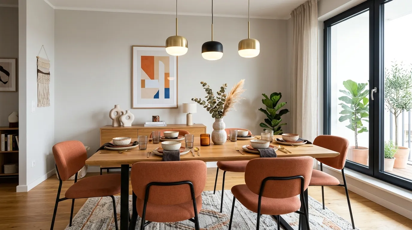
Orange accents can add warmth, enthusiasm, and a sense of connection when introduced thoughtfully into modern interiors. This energetic shade works especially well in dining rooms, kitchens, and creative spaces where a lively atmosphere is desired. Instead of using bright orange everywhere, contemporary designs often include softer terracotta or burnt orange details for a more refined appearance. I’ve seen small additions like chairs, artwork, and decorative accessories create a noticeable transformation while keeping the room balanced. These touches can make everyday spaces feel more inviting and full of personality.
The key to using orange successfully is creating harmony with surrounding colors. Pairing warm orange tones with neutral backgrounds, natural wood, or soft gray shades allows the color to stand out without dominating the room. These combinations create a comfortable balance between energy and relaxation. Whether through textiles, lighting, or statement furniture, orange can bring emotional warmth into a home. Thoughtful placement helps homeowners create spaces that feel expressive, welcoming, and visually memorable while maintaining a modern and polished interior style.
Conclusion
Your home should feel like a reflection of your personality, and the right colors can help create that connection. By understanding color psychology home decor, you can choose shades that bring comfort, energy, balance, and beauty into every space. From calming blues to warm neutrals and expressive accents, each color choice can transform the atmosphere of your rooms. I’ve seen how small updates can create surprisingly meaningful changes in a home’s overall feeling. Save this guide on Pinterest, try your favorite color approach, and share these ideas with anyone looking to create a more inspiring space.
Elira Montclair
Elira writes about timeless home decor, kitchen styling, and practical interior ideas. Her work blends warm, inviting aesthetics with simple decorating tips that make everyday spaces feel beautiful and comfortable.