Modern Color Palette Ideas for a Calm Yet Luxurious Look

Introduction:
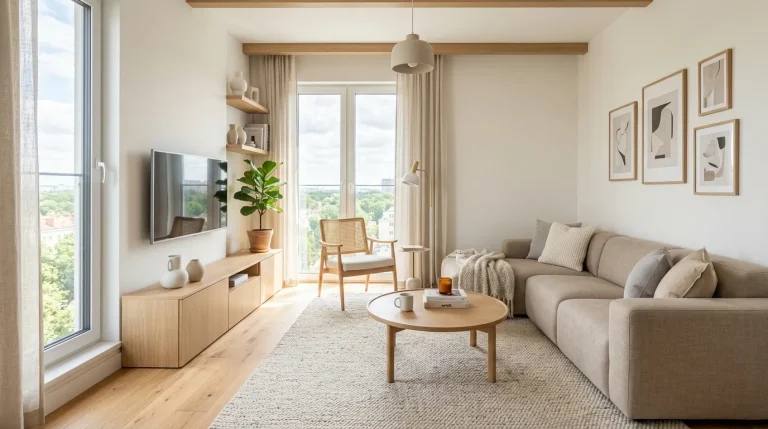
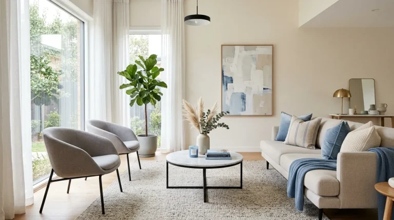
If you’ve ever walked into a room and instantly felt calm, balanced, and effortlessly stylish, you already understand the power of modern color palette ideas. The right colors don’t just decorate a space — they completely transform how it feels, how it flows, and even how you experience everyday life at home.In this article, you’ll discover soothing yet luxurious color combinations that are trending in modern interior design right now.
From warm neutrals to soft earthy tones, each idea is designed to help you create a Pinterest-worthy space that feels both elegant and deeply comfortable. I’ve noticed that even small color shifts can completely change a room’s mood, making it feel more expensive, inviting, and thoughtfully designed.Whether you’re redesigning a full room or just refreshing your space, these ideas will guide you toward a more calm and visually stunning home.
1.Warm Greige Layers
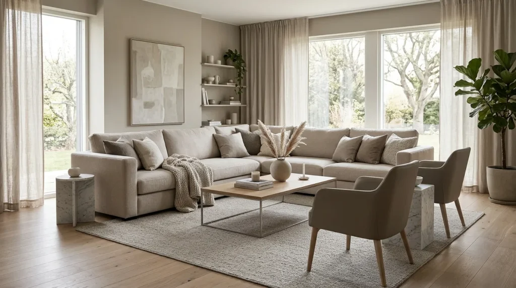
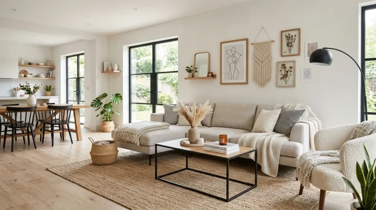
A beautifully layered greige palette instantly makes a room feel more polished and expensive. The blend of gray and beige offers a softer alternative to stark neutrals while maintaining a clean, contemporary appearance. This color combination adapts easily to different lighting conditions, making it practical for both bright and darker homes. By combining several shades of greige through furniture, textiles, and wall colors, the space gains depth without overwhelming the eye. The result feels calm, welcoming, and intentionally designed from every angle.
One reason this approach remains popular in modern color palettes idea is its incredible versatility. Warm greige pairs effortlessly with natural wood, stone surfaces, matte black details, and brushed metal finishes. In my experience, homes using layered neutrals often feel more cohesive because every element appears connected rather than competing for attention. The subtle contrast between tones creates visual interest while preserving a peaceful atmosphere. Homeowners often notice that rooms decorated this way feel more relaxing, luxurious, and easier to style over time.
2.Soft Taupe Contrast
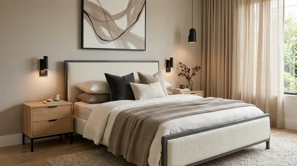
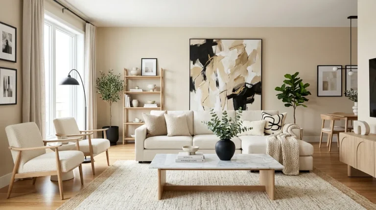
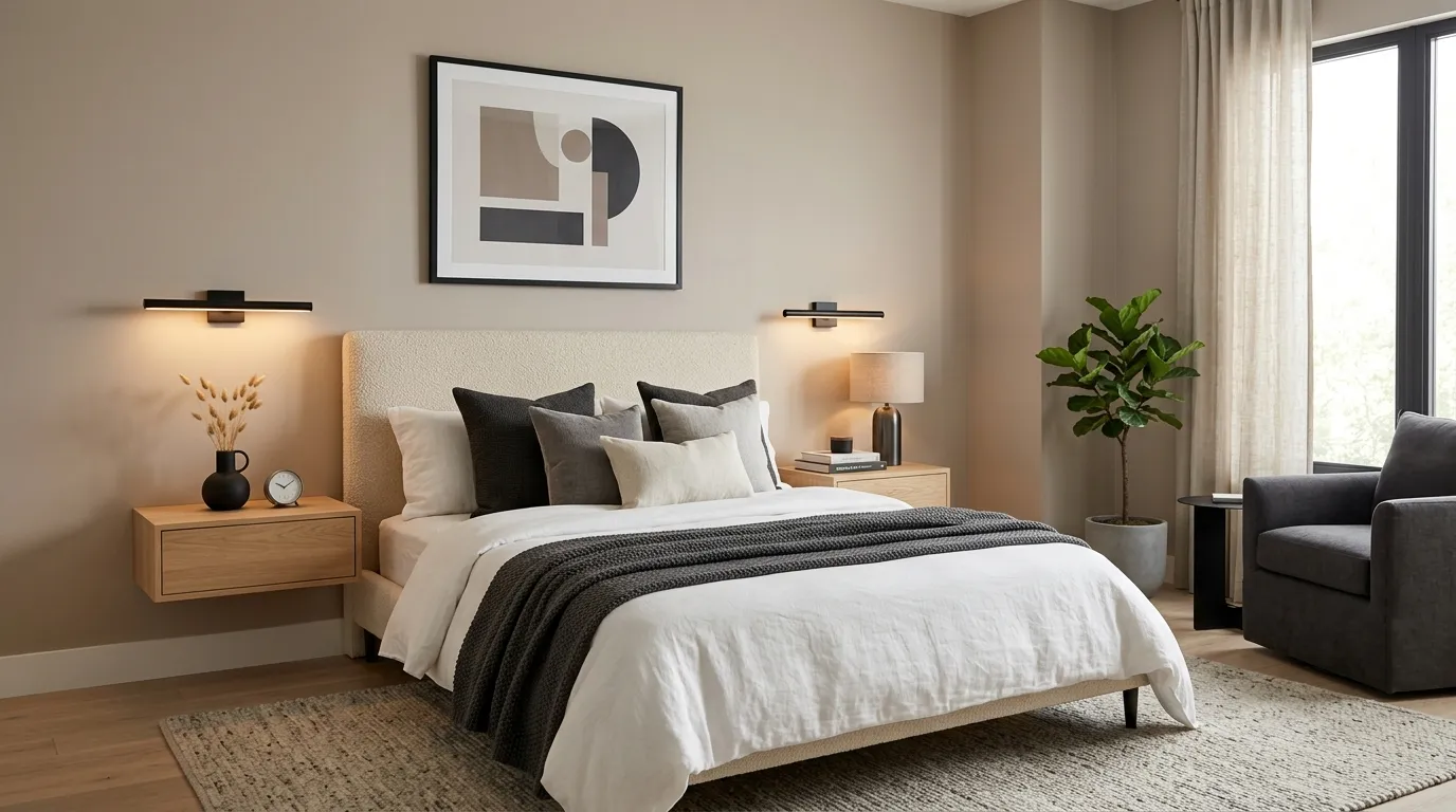
A subtle contrast can completely change how a room feels, and taupe is one of the easiest ways to achieve it. Instead of relying on bold colors, this approach introduces deeper neutral shades that quietly define the space. Walls, furniture, or textiles in soft taupe add dimension while preserving a serene atmosphere. The effect feels refined rather than dramatic, making it ideal for homeowners who want elegance without excessive decoration. Small changes in tone create visual structure that naturally guides the eye throughout the room.
The beauty of taupe lies in its ability to bridge warm and cool elements effortlessly. That’s why many designers recommend it when creating balanced interiors that feel timeless. Paired with cream fabrics, matte finishes, and gentle lighting, taupe introduces richness without making a room appear dark. I’ve noticed that spaces using this combination often photograph beautifully because the layers remain visible without looking busy. The overall result feels sophisticated, modern, and perfectly suited to everyday living while still maintaining a luxurious appearance.
3.Cream And Charcoal
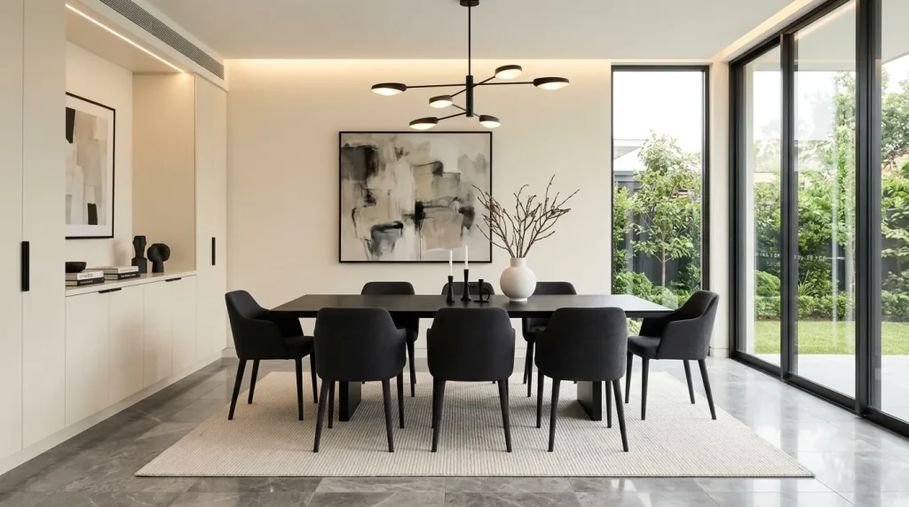
Few combinations feel as effortlessly sophisticated as cream and charcoal. The lightness of cream keeps the room feeling open, while charcoal introduces definition and visual weight. Together, they create a balanced contrast that feels intentional and upscale. This pairing works particularly well in dining rooms, living spaces, and open-concept layouts where structure is important. The darker accents help anchor the design, allowing lighter surfaces to stand out without making the room feel stark or overly minimal.
When used thoughtfully, this contrast creates a dramatic effect without relying on bright colors. Many homeowners appreciate how easy it is to maintain because the palette remains stylish across changing trends. Within modern color palettes idea, cream and charcoal continue to stand out for their clean, architectural appearance. I’ve seen this work well in many homes because it highlights furniture, textures, and lighting beautifully. The finished space feels organized, luxurious, and visually striking while still remaining comfortable enough for everyday life.
4.Muted Olive Accents
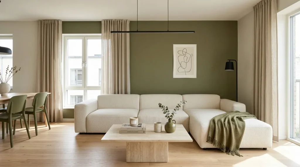
A touch of muted olive can transform a neutral room into something far more dynamic and memorable. Unlike brighter greens, this shade feels understated and sophisticated while still adding personality. It works especially well as an accent wall, upholstered chair, or decorative accessory that introduces gentle contrast. The earthy undertones create warmth and balance, making modern interiors feel more welcoming. Even a few carefully chosen olive elements can add depth and visual interest without disrupting the calm aesthetic many homeowners want.
This palette works because it blends natural inspiration with contemporary design principles. Muted olive complements warm woods, textured fabrics, and soft neutral backgrounds with remarkable ease. In my experience, adding even a small amount of this shade helps prevent minimalist spaces from feeling flat or unfinished. The color brings subtle energy while maintaining a peaceful environment. Many homeowners find that olive accents create a more layered and collected appearance, helping rooms feel stylish, modern, and thoughtfully designed.
5.Mocha Beige Blend
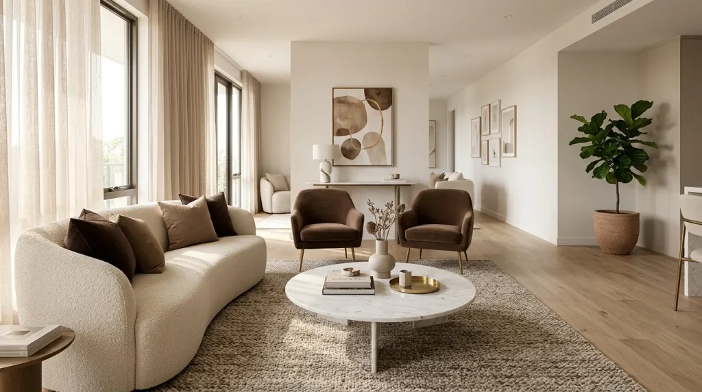
A mocha beige combination delivers warmth and elegance in a way that feels instantly inviting. The deeper mocha tones add visual weight while beige keeps the room bright and balanced. Together, they create a layered look that feels both comfortable and upscale. This pairing works particularly well in spaces where relaxation is important, such as living rooms and bedrooms. The contrast remains subtle enough to maintain a calm environment while still introducing enough variation to keep the design visually engaging.
One reason this palette continues to grow in popularity is its ability to create depth without strong color shifts. That’s why many designers recommend combining multiple shades through furniture, rugs, and decorative accents rather than relying on a single tone. Within modern color palettes ideas, mocha and beige help create a sophisticated atmosphere that feels current yet timeless. Homeowners often notice that these colors make a room feel warmer and more welcoming while still preserving the clean, polished appearance associated with modern luxury.
6.Stone Gray Base
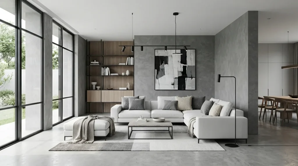
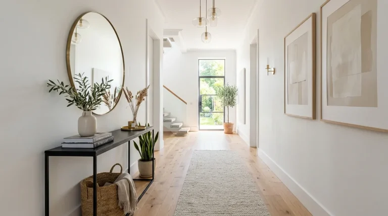
A stone gray base brings instant sophistication to modern interiors without feeling cold or overly industrial. The tone sits perfectly between warm and cool, making it one of the most adaptable foundations in interior design. Walls or flooring in this shade provide a clean backdrop that allows furniture and textures to stand out naturally. It also works beautifully in open spaces where visual continuity is important, helping the entire area feel connected and intentionally designed rather than segmented or chaotic. The same design principle can be carried beyond the walls of your home with these outdoor living space ideas, creating a cohesive and inviting environment throughout the property.
This approach is especially effective when you want a timeless, architectural look that won’t feel outdated quickly. Stone gray pairs effortlessly with matte black fixtures, light wood elements, and soft textiles, creating subtle contrast without overwhelming the senses. I’ve noticed that homes using this base often feel more structured and organized because the color naturally reduces visual clutter. It supports both minimalist and layered styling, making it a reliable choice for achieving a calm yet luxurious environment.
7.Ivory Warm Glow
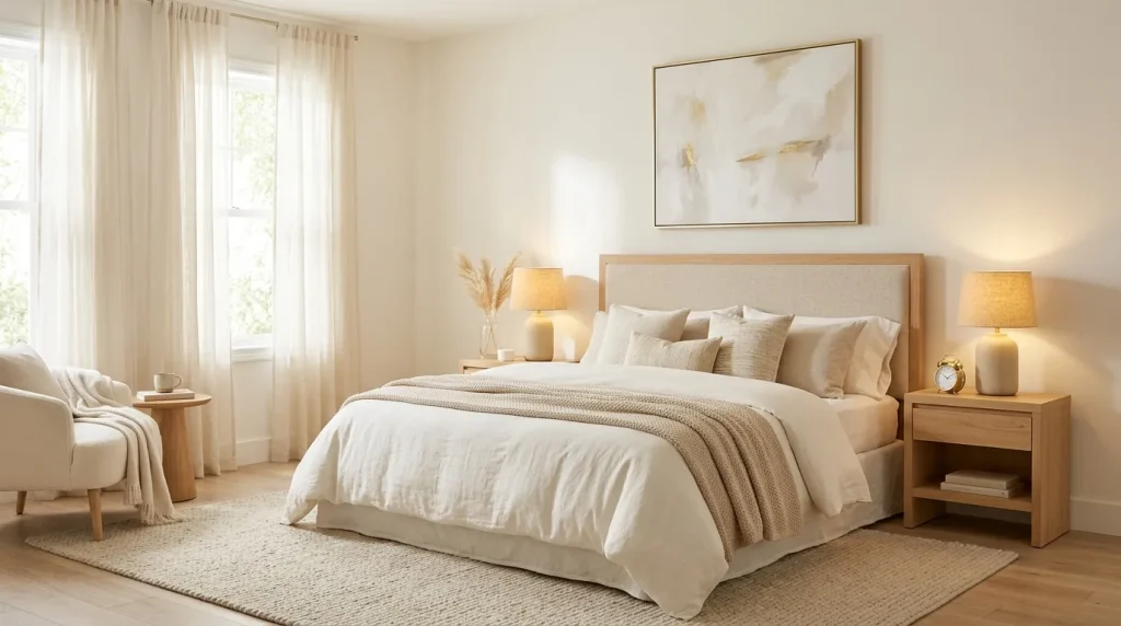
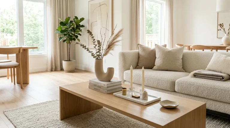
Ivory tones bring a gentle glow that instantly makes a space feel more peaceful and refined. Unlike stark white, ivory carries warmth that softens the entire room while still maintaining brightness. This makes it ideal for spaces where comfort and calm are priorities. Walls, bedding, and curtains in ivory create a seamless flow of light, making even smaller rooms feel more open and inviting. The overall effect is subtle but incredibly powerful in shaping the atmosphere of a home.
This palette works exceptionally well in modern interiors because it balances simplicity with warmth. Ivory pairs beautifully with natural wood, soft fabrics, and muted metallic accents, creating a layered yet cohesive look. Within modern color palettes idea, this shade is often chosen for its ability to enhance natural light and create a luxurious softness. I’ve seen it used in many homes where the goal is to achieve a spa-like, relaxing environment that still feels elegant and thoughtfully designed.
8.Dusty Sage Calm
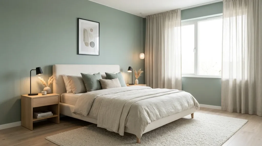
Dusty sage brings a refreshing sense of calm that feels both natural and modern. It is soft enough to blend with neutral interiors while still adding a hint of color that makes the space feel alive. This shade works especially well on accent walls, bedding, or decor pieces where you want gentle contrast without overpowering the design. The muted green undertone creates a soothing environment that feels connected to nature, making it a popular choice for relaxed, contemporary bedrooms.
This color is often used in modern interiors because it supports both minimal and layered styling approaches. Dusty sage pairs effortlessly with beige, cream, light wood, and stone textures, creating a harmonious balance across the room. In my experience, bedrooms using this tone often feel more restful and emotionally balanced. It adds personality without chaos, helping maintain a clean yet inviting aesthetic that feels timeless and thoughtfully designed.
Conclusion:
Creating a beautiful home doesn’t always require big changes — sometimes it starts with the right palette. These modern color palette ideas show how soft neutrals, earthy tones, and balanced contrasts can completely transform any space into something calm, luxurious, and visually inspiring.
If you’re planning a refresh, start small and experiment with one idea at a time. I’ve seen how even subtle color updates can make a room feel brand new and more inviting. Save this post on Pinterest for future inspiration, try your favorite combination in your own space, and share it with someone who loves home design. A thoughtful color choice can truly change everything.
Clara Whitmore
Clara specializes in interior styling, seasonal home trends, and cozy living spaces. She loves combining classic design elements with modern touches to create homes that feel personal, welcoming, and effortlessly stylish.