Ultimate Kitchen Paint Colors to Transform Your Space with Confidence

Introduction:
The right kitchen paint colors can completely change how your space looks and feels. Sometimes all it takes is a fresh shade to make an ordinary kitchen feel brighter, calmer, and more inviting.
Whether you’re planning a full makeover or simply refreshing the walls, choosing the perfect color can feel overwhelming with so many beautiful options available. This guide is designed to make that decision easier by exploring timeless neutrals, calming nature-inspired tones, and modern statement shades that work in real homes.
In my experience, the best color isn’t always the trendiest one—it’s the shade that complements your lighting, cabinetry, and daily lifestyle. I’ve noticed that even a simple color update can make a kitchen feel larger, cleaner, and more enjoyable to spend time in. As you explore these inspiring ideas, you’ll discover practical combinations that balance style with everyday function, helping you create a space that’s both Pinterest-worthy and genuinely comfortable for family life.
1. Soft White
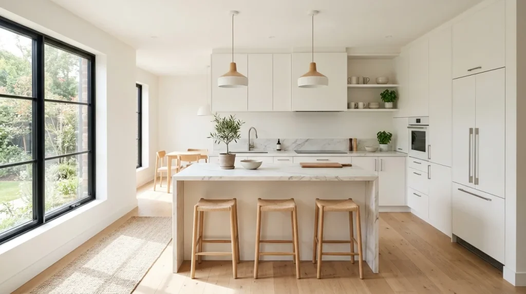
Nothing refreshes a kitchen faster than a soft white backdrop that instantly brightens every corner. This shade reflects natural light beautifully, helping even compact spaces feel larger and more welcoming. It creates a calm foundation that allows countertops, lighting, and decorative accents to become subtle focal points without overwhelming the room. In my experience, soft white remains one of the easiest choices because it adapts to changing trends while maintaining a fresh appearance. It also blends effortlessly with wood, stone, glass, and matte finishes for a polished, modern look.
One reason this color remains popular is its incredible flexibility with different decorating styles. Whether paired with black hardware, warm wood shelving, or sleek marble surfaces, it creates balance without stealing attention. Homeowners often appreciate how easy it becomes to introduce seasonal accents because the neutral backdrop complements nearly everything. When choosing kitchen paints color, this option delivers lasting value while reducing the risk of the room feeling outdated. The result is a space that feels brighter, cleaner, and comfortable enough for everyday cooking, gathering, and entertaining.
2.Warm Greige
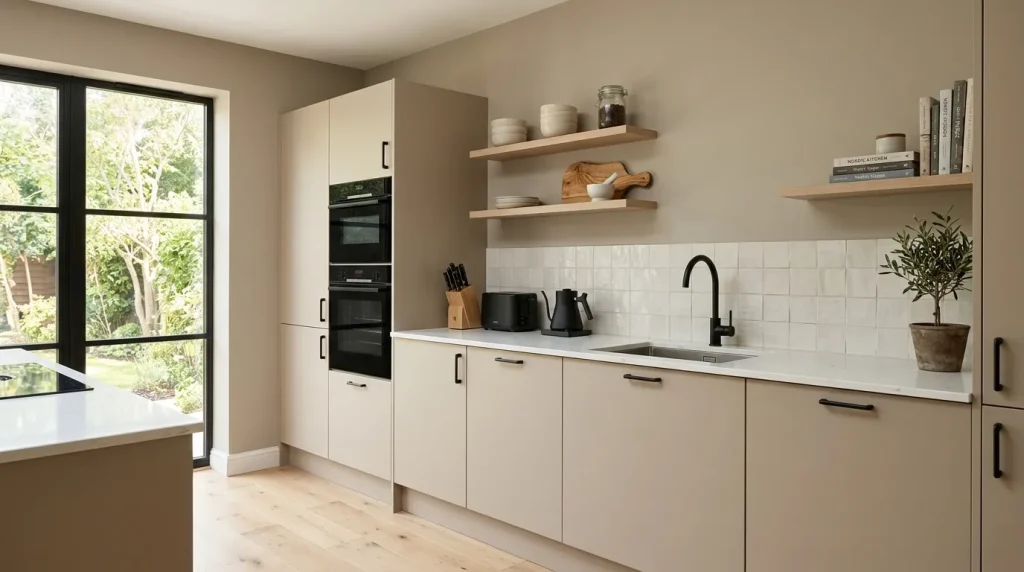
Warm greige has become a favorite because it combines the softness of beige with the sophistication of gray. Instead of feeling cold or overly creamy, it introduces a balanced neutral tone that works across many home styles. The gentle warmth helps create an inviting atmosphere while keeping the overall design clean and modern. I’ve noticed this shade performs especially well in kitchens with limited direct sunlight because it maintains warmth throughout the day without making the walls appear yellow or dull.
This versatile tone pairs naturally with white counters, matte black fixtures, natural oak cabinets, and subtle metallic finishes. The combination feels polished while remaining relaxed enough for everyday family life. Designers often recommend greige because it allows statement lighting, textured backsplashes, and decorative accessories to shine without visual competition. As decorating preferences evolve, the room stays current with only small accessory updates instead of expensive renovations. That flexibility makes it a practical investment for homeowners wanting long-lasting style and everyday comfort.
3.Sage Green
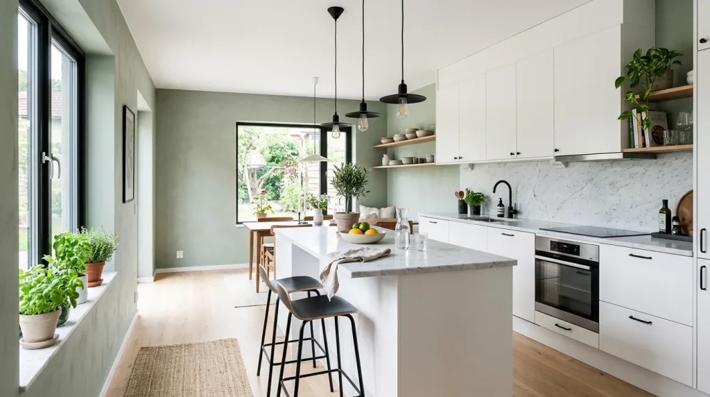
Few colors make a kitchen feel as peaceful as sage green while still adding noticeable personality. Inspired by nature, this muted shade introduces softness that instantly relaxes the overall atmosphere. It works beautifully with bright countertops, natural wood finishes, and sleek black hardware, creating an elegant balance between warmth and freshness. The gentle color also helps soften modern lines, making contemporary kitchens feel more welcoming without sacrificing their clean appearance. This combination delivers visual interest while remaining timeless enough for everyday living.
Beyond its beauty, sage green creates a comforting environment that encourages people to spend more time cooking and gathering together. Many homeowners find the color surprisingly versatile because it complements changing decor throughout the year. That’s why many designers recommend muted greens when selecting kitchen paints color that should remain stylish for years. The finished space feels calm, fresh, and thoughtfully designed while maintaining the bright, uncluttered appearance that Pinterest-inspired interiors are known for.
4.Charcoal Accent
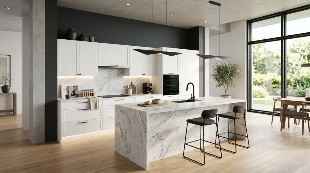
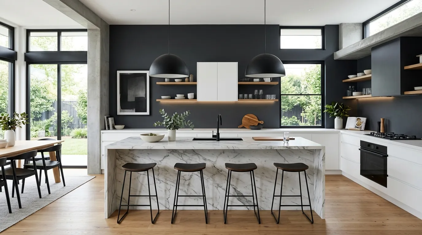
A charcoal accent wall can completely change the personality of a kitchen without requiring a full repaint. The rich tone introduces depth that instantly draws the eye while allowing lighter cabinets and countertops to stand out beautifully. When balanced with natural light, the darker shade feels sophisticated rather than heavy. In my experience, using charcoal on just one wall delivers the strongest visual impact while keeping the room open, bright, and welcoming. It creates a designer-inspired finish that feels polished without becoming overwhelming.
Dark accents also provide the perfect backdrop for warm wood, brushed metal, and sleek marble surfaces. Decorative shelves, artwork, or pendant lights naturally become stronger focal points against the deeper color. This simple contrast adds dimension that many all-white kitchens sometimes lack. The result is a balanced space with modern character and lasting appeal. Even small kitchens can benefit when the remaining walls stay light, allowing the bold feature wall to introduce drama without reducing the sense of openness.
5.Misty Blue
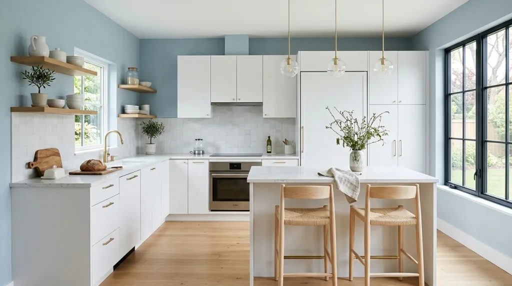
Misty blue brings a fresh, calming feeling that instantly makes a kitchen feel more spacious. The gentle color reflects light beautifully while adding more personality than traditional neutrals. It works especially well in homes that receive generous daylight, creating soft shifts in tone throughout the day. I’ve seen this work well in many homes where homeowners wanted subtle color without making the room feel busy. The result is an elegant balance between freshness, comfort, and contemporary style.
Pairing this gentle shade with light wood, white cabinetry, and brushed brass hardware creates an inviting atmosphere that feels both relaxed and refined. Simple greenery and textured accessories become more noticeable against the cool background, adding natural warmth without clutter. This thoughtful palette remains easy to update as decorating trends change because the wall color supports a wide variety of finishes and accent pieces. The overall design feels bright, peaceful, and effortlessly polished for everyday living.
6.Taupe Neutral
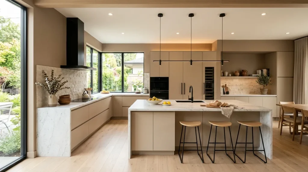
Taupe offers a refined balance between warm and cool tones, making it one of the easiest neutrals to decorate around. Unlike stronger beige shades, it feels modern while still adding welcome warmth to the room. The soft color helps large kitchens feel more inviting and gives smaller spaces a cozy yet uncluttered appearance. It also creates an ideal background for natural textures like stone, wood, and woven accessories, allowing every design element to work together harmoniously without competing for attention.
For homeowners searching for versatile kitchen paints color, taupe delivers impressive flexibility year after year. Whether paired with matte black hardware, creamy countertops, or light wood cabinetry, it creates a balanced environment that rarely feels outdated. That’s why many designers recommend neutral shades with subtle depth instead of dramatic colors that quickly lose appeal. The finished kitchen feels sophisticated, comfortable, and practical enough to complement everyday family life while maintaining a beautifully curated Pinterest-inspired aesthetic.
7.Creamy Beige
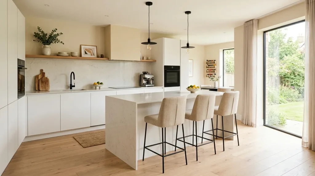
Creamy beige creates a welcoming atmosphere that feels warm from the moment you walk into the kitchen. Unlike stronger yellow-based shades, this softer neutral maintains a clean appearance while adding comfort and depth. It reflects natural light beautifully, helping the room stay bright without looking stark. In my experience, this color is especially effective in family kitchens where people spend time cooking, talking, and gathering throughout the day because it naturally encourages a relaxed and inviting environment.
Pairing creamy beige with white cabinetry, light oak flooring, and subtle black accents creates a timeless combination that rarely feels outdated. Decorative elements like woven baskets, ceramic vases, and indoor plants become more noticeable against the soft background without making the room feel busy. This balanced palette also gives homeowners greater flexibility when updating accessories over time. The finished kitchen feels calm, polished, and effortlessly stylish while remaining practical enough for everyday living.
8.Dusty Olive
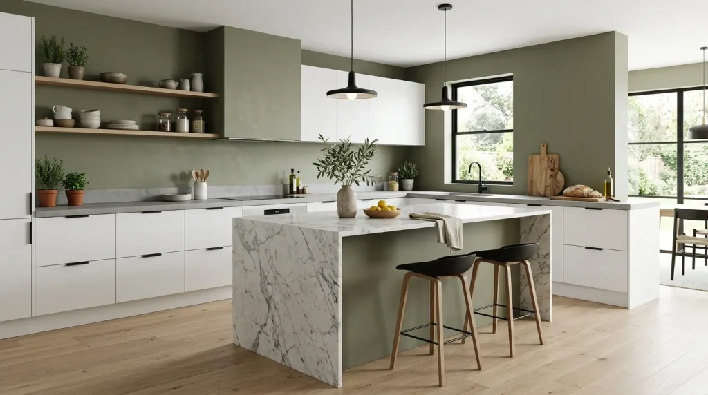
Dusty olive introduces natural richness while keeping the overall design calm and contemporary. Its muted appearance feels sophisticated rather than bold, making it easier to decorate around than brighter green shades. The earthy tone pairs beautifully with marble, light wood, and matte finishes, creating an interior that feels grounded and elegant. I’ve noticed homeowners often appreciate how this shade changes gently throughout the day as sunlight shifts, adding subtle visual interest without becoming distracting. To create a cohesive look that extends beyond the interior, consider carrying these earthy tones to your entryway with these front door decor ideas, which offer stylish ways to boost curb appeal while complementing your home’s overall design.
The muted green backdrop also highlights black fixtures, warm metallic accents, and simple decorative pieces with impressive balance. Fresh herbs, leafy plants, and textured ceramics blend naturally into the palette, giving the room a thoughtfully designed appearance. Rather than dominating the space, dusty olive quietly adds depth and warmth that grows more appealing over time. This makes it an excellent option for anyone wanting a kitchen that feels modern, comfortable, and connected to natural materials.
9.Warm Terracotta
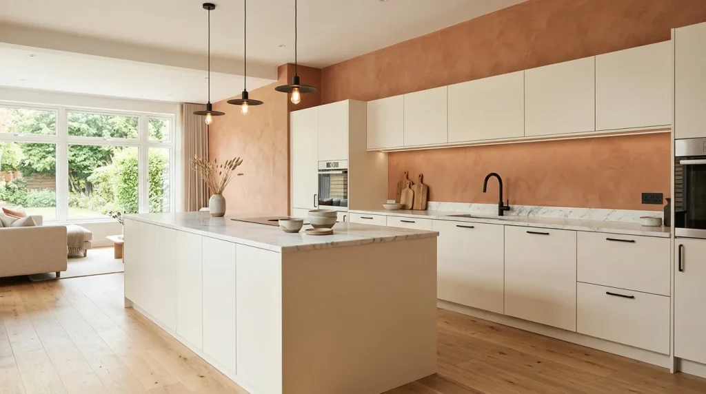
Warm terracotta brings depth and personality while still feeling refined in a modern kitchen. The earthy tone creates a welcoming environment that feels vibrant without becoming overpowering. When balanced with light cabinetry and clean architectural lines, it adds warmth that instantly makes the room feel more lived-in. This color works especially well in spaces filled with natural light, where its subtle undertones shift beautifully throughout the day and create an inviting atmosphere from morning until evening.
Among today’s trending kitchen paint colors, warm terracotta offers a refreshing alternative to cooler neutrals while maintaining a sophisticated appearance. That’s why many designers recommend combining it with creamy cabinets, pale wood flooring, and simple black accents for visual balance. The result feels fresh instead of overly rustic, proving that earthy shades can look incredibly contemporary when paired with sleek finishes and uncluttered styling. It creates a memorable kitchen that feels welcoming every single day.
Conclusion:
A thoughtful color choice has the power to refresh your entire home without the need for a major renovation. From soft neutrals to rich earthy tones, these kitchen paint colors offer inspiration for creating a space that feels brighter, more welcoming, and uniquely yours. I’ve seen how small updates like these can completely transform the atmosphere of a kitchen while adding lasting style. Save this guide to Pinterest for future inspiration, try one or more of your favorite ideas in your own space, and share this article with anyone planning their next kitchen makeover.
Elira Montclair
Elira writes about timeless home decor, kitchen styling, and practical interior ideas. Her work blends warm, inviting aesthetics with simple decorating tips that make everyday spaces feel beautiful and comfortable.