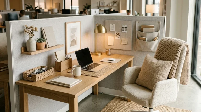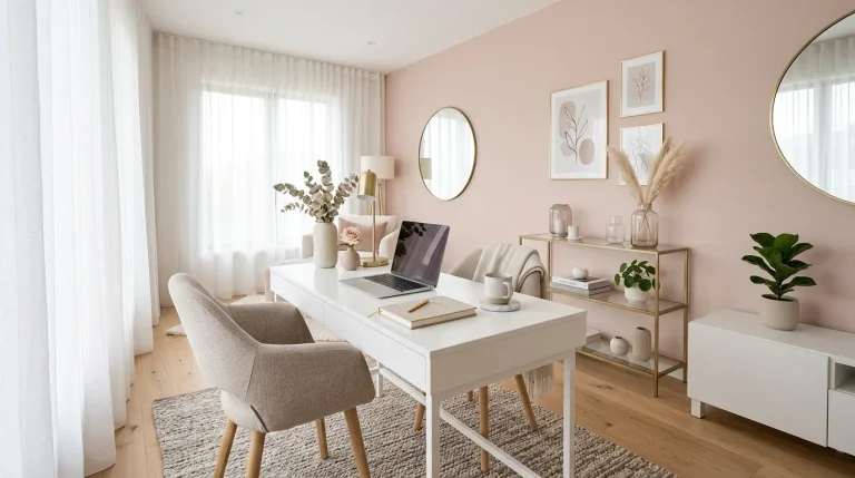
Color Psychology in Office Decor for the Ultimate Professional Look

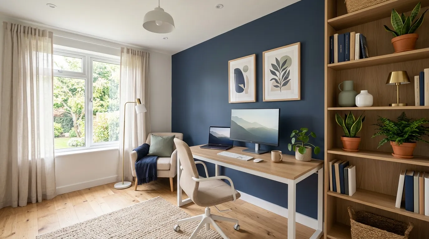
Your workspace can influence your mood, focus, and creativity more than you realize. Color psychology in office decor helps transform ordinary work areas into inspiring, balanced environments. The right shades can create a feeling of calm, confidence, energy, or professionalism without requiring a complete renovation. In this guide, you will discover practical ways to use modern colors, accents, and combinations to improve your office atmosphere. From soothing neutrals to bold statement tones, each choice can shape how your space feels and functions. I’ve noticed that thoughtful color decisions often make even simple offices feel more intentional, comfortable, and beautifully designed.
1. Calm Blue Accents
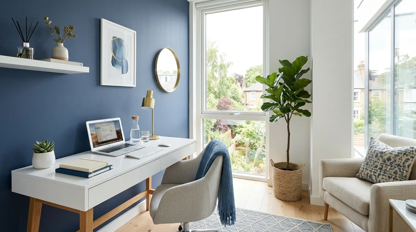
A calm workspace can instantly change how a room feels and functions throughout the day. Soft blue accents bring a sense of balance while helping the office look polished and intentional. This approach works especially well in busy homes where the workspace needs to feel peaceful yet professional. I’ve noticed that small color updates like a painted wall or decorative accessories often create a bigger visual impact than expected. The right shades can support concentration and make the entire area feel more comfortable. These subtle choices help create a welcoming environment that feels organized and inspiring for everyday tasks too.
Choosing cooler tones does not mean the space has to feel cold or plain. When paired with warm materials like wood finishes and textured fabrics, blue elements add depth without overwhelming the room. Many designers use this combination because it creates a refined atmosphere while keeping the office visually fresh. In my experience, balanced color choices help transform ordinary corners into spaces that feel more purposeful and enjoyable. A thoughtful palette can improve the overall mood of the room and encourage a smoother workflow. Even simple changes like cushions or artwork can introduce this effect without requiring a full renovation.
2. Energizing Green Details
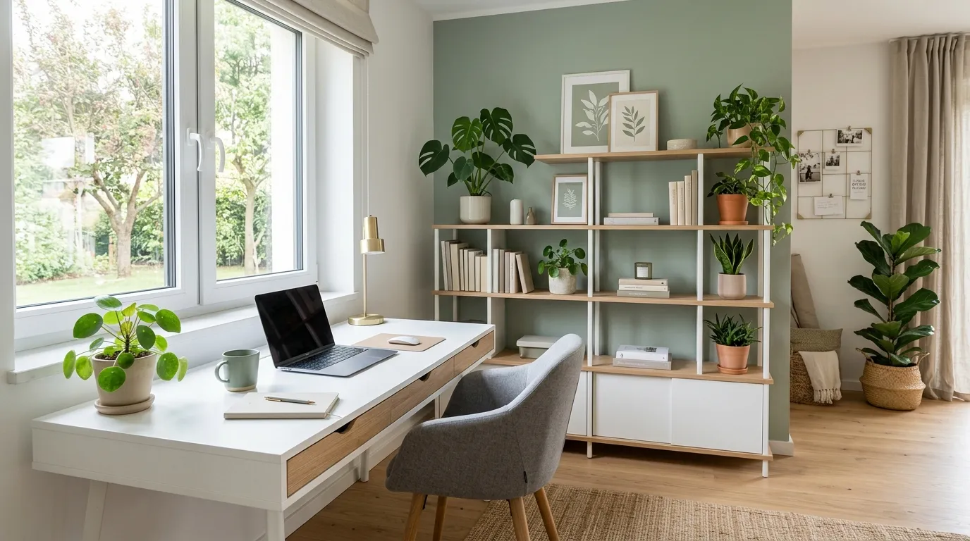
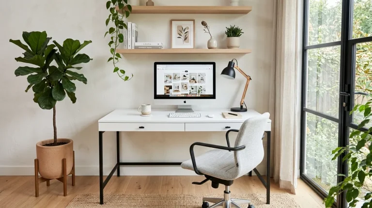
Green details can make an office feel more connected, balanced, and visually refreshing. Small touches like sage accessories, artwork, or a feature chair introduce a natural element without making the room feel busy. This style works because green sits comfortably between calming and energizing tones, making it suitable for creative and professional spaces. I’ve seen this approach work well in many homes where people want their office to feel inspiring but still organized. A carefully chosen shade can improve the atmosphere while adding personality to a simple workspace.
Modern offices often benefit from colors that create emotional comfort as well as visual appeal. Green accents paired with clean furniture and natural textures can make the room feel brighter and more inviting. The result is a workspace that feels thoughtfully designed instead of purely functional. Many people find that surrounding themselves with balanced tones helps create a more enjoyable daily routine. Even small additions, such as a green lamp, storage piece, or wall detail, can introduce a fresh feeling. These updates are simple, affordable, and effective for creating a polished environment.
3. Confident Neutral Layers
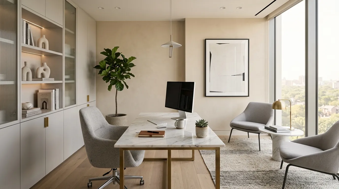
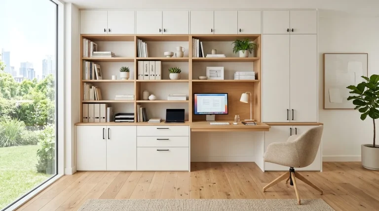
Neutral layers create a strong foundation for a workspace that feels elegant and comfortable. Shades like beige, cream, and soft gray allow the office to look sophisticated without becoming overwhelming. This approach is especially helpful when creating a flexible room that needs to support different tasks throughout the day. I’ve noticed that neutral palettes often make decorating easier because they work well with changing accessories and seasonal updates. The balanced tones create a professional atmosphere while keeping the space warm, welcoming, and visually appealing for everyday use.
A thoughtfully layered neutral palette can completely transform the personality of an office. Instead of feeling empty or plain, the room gains depth through textures, materials, and carefully selected finishes. Soft fabrics, matte surfaces, and natural elements help create a polished appearance that feels intentional. This style is often recommended for spaces where focus and comfort are equally important. Simple upgrades like a textured chair, neutral artwork, or elegant storage can make the workspace feel more complete. These small details create a refined environment that supports productivity while maintaining a beautiful aesthetic.
4. Warm Beige Balance
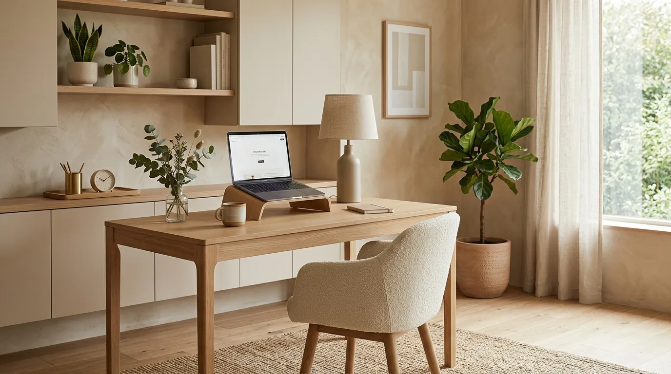
Warm beige tones can make a professional workspace feel instantly more comfortable and inviting. This color choice works beautifully because it creates a gentle backdrop that supports focus while adding visual warmth. Unlike stronger shades, beige allows furniture, artwork, and accessories to become the main features of the room. I’ve noticed that many home offices feel more relaxing when they include soft neutral colors instead of harsh contrasts. A balanced beige palette can make even a simple workspace appear thoughtfully designed, helping create a place where productivity and comfort naturally come together.
The beauty of warm beige is its ability to adapt to different modern office styles. It pairs effortlessly with wood finishes, soft textiles, and sleek materials, creating a layered look without feeling crowded. Many designers use warm neutrals because they provide a timeless foundation that stays appealing over time. Small additions like beige curtains, rugs, or wall accents can completely change the atmosphere of a workspace. This approach is especially useful for people who want a calm professional setting that still feels personal. A carefully chosen neutral shade can quietly influence the overall mood of the room.
5. Bold Accent Walls
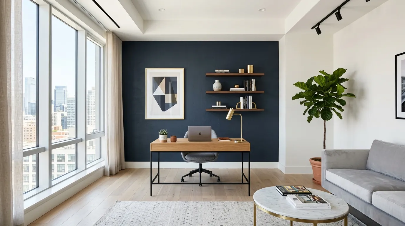
A bold accent wall can completely change the energy of a workspace without requiring a full redesign. One carefully selected wall color can add confidence, depth, and a professional feel while allowing the rest of the room to remain simple. This technique works especially well in minimalist offices where a single statement feature creates visual interest. In my experience, a strong wall color often becomes the element that ties the entire room together. When balanced with neutral furniture and soft lighting, deeper shades can feel sophisticated rather than overwhelming.
The key to using bold colors successfully is choosing a shade that supports the purpose of the room. Deep blues, charcoal tones, or muted greens can create a focused atmosphere while adding a luxurious touch. A feature wall also helps separate a workspace from surrounding areas, especially in open-plan homes. I’ve seen this approach work well when people want their office to feel distinct without adding extra furniture or complicated decor. With the right balance, a bold accent becomes a stylish backdrop that enhances creativity, confidence, and overall room appeal.
6. Soft Gray Harmony
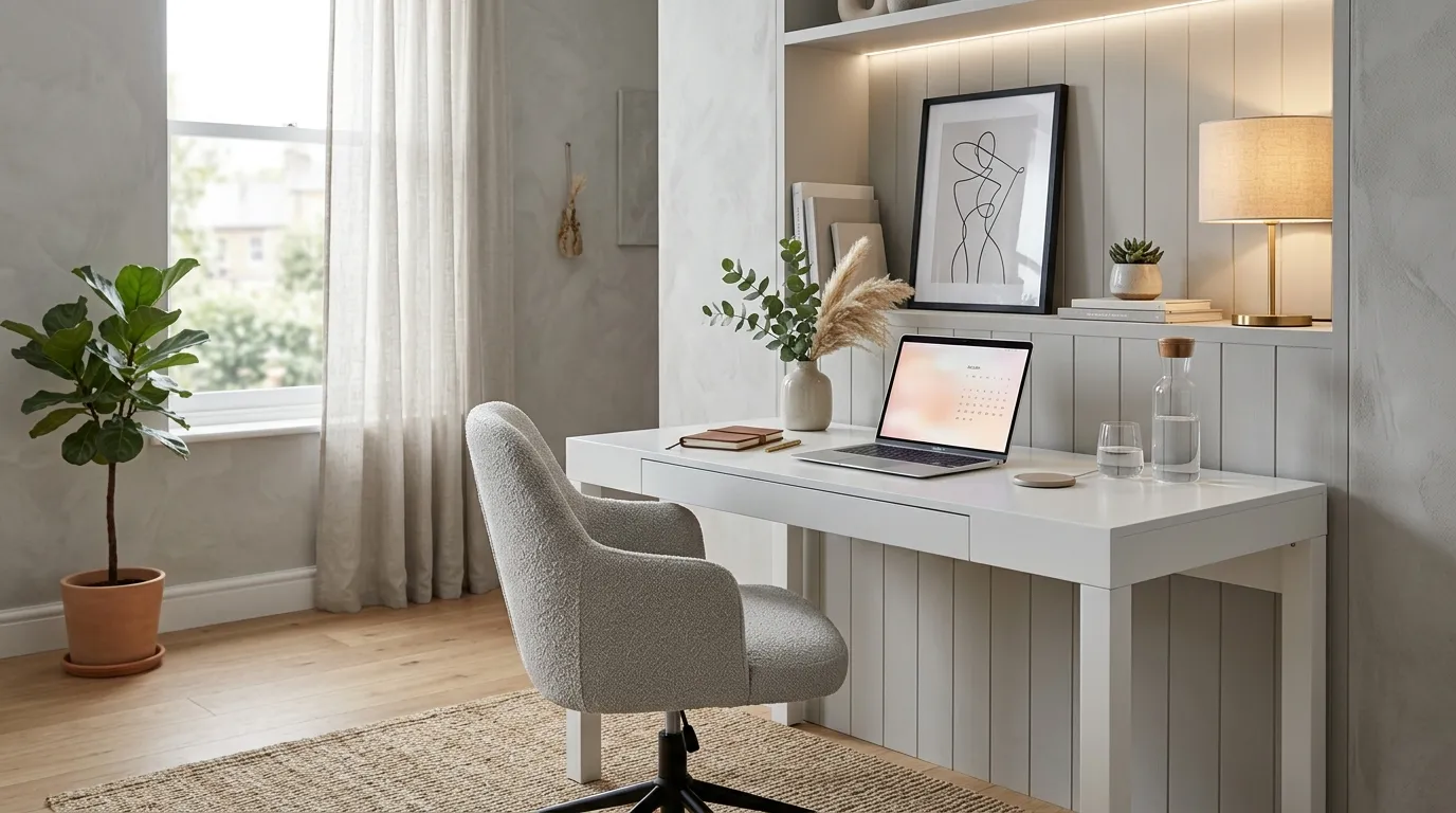
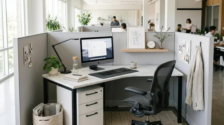
Soft gray tones bring a sense of balance and refinement to a modern workspace. This versatile shade creates a clean foundation that allows furniture, artwork, and decorative elements to stand out naturally. Gray is often chosen for professional environments because it feels organized and calm without appearing too plain. I’ve noticed that softer gray shades work especially well in home offices because they create a peaceful background for concentration. When combined with warm lighting and natural textures, gray can feel inviting while maintaining a polished and contemporary appearance.
You may want to check out Masculine Home Office Paint Colors as well.
A harmonious gray office design can help create a space that feels focused and thoughtfully arranged. The color works beautifully with white surfaces, wood details, and metallic accents, giving the room a modern layered appearance. Many people choose gray because it adapts easily to changing styles and seasonal updates. Simple additions like a textured rug, artwork, or comfortable chair can bring extra personality to the space. This balanced approach allows the office to feel professional yet comfortable, making it easier to enjoy daily routines while maintaining a stylish environment.
7. Creative Yellow Touches
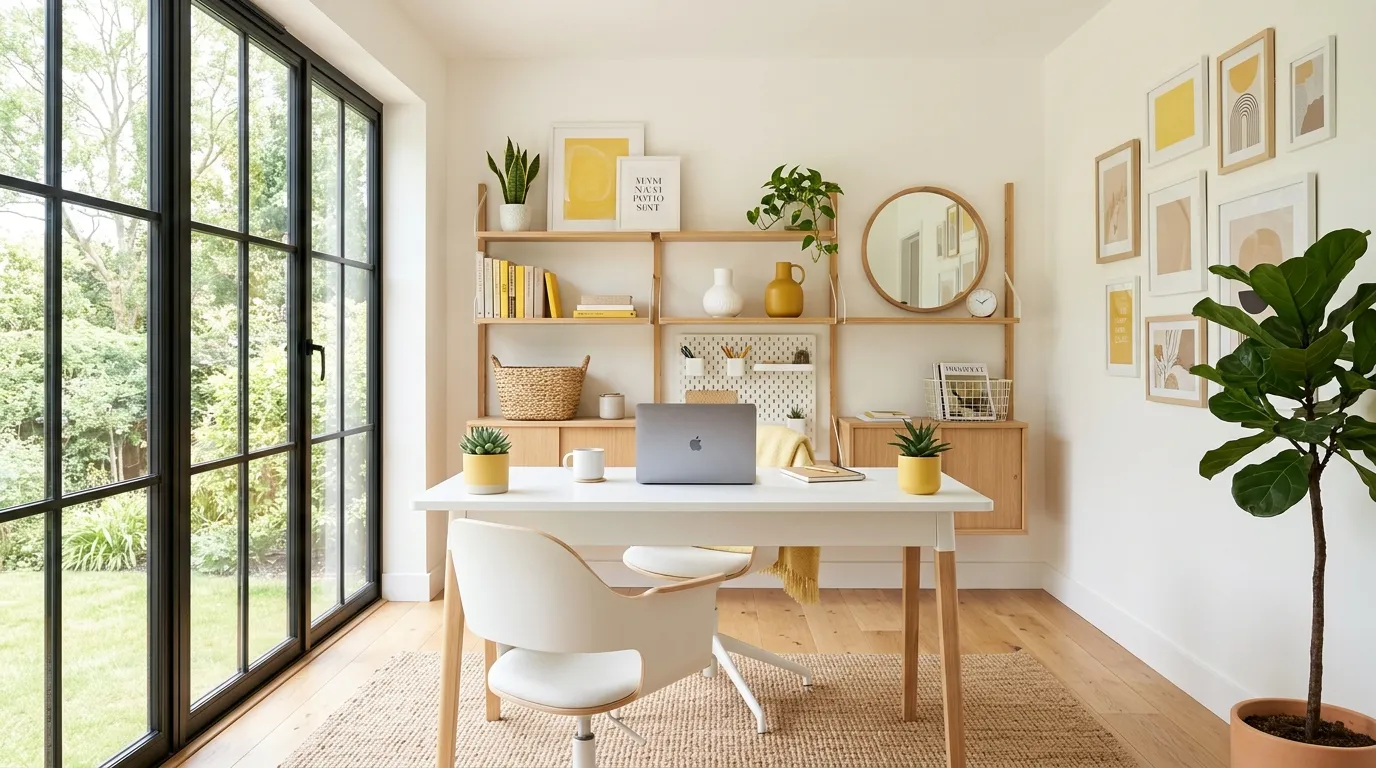
Small yellow touches can bring an uplifting feeling into a workspace while keeping the overall design professional. This color works best when used strategically through accessories, artwork, lighting details, or small furniture pieces. Bright shades can encourage creativity and add personality, especially in offices that rely heavily on neutral tones. I’ve noticed that carefully placed pops of color often make a room feel more inspiring without requiring major changes. The goal is not to cover the entire space in yellow but to introduce just enough warmth and energy to create a positive environment.
A balanced approach to yellow accents can make a modern office feel more lively and welcoming. When paired with whites, soft grays, or natural wood finishes, yellow creates a fresh contrast that catches attention in a subtle way. Many creative workspaces use this technique because color can influence the emotional experience of a room. Simple additions like a yellow chair, lamp, or decorative object can make the environment feel brighter. These small details help transform a basic workspace into a place that feels more personalized, motivating, and visually appealing.
8. Sophisticated Black Details
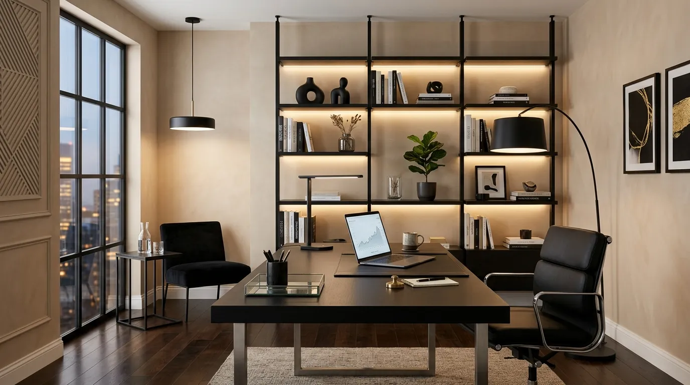
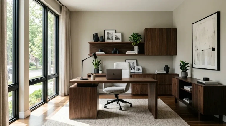
Black details can instantly add sophistication and structure to a modern office design. When used carefully, this powerful shade creates contrast and makes lighter colors appear more refined. Instead of feeling heavy, small black elements such as lighting fixtures, frames, shelves, or desk accessories can give the room a designer-inspired finish. I’ve seen this approach work especially well in minimalist spaces where a few darker details create balance. The key is moderation because thoughtful placement allows black accents to enhance the room without making it feel too dramatic or closed.
A modern office with black accents often feels confident, organized, and visually striking. This color works beautifully with materials like glass, marble, metal, and natural wood, creating a sophisticated combination. Many designers use darker details to define areas and add depth to simple layouts. Even small changes, such as replacing hardware or adding black decor pieces, can create a noticeable upgrade. The result is a workspace that feels intentional and professional while still maintaining a comfortable atmosphere. These subtle touches can help create a space that looks elegant and timeless.
9. Balanced Color Zoning
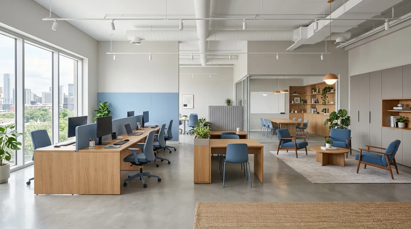
Color zoning is a smart way to organize a workspace visually without changing the physical layout. By using different shades for specific areas, you can create clear zones for working, reading, planning, or relaxing. This technique is especially useful in multipurpose rooms where every corner needs a purpose. I’ve noticed that thoughtful color placement can make a small office feel larger and more structured. Instead of relying only on furniture placement, colors guide the eye and create natural transitions throughout the room, making the entire space feel more balanced.
Using color zones does not require dramatic changes or complicated designs. Simple choices like a painted wall section, matching accessories, or different textures can define areas beautifully. Many modern interiors use this approach because it creates organization while keeping the room open and flexible. When colors are selected carefully, each zone can support a different mood while still connecting with the overall design. This method helps create a workspace that feels functional, stylish, and personalized. A well-planned palette can improve both the appearance and usability of the office.
Conclusion:
Creating a beautiful workspace starts with understanding how colors affect the feeling of a room. The right choices can make your office more comfortable, focused, and visually appealing while reflecting your personal style. By applying these color psychology in office decor techniques, you can create a space that supports productivity and inspiration every day. Save this post on Pinterest for future design inspiration and try adding small color updates that make a noticeable difference. I’ve seen how simple changes can completely transform a workspace into a place people enjoy using. Share these ideas with anyone looking to refresh their office.
Elira Montclair
Elira writes about timeless home decor, kitchen styling, and practical interior ideas. Her work blends warm, inviting aesthetics with simple decorating tips that make everyday spaces feel beautiful and comfortable.