Refresh Your Color Drenching Kitchen in 26 Easy Ways

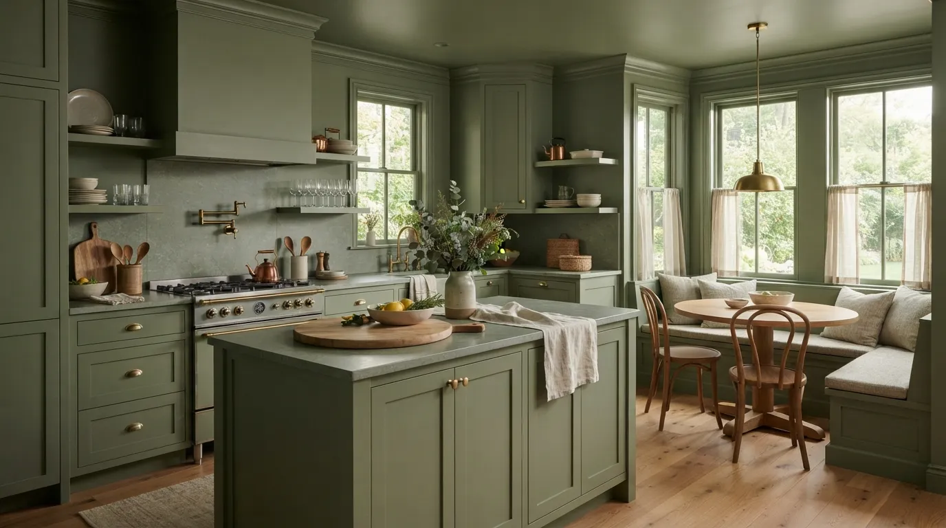
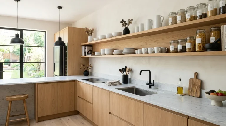
A Color Drenching Kitchen can make an ordinary room feel intentional without adding lots of decoration. The idea is simple: choose one main color and carry it across several surfaces, such as cabinets, walls, trim, and sometimes the ceiling. When the same shade appears in different places, the kitchen feels more connected and visually calm.
You don’t need a huge kitchen to try this look. A soft clay tone can warm white counters, while muted blue can give painted cabinets a relaxed feel. You can also play with sheen, wood, stone, brass, and glass so the single-color palette doesn’t feel flat. These 26 ideas show practical ways to bring color drenching into your kitchen while keeping the space useful, comfortable, and easy to live with.
Wrap the Cabinets in One Rich Shade
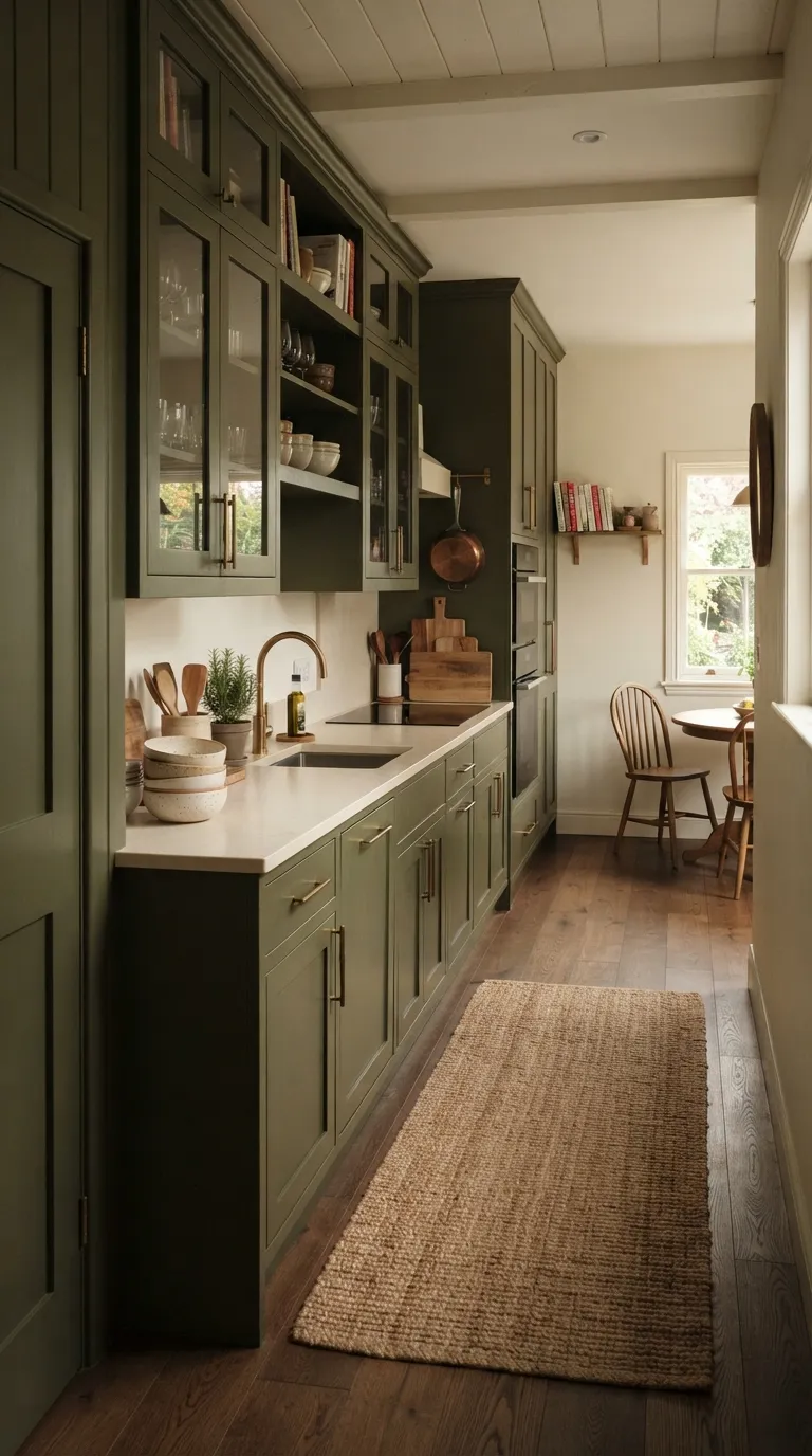
Start with the cabinets if you want the color to carry the most visual weight. A saturated olive, muted rust, or dusty blue can cover both upper and lower doors for a strong but controlled effect. Professional painters often recommend testing large swatches first because kitchen lighting can make the same paint look very different during morning and evening hours.
Carry that shade onto nearby trim or a pantry door for a more connected look. Keep the counters lighter if you want the cabinetry to stay in charge. Warm wood accents can also break up the painted surfaces without competing with the main color.
Paint the Walls and Trim Together
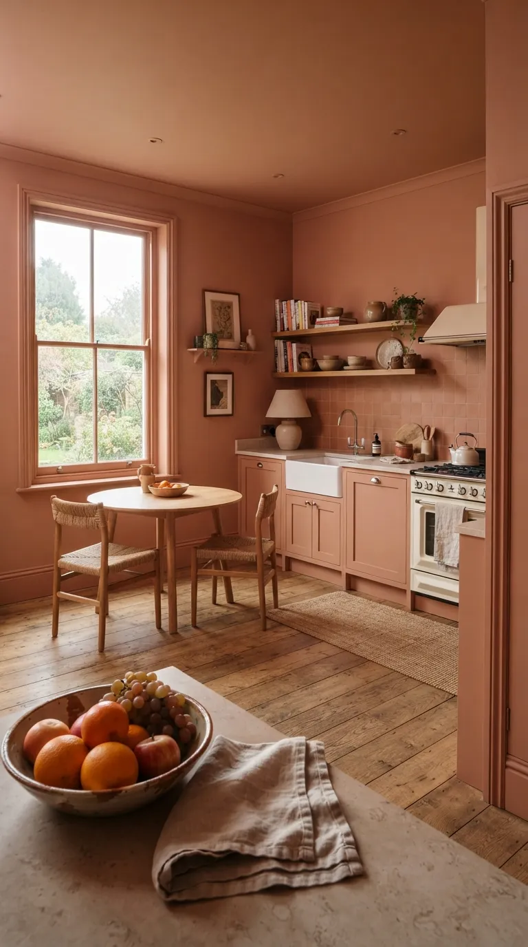
Treat the trim as part of the color plan rather than an afterthought. Painting baseboards, casings, and window trim in the wall color removes sharp breaks and gives the room a smoother visual line. This works especially well with earthy shades that already feel soft and grounded.
For a Color Drenching Kitchen with pale counters, a mid-tone wall color can add depth without making the work surfaces feel heavy. Use a durable kitchen-friendly paint finish and check how the shade looks beside your countertop before committing to every wall.
Take the Color Onto the Ceiling
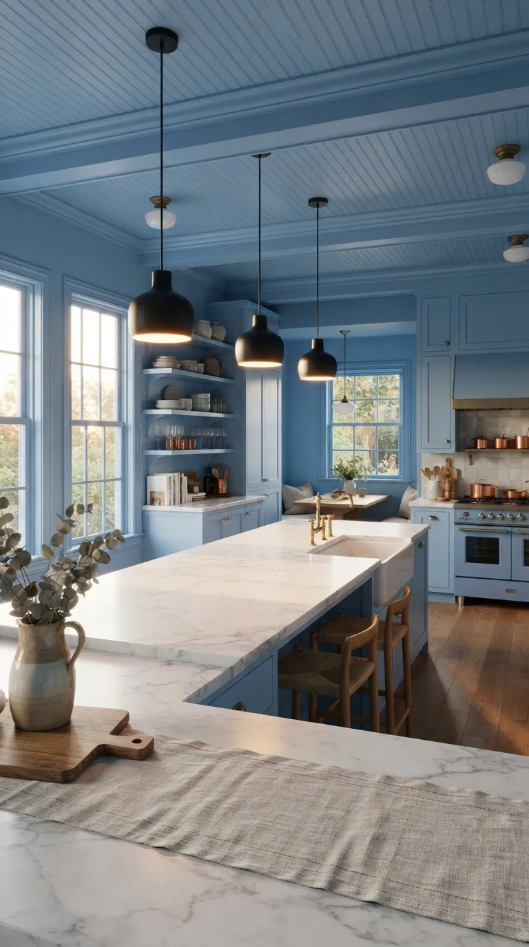
Don’t overlook the fifth wall when planning your color palette. Extending the kitchen shade onto the ceiling can make the room feel more wrapped in color, especially when the walls and cabinets already share a similar tone. A pale blue, warm beige, or muted green can work well when you want the effect to stay light.
Keep the ceiling finish slightly different from the walls if you want subtle contrast. A lower-sheen ceiling paired with satin cabinetry can create small changes in reflection without introducing another color. Test the ceiling color under both daylight and your evening fixtures before painting the full surface.
Add Matching Color to the Island
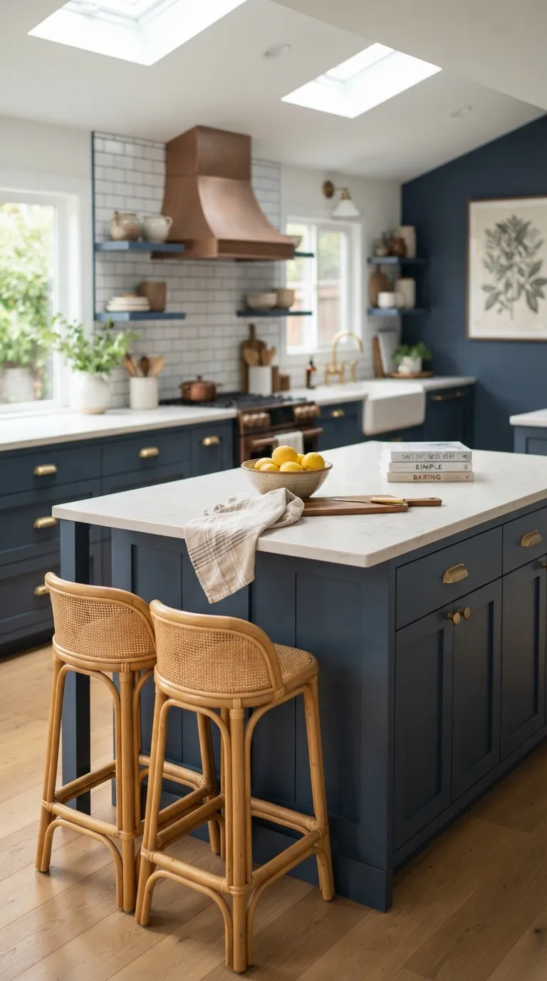
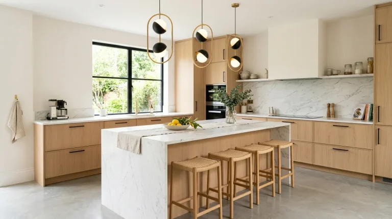
Make the island part of the main color story instead of treating it as a separate feature. Painting it the same shade as the surrounding cabinetry creates a strong visual anchor, especially in an open kitchen where the island sits between cooking and living areas.
Let the countertop provide the contrast. Pale quartz, limestone, or light wood can keep a dark painted island from feeling too heavy. If your island already has a bold shape, a single paint color can also make its form feel cleaner and more intentional.
Use Soft Sage for a Calm Kitchen
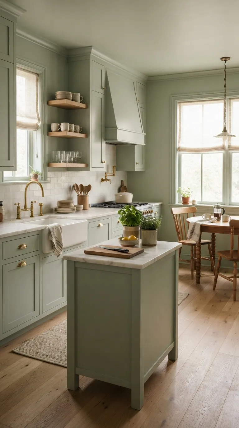
Soft sage is a useful choice when you want color without a loud visual statement. The muted green works nicely with oak, marble, brass, woven textures, and creamy neutrals. In a Color Drenching Kitchen, repeating sage across walls and cabinetry can make the room feel settled and cohesive.
Keep the shade slightly dusty rather than highly saturated if your kitchen gets limited daylight. Add natural materials to keep the palette from feeling too uniform. Herbs, rattan, pale wood, and handmade ceramics all fit naturally with this color family.
Try a Warm Mushroom Brown
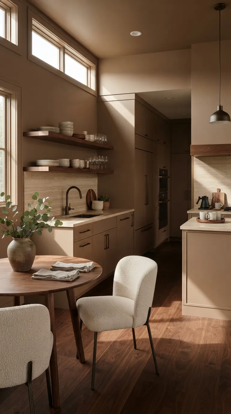
Mushroom brown gives a kitchen a grounded look while staying softer than charcoal or black. Use it across painted cabinets and walls, then bring in walnut, travertine, or aged bronze for material variety. The result feels warm without relying on lots of decorative pieces.
This shade suits kitchens with natural wood nearby because the colors share earthy undertones. If the room feels visually dense, use a lighter stone countertop and keep the backsplash simple. A few cream ceramics can also provide small breaks without taking attention away from the main color.
Make the Backsplash Part of the Palette
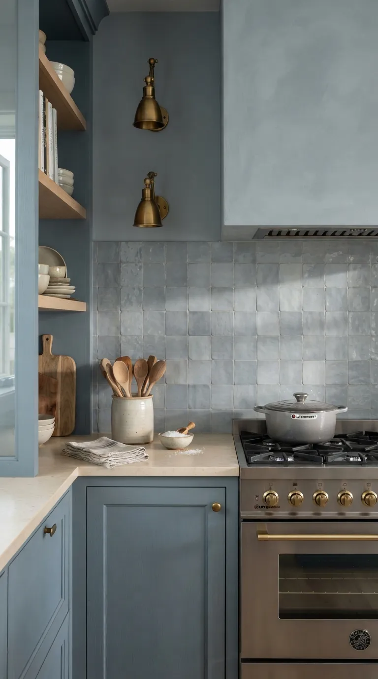
A backsplash doesn’t have to introduce a new color. Pick tile that sits close to your cabinet or wall shade, then let the tile shape and grout lines add interest. Handmade ceramic tile is especially useful because small variations keep a monochrome kitchen from looking too flat.
Match the undertones before buying a large quantity. A blue backsplash with a green cast may look mismatched beside a clean blue-gray cabinet. Bring paint and tile samples together under your actual kitchen lighting before making the final choice.
Paint the Range Hood to Match
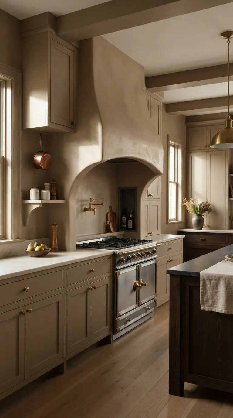
A painted range hood can make the main cooking wall feel much more connected to the rest of the room. Use the cabinet color or a close tonal match so the hood reads as part of the architecture rather than a separate appliance feature.
This approach works particularly well with custom plaster or wood hoods. Keep the countertop quieter when the hood has a strong shape or texture. Simple hardware and restrained open shelving can give the painted area enough breathing room.
Carry Color Through Open Shelves
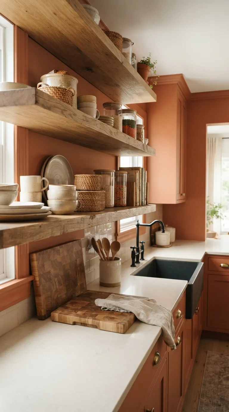
Open shelves can expose a lot of wall, so they’re a natural place to continue your kitchen color. Paint the wall behind them in the same shade as the cabinets to create a strong backdrop for dishes and everyday pieces.
Keep the shelf styling fairly restrained. Cream ceramics, clear glass, woven baskets, and natural wood can add texture without creating a busy mix of colors. The painted wall then does most of the visual work.
Pair Deep Green With Natural Wood
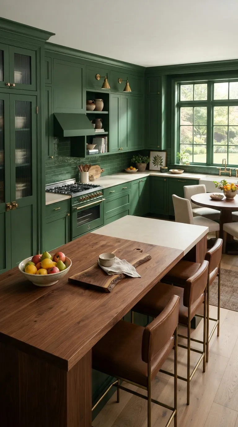
Deep green and natural wood make a strong pair because both bring earthy character to the room. Let the green cover the built-in elements while walnut, oak, or ash supplies a clear change in texture.
Use wood where you want the eye to pause. An island, open shelves, or a simple dining table can provide enough contrast without introducing a second bold paint color. Cream stone and warm metal finishes can fill in the remaining gaps.
Go Moody With Charcoal Blue
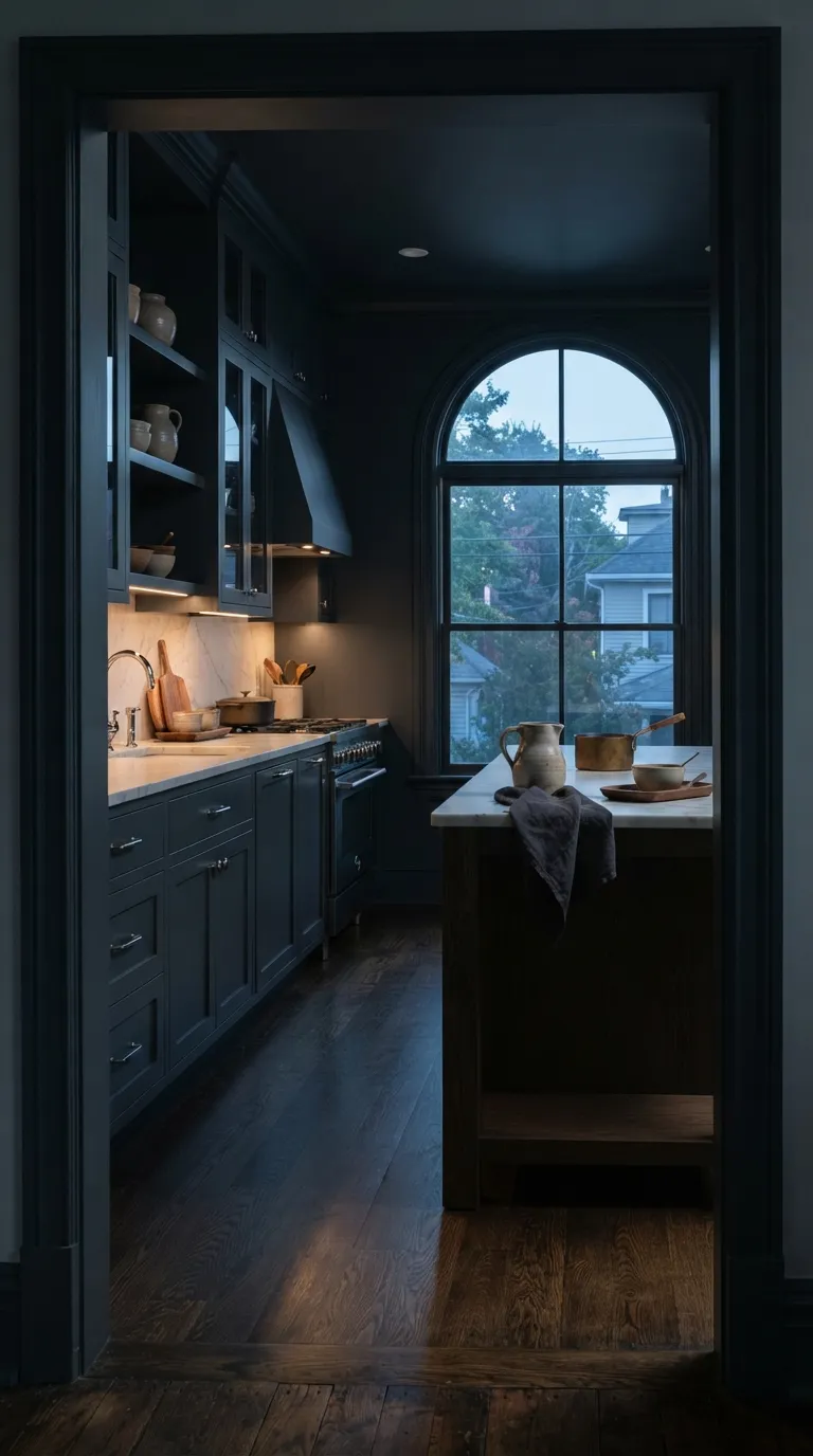
Charcoal blue suits kitchens where you want a deeper, more intimate feel. Covering the walls and cabinets in one dark shade can make the room feel visually contained instead of chopped into separate surfaces.
Bring in lighter materials to keep the space practical. White marble, pale limestone, or warm oak can reflect available light and give the eye a resting point. Good task lighting matters even more when the paint color is this deep.
Use One Color in Different Sheens
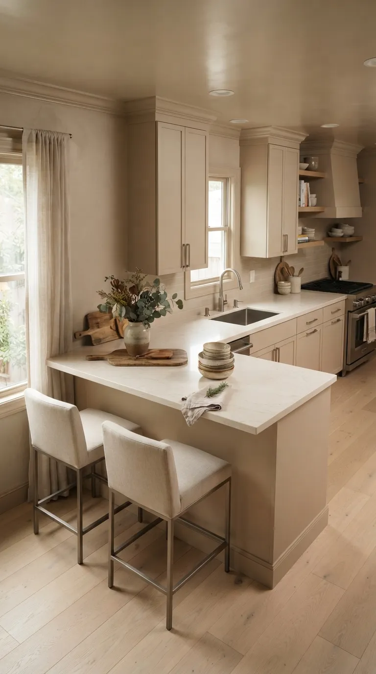
A single paint color doesn’t have to look identical on every surface. Changing the sheen can create subtle visual variation while keeping the palette intact. Matte walls can sit beside satin cabinets, while trim gets a slightly more reflective finish.
Choose the finish based on the surface as well as the look you want. Cabinet paint needs to handle frequent cleaning, while ceilings usually benefit from lower sheen. The small differences in reflection can give a monochrome kitchen more depth without adding another color.
Bring the Color Into the Pantry
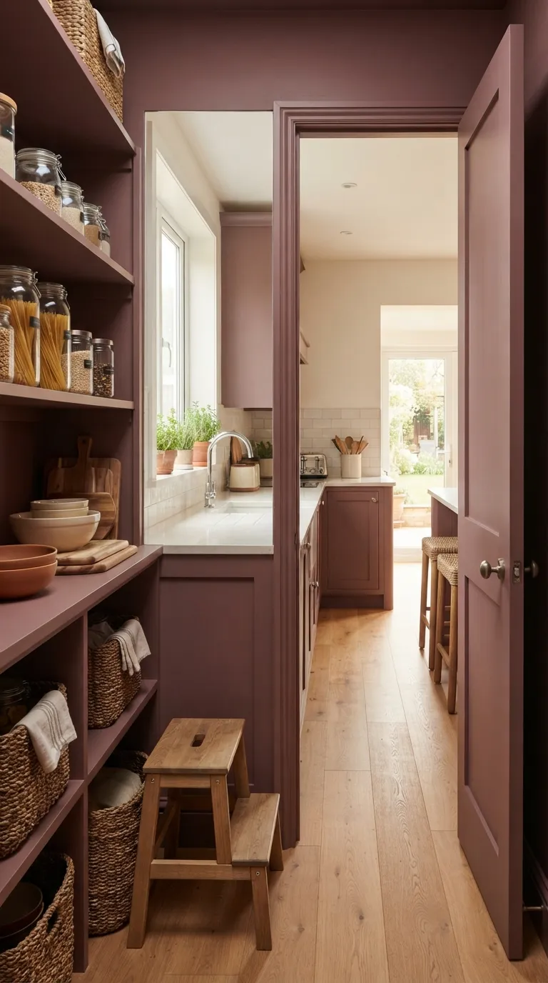
A pantry gives you another place to carry the kitchen color. Paint the door, shelving, and interior walls in the same family for a small detail that feels intentional when the door is open. This works especially well in kitchens with built-in pantry cabinets.
Keep the shelves practical rather than overly styled. Matching baskets can hide smaller items, while clear jars make frequently used ingredients easy to spot. A lighter countertop or wood shelf can prevent the darker paint from making the pantry feel cramped.
Try Dusty Blue From Floor to Ceiling
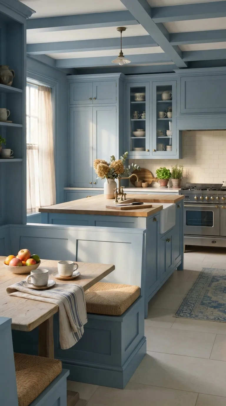
Dusty blue can give a kitchen a relaxed look while still feeling polished. Covering several architectural surfaces in the same shade makes the color feel deliberate rather than like a single painted accent.
Use warm materials to keep the blue from feeling cold. Oak, aged brass, woven fabric, and creamy tile all work well beside dusty blue. In a smaller room, choose a lighter version of the shade so the color remains noticeable without absorbing too much light.
Let Warm Beige Cover Small Kitchens
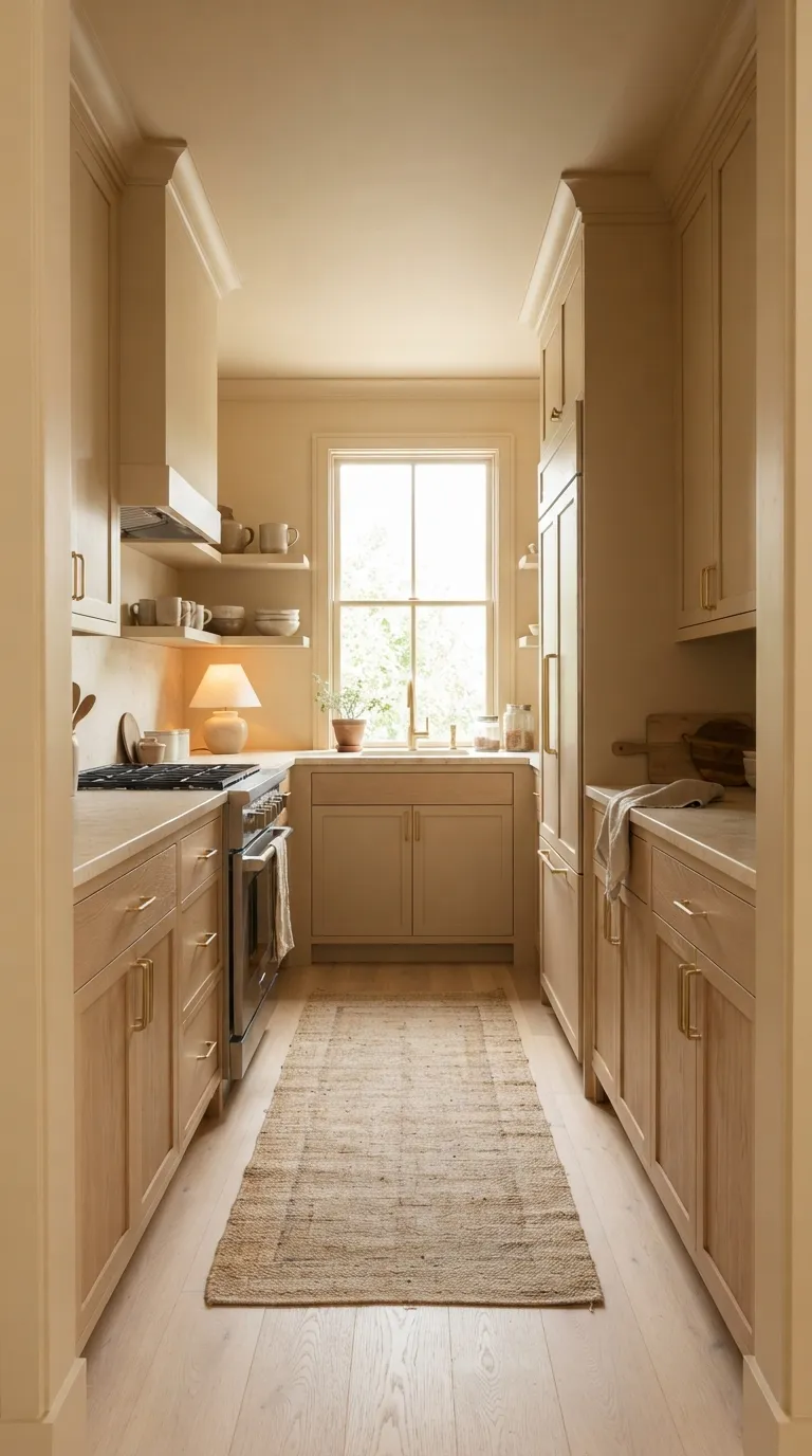
Warm beige is an easy choice when you want a monochrome kitchen that still feels bright. In a small space, using one color across cabinets, walls, and trim can reduce visual breaks and make the layout feel more connected.
Choose a beige with warm undertones if your kitchen has oak or brass details. Creamy stone can continue the soft palette without making every surface identical. Add one or two darker accents through hardware or lighting for enough contrast to define the room.
Use Terracotta for a Sun-Warmed Look
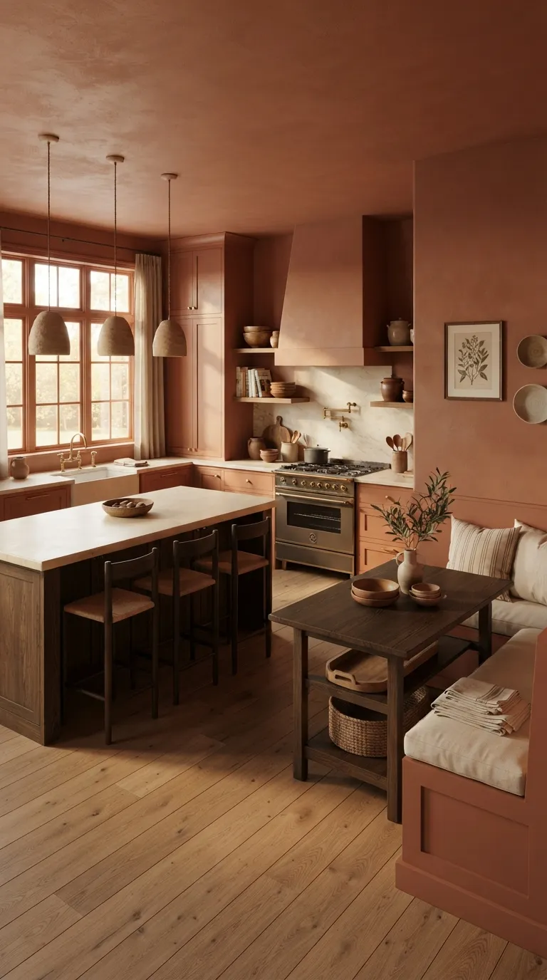
Terracotta brings warmth without needing a long list of decorative accents. Use it across painted cabinets and walls, then add clay, wood, stone, and brass to reinforce its earthy character.
A muted version usually feels easier to live with than a bright orange-red. Pair it with creamy counters if you want the kitchen to stay light. Dark wood can also give the warm palette a grounded finish.
Paint the Door in the Kitchen Shade
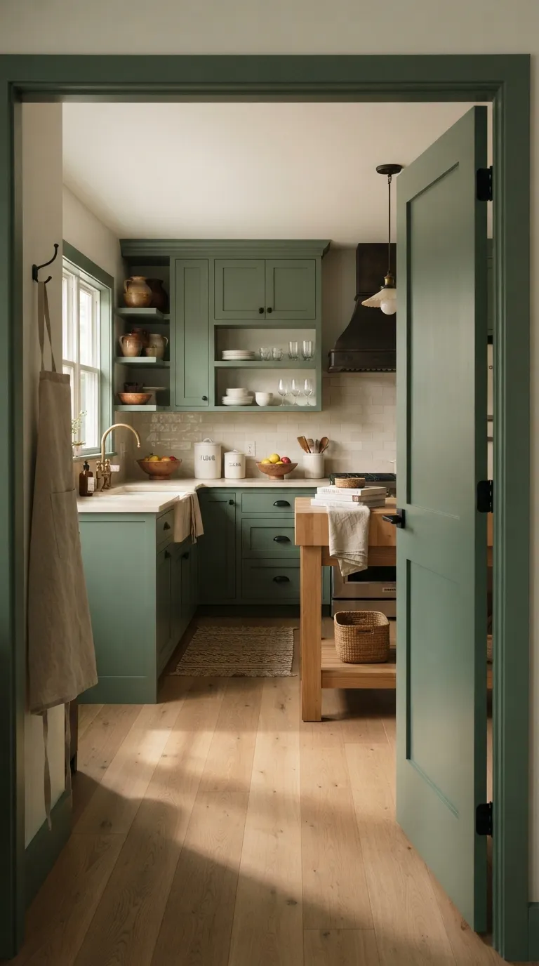
Interior doors are easy to overlook, but painting one in the kitchen color can connect nearby spaces. The repeated shade can make the kitchen feel like part of a larger design plan instead of a room that stops at its doorway.
This works particularly well when the door sits close to painted cabinets or trim. Keep the handle simple so the door color remains the main detail. If the kitchen already has several strong materials, this small paint change may be enough to tie them together.
Add a Matching Breakfast Nook
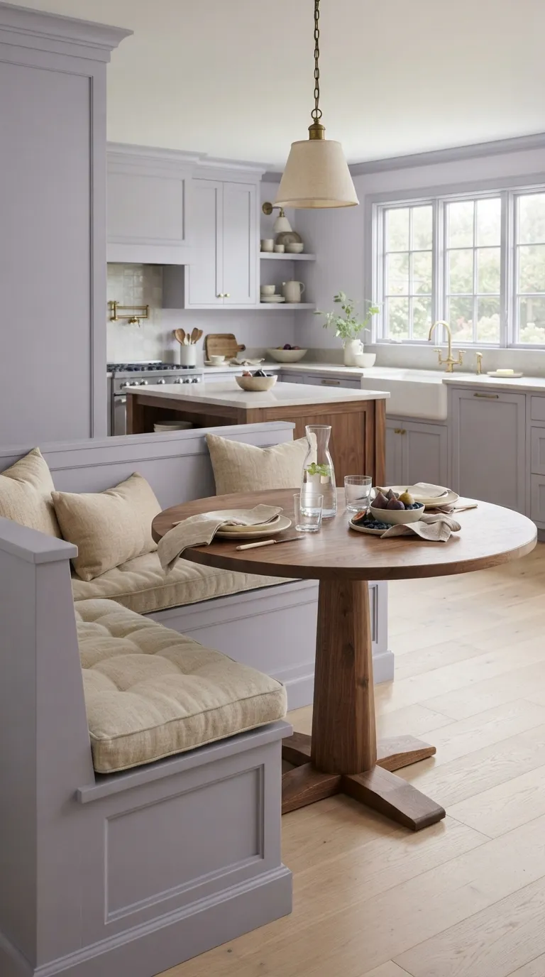
A breakfast nook gives you another surface where the kitchen color can appear naturally. Paint a built-in bench, nearby wall, or window trim in the same shade to connect the dining corner with the cooking area.
Use furniture to add a different texture instead of another strong color. Walnut, linen, rattan, and light oak can soften a cooler painted palette. Keep the table styling simple so the continuous color remains easy to see.
Keep the Lower Cabinets Darker
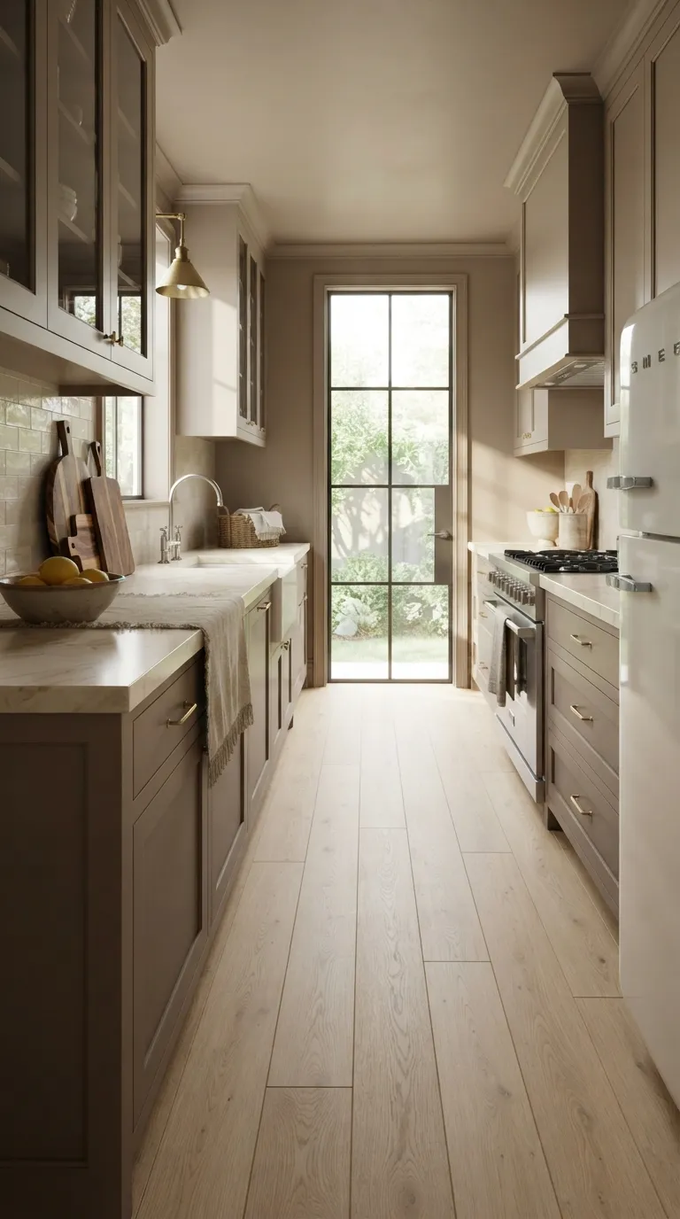
You can keep a color-drenched look from feeling too heavy by using several tones from one color family. A deeper shade on the lower cabinets gives the kitchen a grounded base, while lighter walls and upper cabinets keep the upper half airy.
This method is useful when you like monochrome rooms but don’t want every surface to have the exact same paint. Stay within the same undertone for a connected look. Light stone counters can provide another quiet layer between the two paint tones.
Choose Creamy Yellow for a Cheerful Space
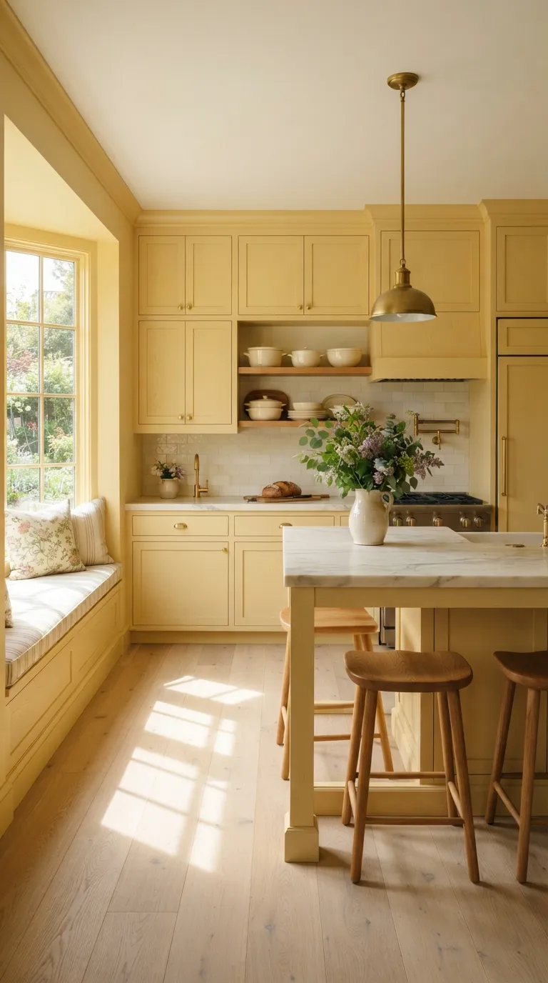
A creamy yellow can give a Color Drenching Kitchen a warm, welcoming character. Choose a soft buttery shade instead of a sharp lemon yellow if you want the room to feel relaxed throughout the day.
Balance the paint with pale stone and natural wood. Brass hardware can reinforce the warm palette, while cream ceramics keep the room from becoming too busy. This color works best when the surrounding finishes have warm rather than blue-gray undertones.
Use Black for a Dramatic Monochrome
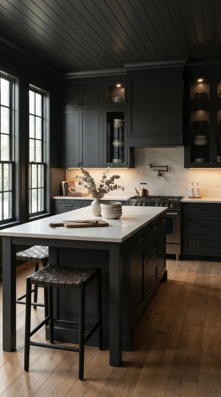
Black can work beautifully when you want the kitchen to feel bold and architectural. Instead of using pure black, consider a softened charcoal with warm or neutral undertones. That small change can make the color easier to pair with wood and stone.
Give the dark palette enough light and contrast to stay functional. Pale counters, glass doors, and warm under-cabinet lighting can help the work areas remain clear. Natural oak is another useful partner because its grain adds texture against the painted surfaces.
Add Pattern Without Leaving the Color Family
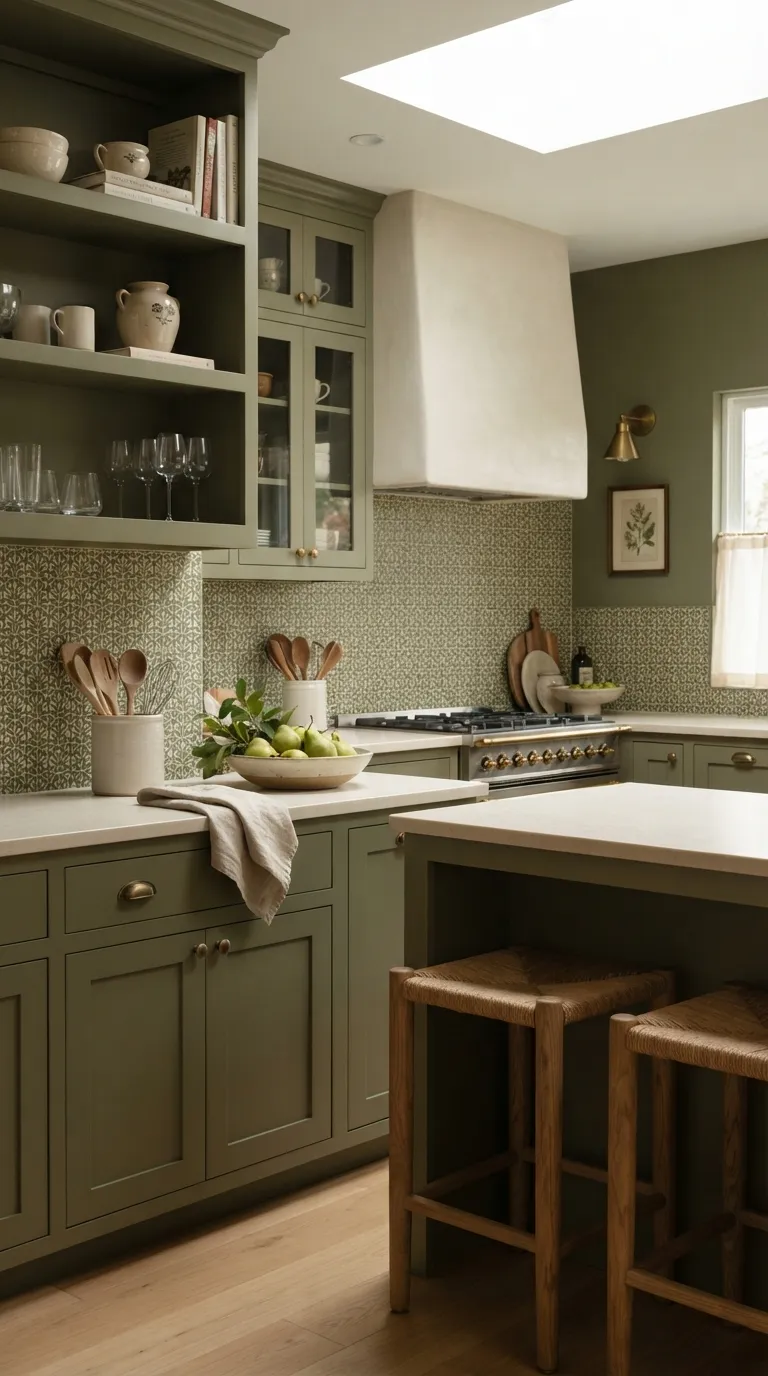
A color-drenched room doesn’t have to be completely plain. A patterned backsplash can add interest while staying within the same color family. Look for tiles that combine your main shade with one quiet neutral rather than introducing several unrelated colors.
Small patterns usually work better when the cabinets and walls already have a strong presence. Keep the countertop simple so the backsplash has room to show its shape. Repeating one tile color elsewhere, such as in ceramics, can make the pattern feel connected to the rest of the room.
Match the Window Trim and Frames
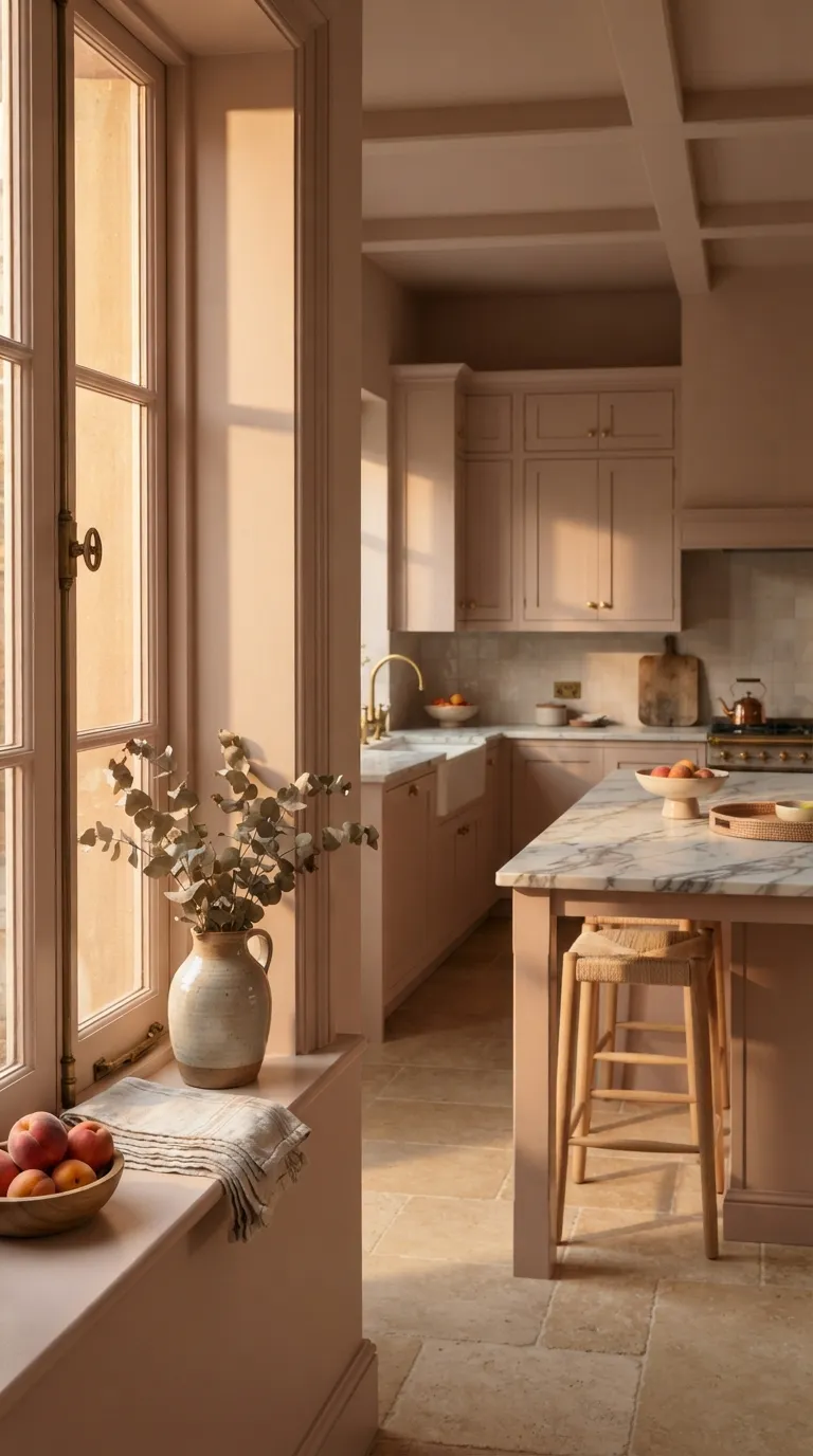
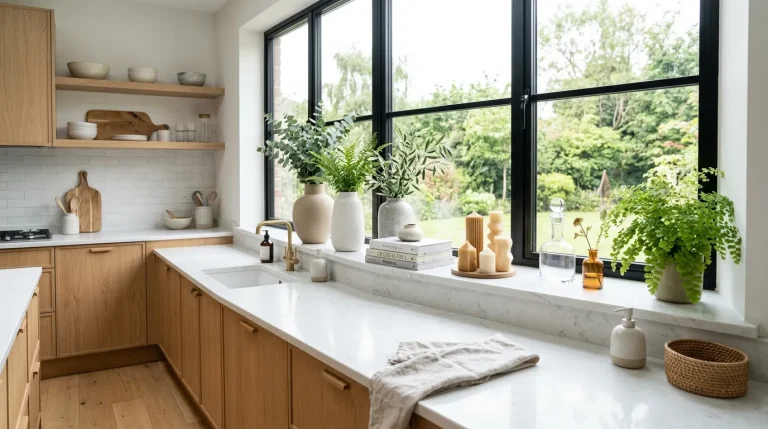
Window trim can be a small detail with a big visual effect. Painting the frames and surrounding casing in the kitchen color helps the architectural lines blend into the larger palette.
This idea works particularly well when the window sits above a sink or beside cabinetry. Use a durable finish on frequently touched areas and test the color around the glass first. Natural daylight will reflect off the painted frame, so check the shade at different times before committing.
Layer Burgundy for a Richer Kitchen
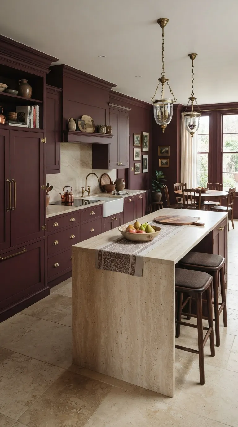
Muted burgundy gives a kitchen a deeper color story without relying on black. It works well on cabinetry, walls, and trim when you want the room to feel warm and collected.
Keep the other finishes fairly quiet. Creamy limestone and pale travertine can lighten the darker paint, while walnut adds warmth without competing with it. Brass hardware is another natural fit, especially when you choose an aged finish instead of a highly polished one.
Finish With a Soft Greige Palette
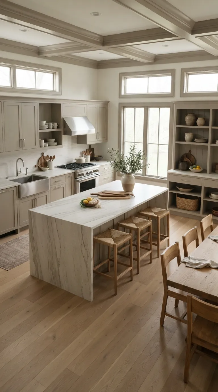
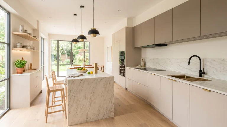
Greige is a practical choice when you want the calm feel of a single-color kitchen without committing to a stronger hue. Its mix of gray and beige works with many common kitchen materials, including oak, limestone, stainless steel, and warm white stone.
Use the same greige across the main painted surfaces, then let natural materials provide the variation. This creates a quiet backdrop for everyday kitchen life without making the room feel bare. If you’re unsure about going fully dark or colorful, greige offers a gentler place to start.
Create a Two-Tone Color Drench
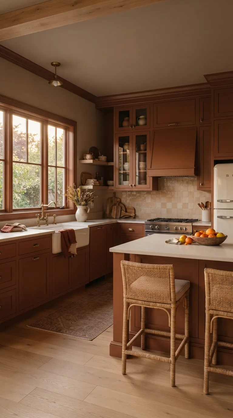
You don’t have to use one exact shade on every surface. Two related colors can create a more layered Color Drenching Kitchen while keeping the overall room cohesive. Try a deeper tone on cabinets and a lighter version on walls and the ceiling.
Keep the undertones closely related so the colors feel like part of the same palette. Natural wood and pale counters can sit between them without creating another strong visual block. Before painting, place both samples together in the kitchen and check them under your normal daylight and evening lighting.
Give Your Color Drenching Kitchen a Clear Finish
A Color Drenching Kitchen works best when the repeated shade has a clear purpose. Choose your main color first, then decide where it should continue across cabinets, walls, trim, ceiling, doors, or built-ins. From soft sage to deep burgundy, the right palette can make everyday surfaces feel more connected without filling the room with extra decoration.
Start small if you’re unsure. Test large paint samples beside your counters, flooring, hardware, and natural light before committing to the full room. Once the color feels right, repeat it across two or three key surfaces and let wood, stone, metal, and ceramics provide the contrast.
Elira Montclair
Elira writes about timeless home decor, kitchen styling, and practical interior ideas. Her work blends warm, inviting aesthetics with simple decorating tips that make everyday spaces feel beautiful and comfortable.