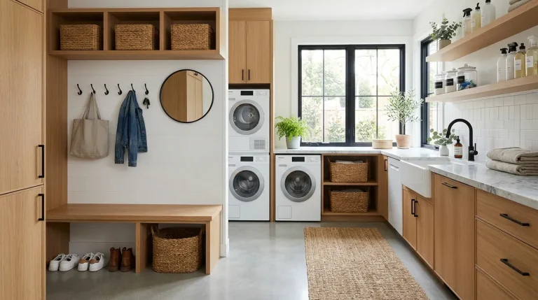
Need a Laundry Room Refresh? Try 21 Best Paint Colors for Laundry Rooms

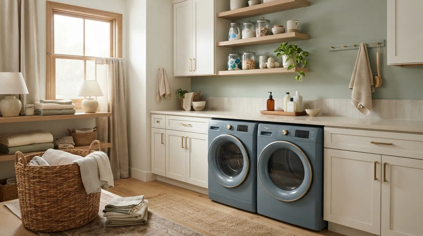
A fresh coat of paint can change how your laundry room feels without replacing cabinets or appliances. The best paint colors for laundry rooms can make a narrow space feel calmer, give a dark room more light, or add enough color to make laundry day feel less routine. From soft whites and warm neutrals to muted greens and dusty blues, the right shade depends on your room’s size, lighting, cabinets, and overall home style.
Before you pick a color, look at the room throughout the day. A north-facing laundry room may need a warmer shade, while a sunny space can handle cooler tones without feeling stark. Think about your flooring, countertops, storage baskets, and metal finishes too, because paint works best when it connects the pieces already in the room.
Soft Warm White
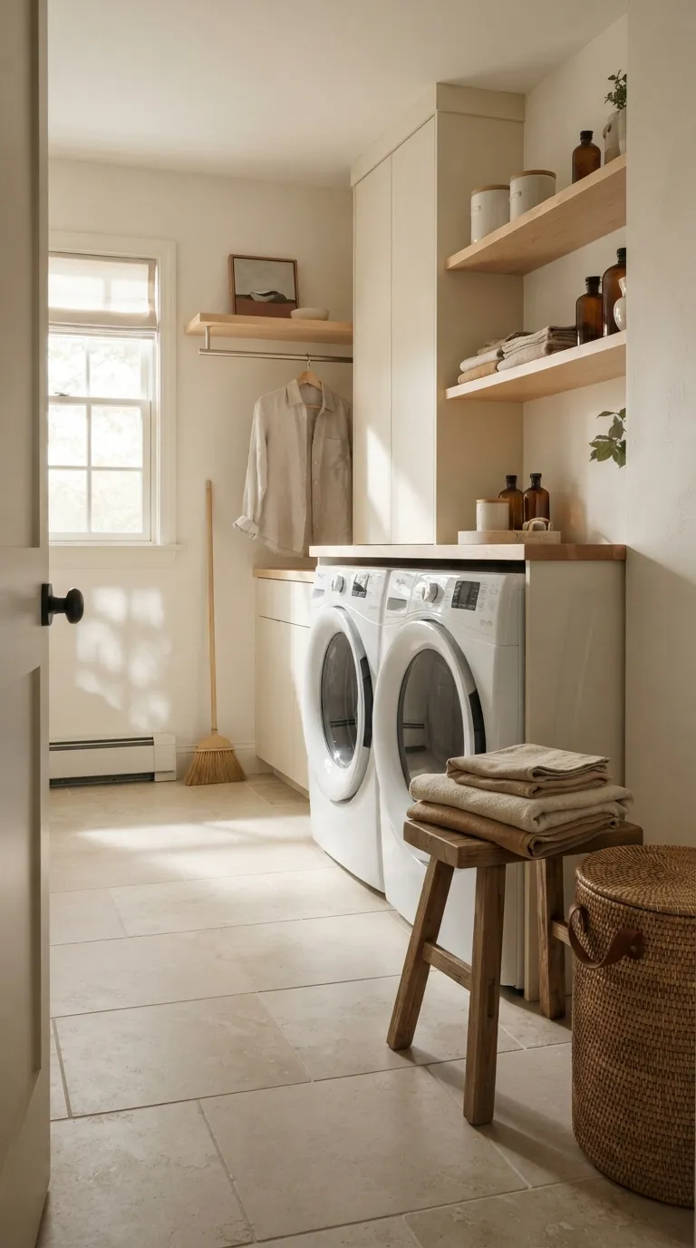
Warm white is one of the safest choices when you want a laundry room to feel clean without looking cold. It pairs easily with white appliances, wood shelves, black hardware, woven storage, and nearly any flooring style. In a small laundry room, the pale wall color can also keep the visual field open rather than making the space feel boxed in.
Look closely at the undertone before buying paint. A warm white with a slight cream or beige base usually works well beside natural wood, while a cleaner white may suit a room with crisp cabinetry and polished surfaces. Many designers recommend testing a large sample on several walls because artificial laundry-room lighting can make the same white appear quite different after sunset.
Muted Sage Green
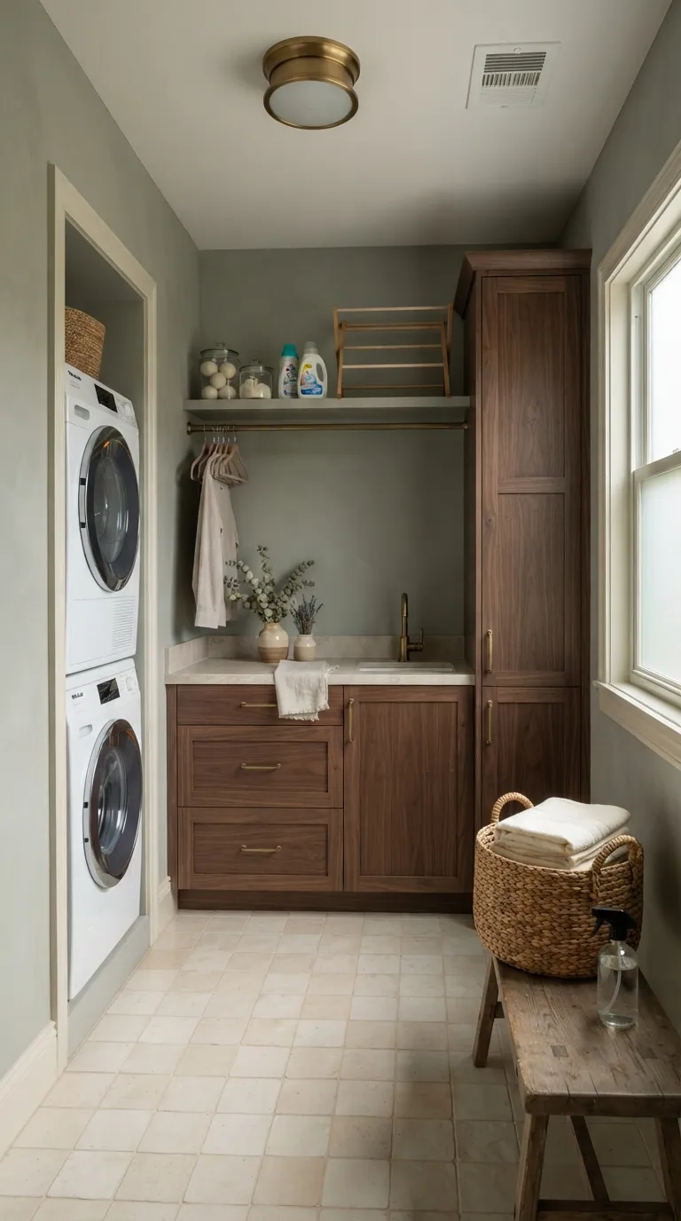
Muted sage green brings color into a laundry room while keeping the mood calm and easy on the eyes. Its gray-green base works especially well with natural wood, cream tile, brushed brass, and woven baskets, making it a strong option when you want more personality than plain white without a loud wall.
Consider sage for a room with decent natural light or warm bulbs. In a very dark laundry room, a deeper green can look heavier than expected, so a pale sage is often the better choice. Try the sample beside your cabinets and flooring, then check it in both daylight and evening light before painting all four walls.
Dusty Blue
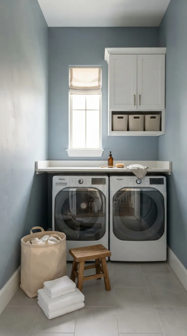
Dusty blue is a smart pick when you want a laundry room to feel fresh but still soft. The muted quality keeps the color from taking over, while the blue-gray base pairs neatly with white cabinets, light wood, gray tile, and brushed nickel hardware.
This shade can work especially well in rooms with moderate to strong daylight. If your laundry area sits under cool LED bulbs, test the paint first because blue undertones can appear sharper under cooler light. For a balanced look, pair dusty blue walls with warm textiles or light wood so the room doesn’t feel too chilly.
Pale Greige
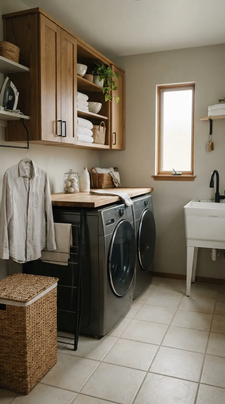
Pale greige sits between beige and gray, which makes it useful when you can’t decide between the two. It gives white appliances a softer setting while working naturally with oak, black hardware, cream tile, and neutral laundry baskets.
This color is especially useful when your laundry room connects to a hallway or mudroom. The gentle tone can help the spaces feel visually related without making every wall the same color. Sample greige beside your flooring because strong beige or gray undertones can become more noticeable against certain tile colors.
Soft Charcoal
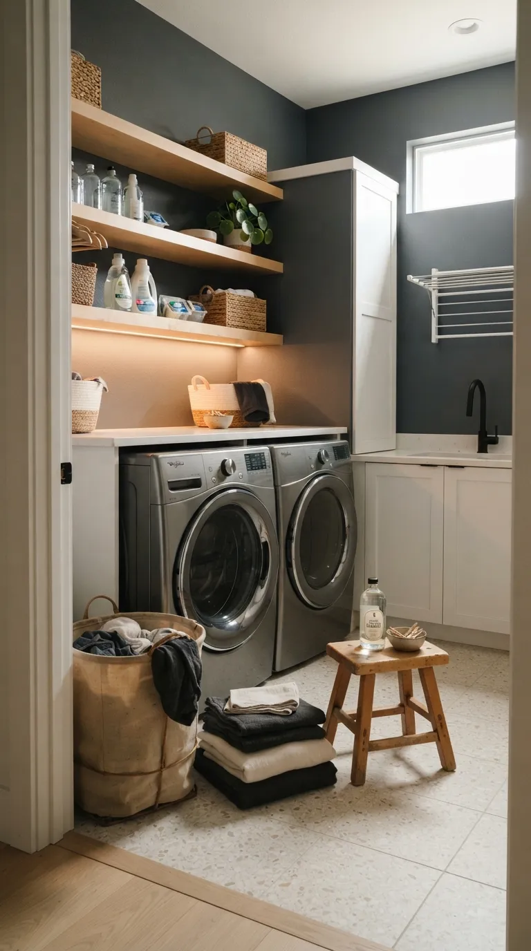
Soft charcoal can give a laundry room a richer, more grounded look. Instead of feeling plain and purely functional, the darker wall color creates contrast against white appliances, pale counters, light shelving, and metallic fixtures.
Use charcoal with care in a small room that receives very little daylight. Painting one feature wall can offer the darker look while keeping the rest of the room visually lighter. If you choose all-over charcoal, add plenty of pale surfaces and strong task lighting so the room stays practical for sorting and folding clothes.
Creamy Beige
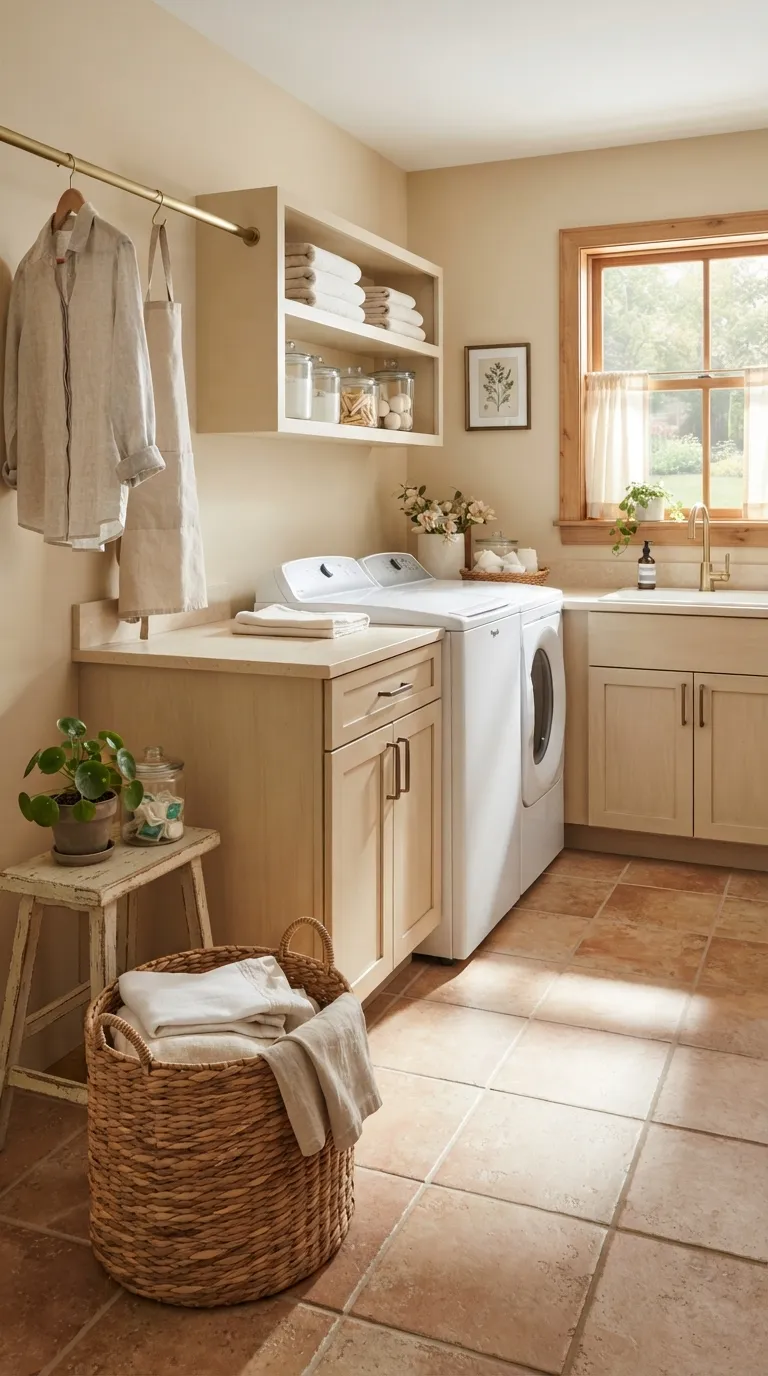
Creamy beige brings warmth to laundry rooms with lots of white, stainless steel, or pale cabinetry. It can make hard surfaces feel less stark and works naturally with rattan, linen, wood, bronze, and warm tile.
Choose this shade when you want a relaxed neutral that still has visible color on the walls. Be careful with strong yellow undertones, especially under warm bulbs, as they can make the room look more golden than planned. A sample placed beside your countertop and flooring will show whether the beige feels balanced in your space.
Powder Blue
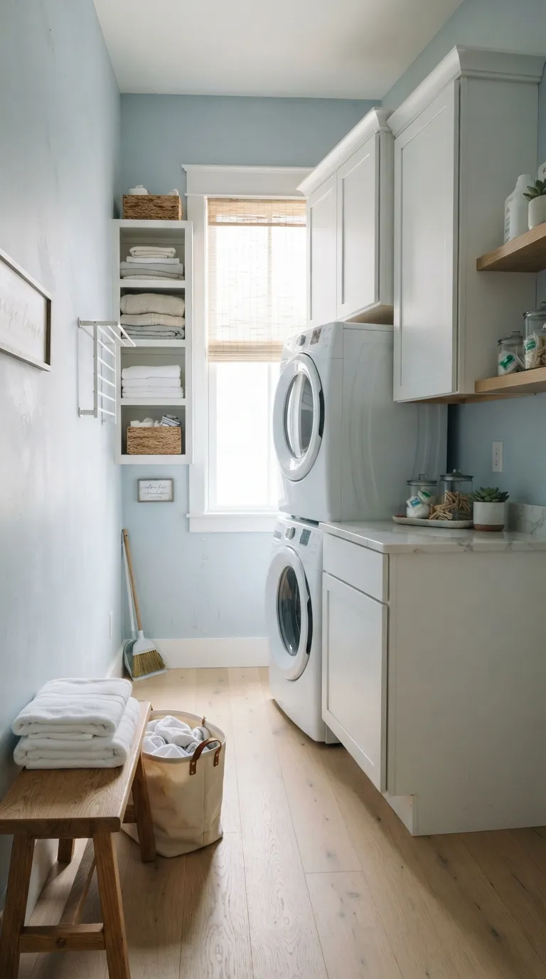
Powder blue keeps a laundry room light and relaxed without relying on plain white walls. The soft color looks especially natural beside white cabinets, pale oak, marble-look counters, and simple linen accessories.
It can be a good choice for a room that gets plenty of daylight but still needs a gentle wall color. If your space has cool gray flooring, choose a powder blue with some warmth so the overall room doesn’t feel icy. A painted sample viewed near the window can help you spot unwanted undertones.
Light Mushroom

Light mushroom offers more depth than a basic beige while staying easy to pair with practical laundry finishes. Its muted taupe character works nicely with oak, black hardware, creamy cabinets, stone counters, and natural-fiber storage.
This shade suits a laundry room where you want warmth without a distinctly yellow wall. It can also connect a utility space to nearby rooms decorated in earthy neutrals. Because mushroom shades vary widely, place your sample next to both the floor and countertop before making the final call.
Misty Gray
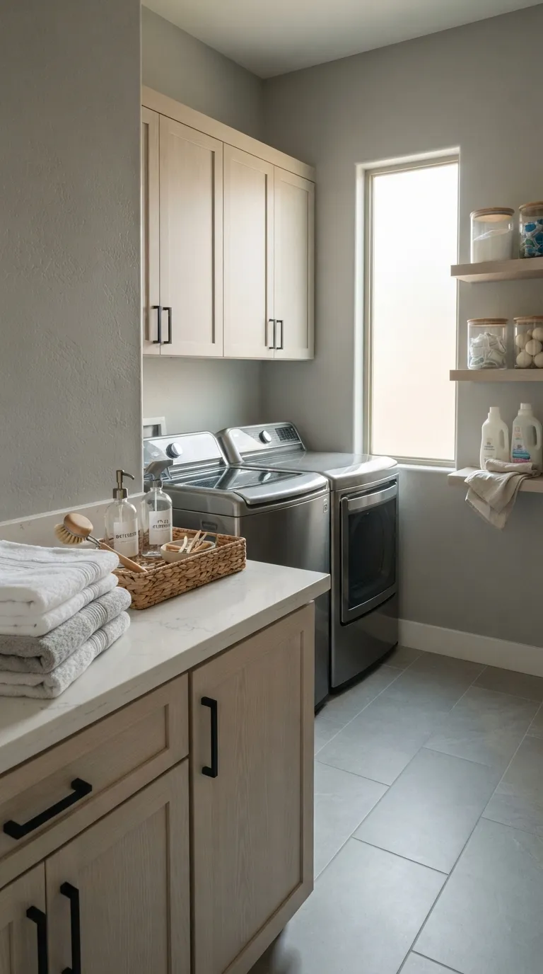
Misty gray gives a laundry room a clean look while adding more color than white. It pairs naturally with stainless steel, pale cabinetry, white quartz, chrome, and cool-toned tile, making it useful for a modern utility space.
Gray can change a lot depending on the light. A shade that looks soft in daylight may appear cooler beneath LED bulbs, so test it at different times before committing. If the room already has several cool surfaces, add warmer wood or woven accessories to keep the palette balanced.
Warm Greige
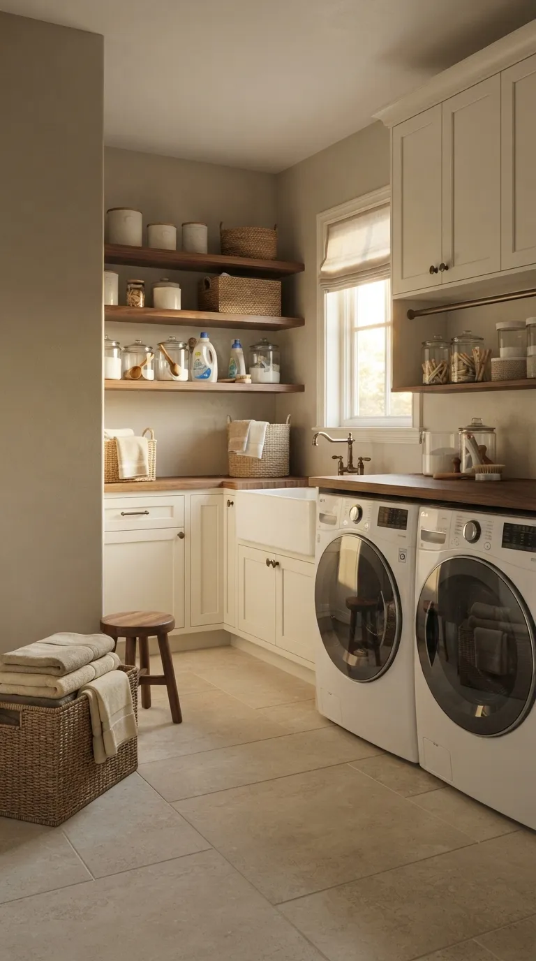
Warm greige gives you the flexibility of a neutral with a little extra warmth. It works particularly well when your laundry room has cream cabinetry, walnut shelves, bronze hardware, or beige flooring that might look disconnected beside a cooler gray.
This color also suits open laundry areas that share space with a mudroom or hallway. Keep the surrounding finishes in the same warm family for a calm visual flow. If your flooring already has strong yellow or orange tones, choose a less beige greige so the room doesn’t feel too warm.
Soft Lavender
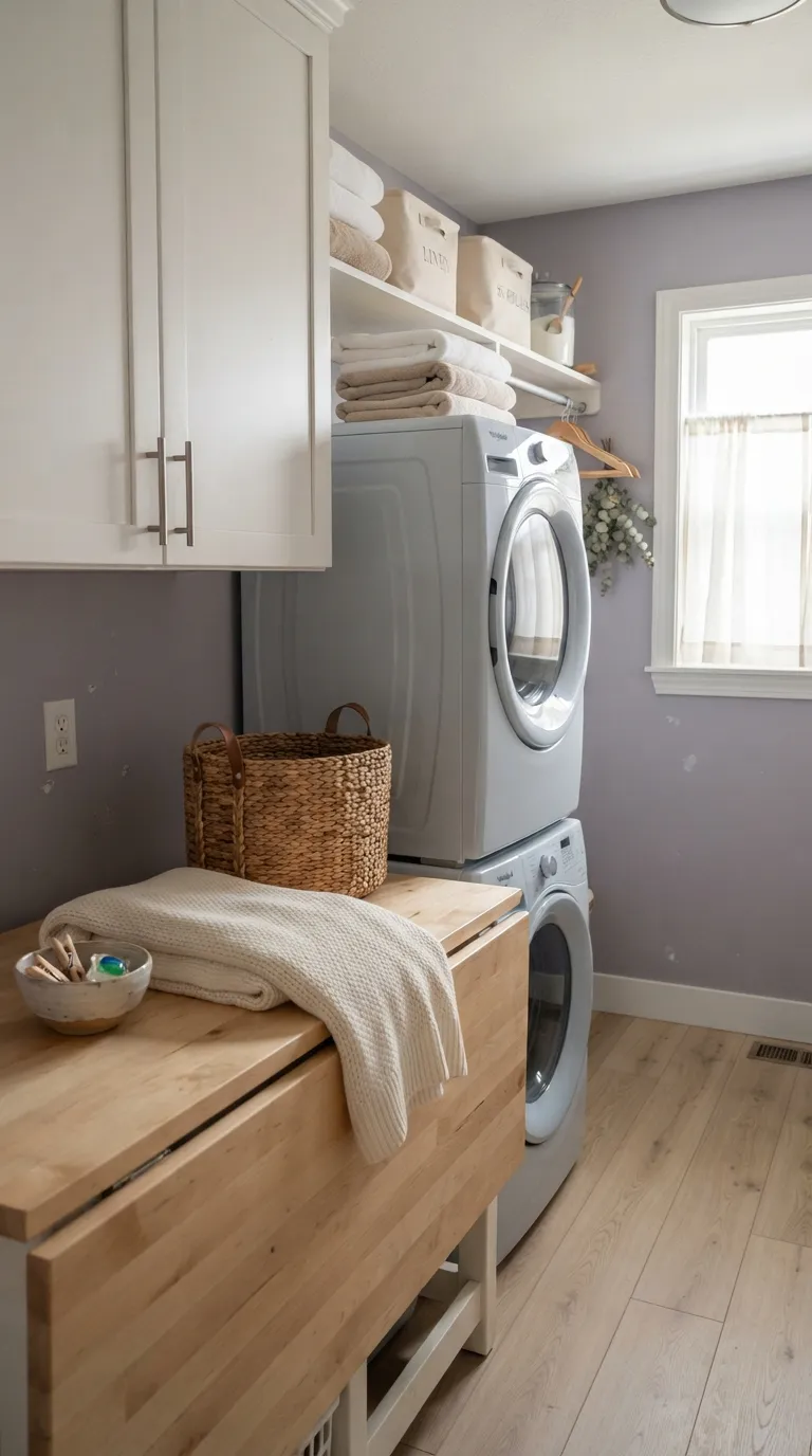
Soft lavender brings a gentle hint of color to a laundry room without competing with the appliances. A muted, gray-based lavender looks especially good with white cabinetry, light wood, brushed nickel, and ivory textiles.
The key is choosing a restrained shade rather than a saturated purple. In a compact laundry room, a dusty lavender can add character while keeping the walls visually soft. Check your sample beside the floor and cabinetry because lavender can look more pink, blue, or gray depending on nearby colors and natural light.
Pale Olive
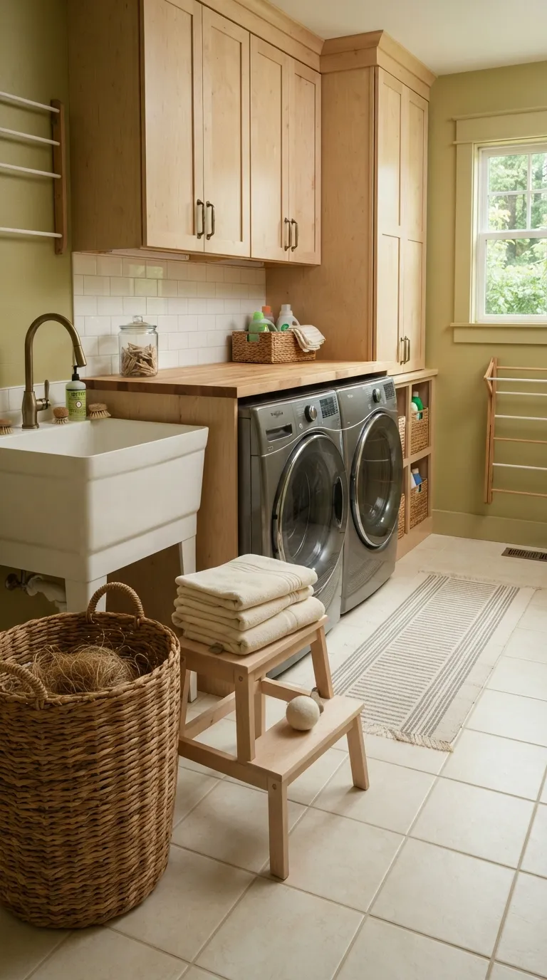
Pale olive is a good middle ground between neutral and green. Its earthy quality pairs naturally with birch, brass, cream tile, woven baskets, and other warm laundry room materials.
This shade can make a utility room feel connected to nature without turning it into a themed space. It works best when the green remains muted and the surrounding finishes stay simple. If your room receives strong afternoon sun, check the sample during that period because warm sunlight can make olive appear more yellow.
Clean Cool White
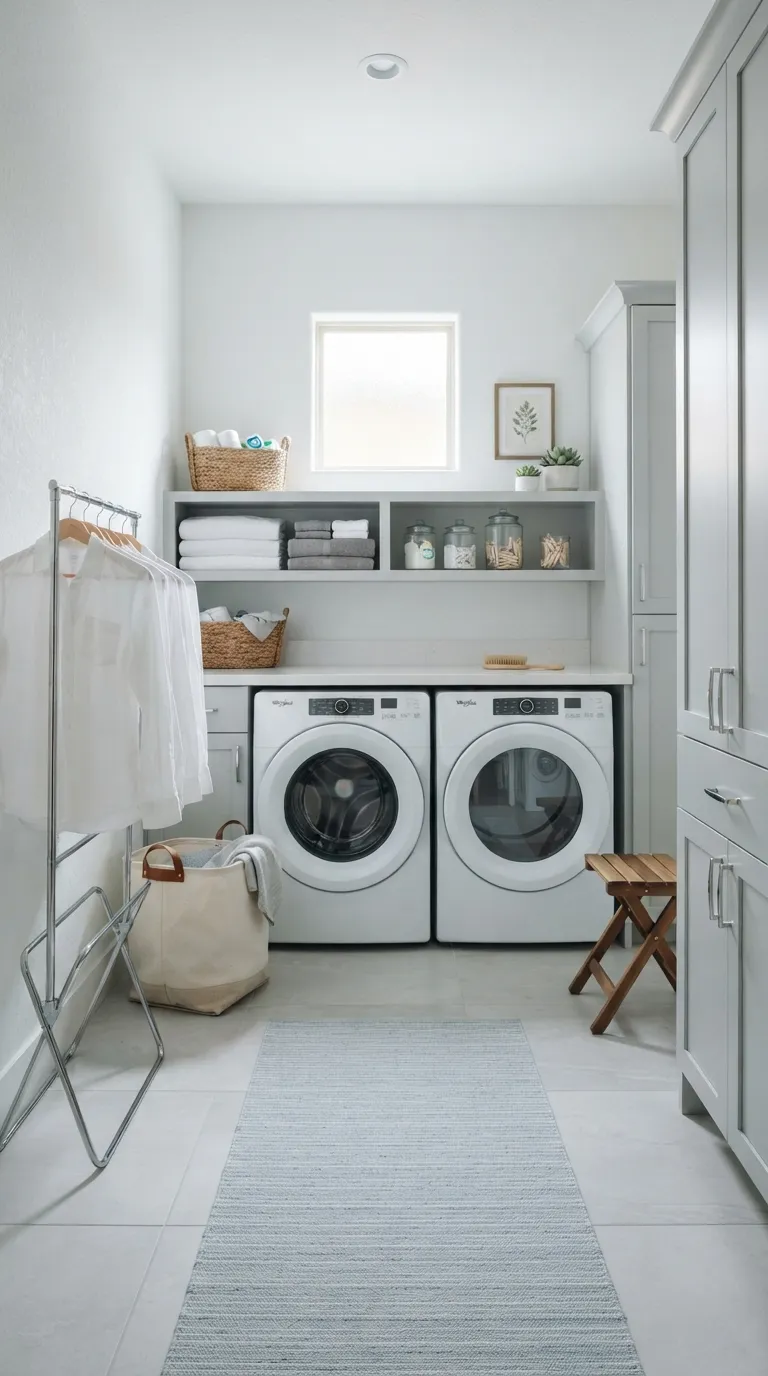
Clean cool white suits a laundry room with modern cabinets, gray flooring, chrome fixtures, and plenty of crisp surfaces. It keeps the space visually simple and can make a compact utility area feel open rather than crowded.
The main detail to watch is the room’s existing temperature. If your flooring and cabinetry already lean cool, this white may make the space feel stark. Add warmer wood, natural baskets, or soft ivory textiles if you want the room to feel more balanced.
Muted Navy
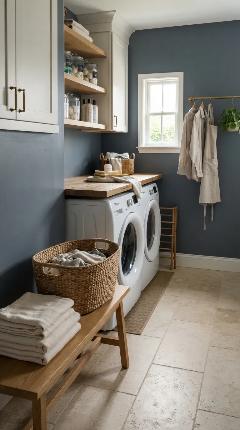
Muted navy gives a laundry room a strong backdrop without the intensity of a brighter blue. It looks especially polished beside warm white cabinetry, pale oak, cream flooring, brass hardware, and white appliances.
Dark colors need enough visual balance to work well in smaller rooms. If you love navy but have limited daylight, consider using it on the appliance wall while keeping the remaining walls lighter. A large paint sample can also show whether the blue reads closer to navy, slate, or charcoal in your particular lighting.
Blush Beige
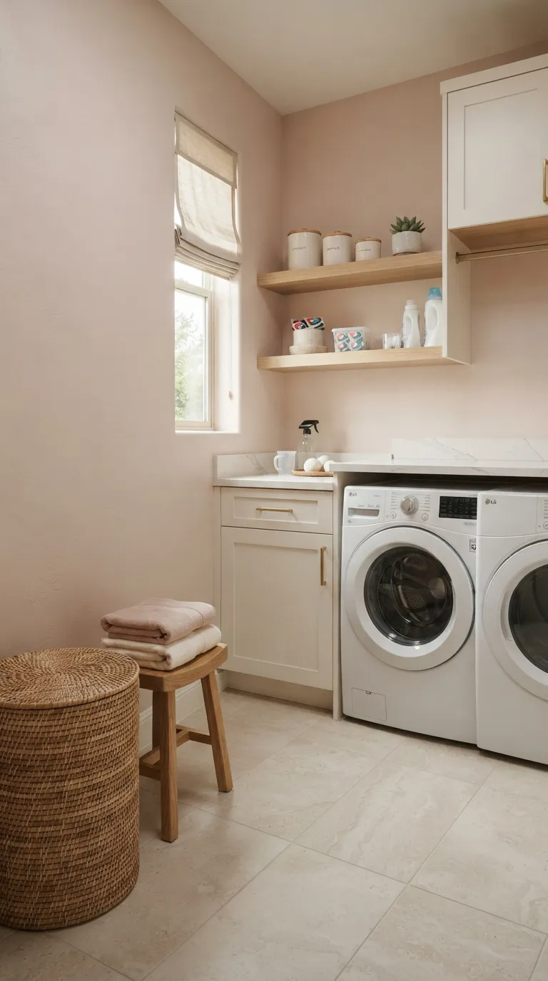
Blush beige adds a quiet hint of pink while still behaving like a neutral. It works well with warm white cabinets, light wood, brass, ivory fabrics, and stone surfaces when you want a laundry room with a softer personality.
Keep the pink undertone subtle if the room needs to coordinate with nearby spaces. Too much pink can become harder to pair with cool gray flooring or blue-based cabinets. Test the shade next to your fixed finishes and check it in daylight before deciding whether it belongs on every wall.
Soft Terracotta
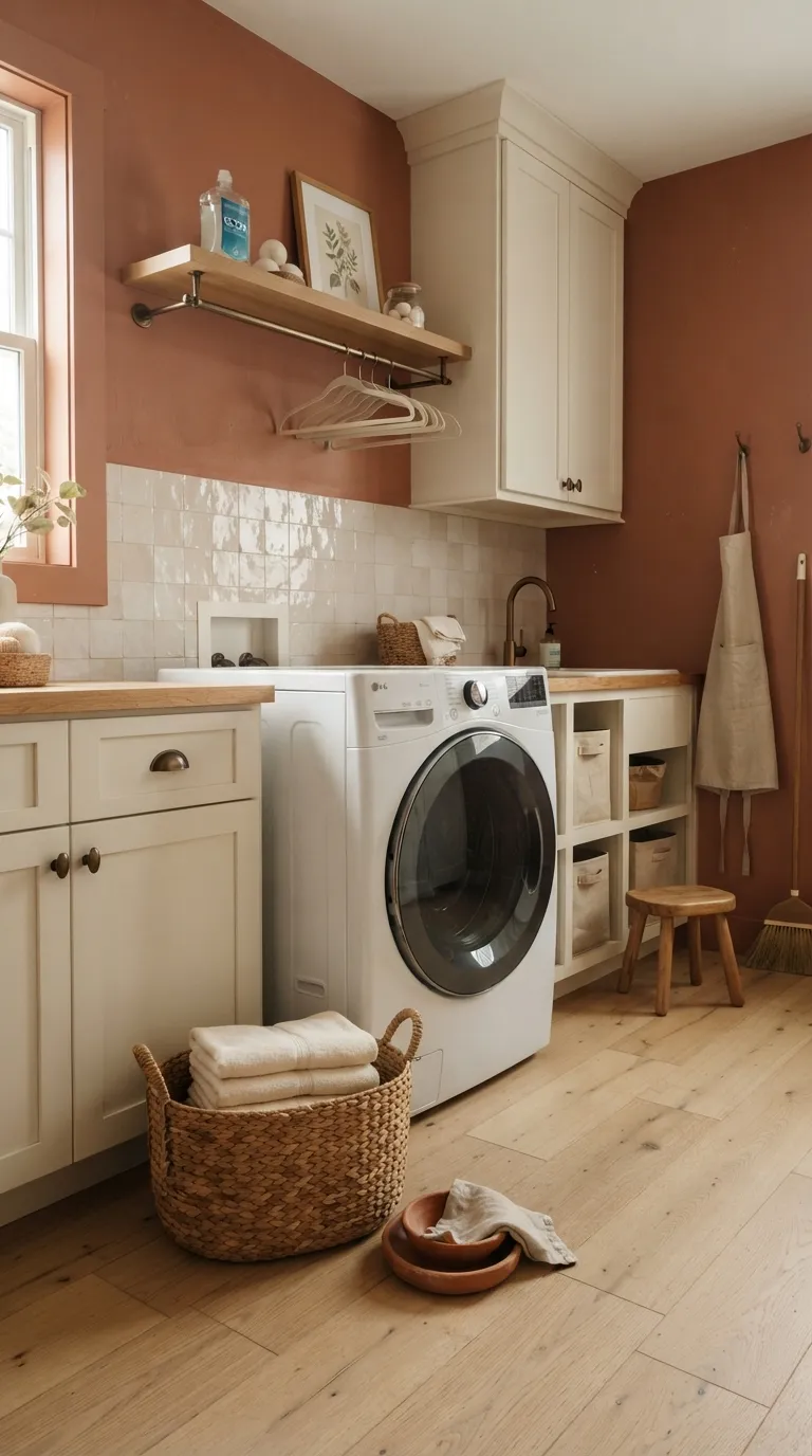
Soft terracotta brings earthy warmth to a laundry room without relying on a traditional beige palette. The muted orange-pink tone pairs beautifully with cream, oak, ivory tile, bronze hardware, and natural woven storage.
This color works best when the rest of the room stays fairly simple. Too many warm shades can make a compact utility room feel busy, so let the wall provide most of the color and keep accessories quiet. In a room with limited daylight, test the paint carefully because low light can make terracotta appear deeper.
Pale Mint
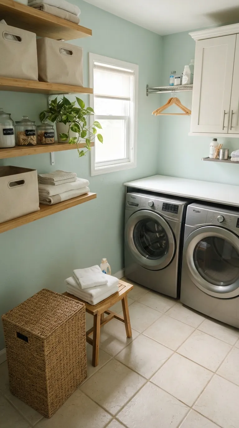
Pale mint gives you a gentle color that feels lighter than many traditional greens. It pairs nicely with white cabinets, bamboo, cream tile, stainless steel, and simple woven storage, making it a useful option for a bright utility space.
Choose a muted mint if you want the room to feel grown-up and easy to style. Very saturated mint can compete with colorful flooring or patterned fabrics, while a pale version leaves more room for practical accessories. Check the paint under both daylight and your regular laundry-room bulbs before covering the walls.
Deep Forest Green
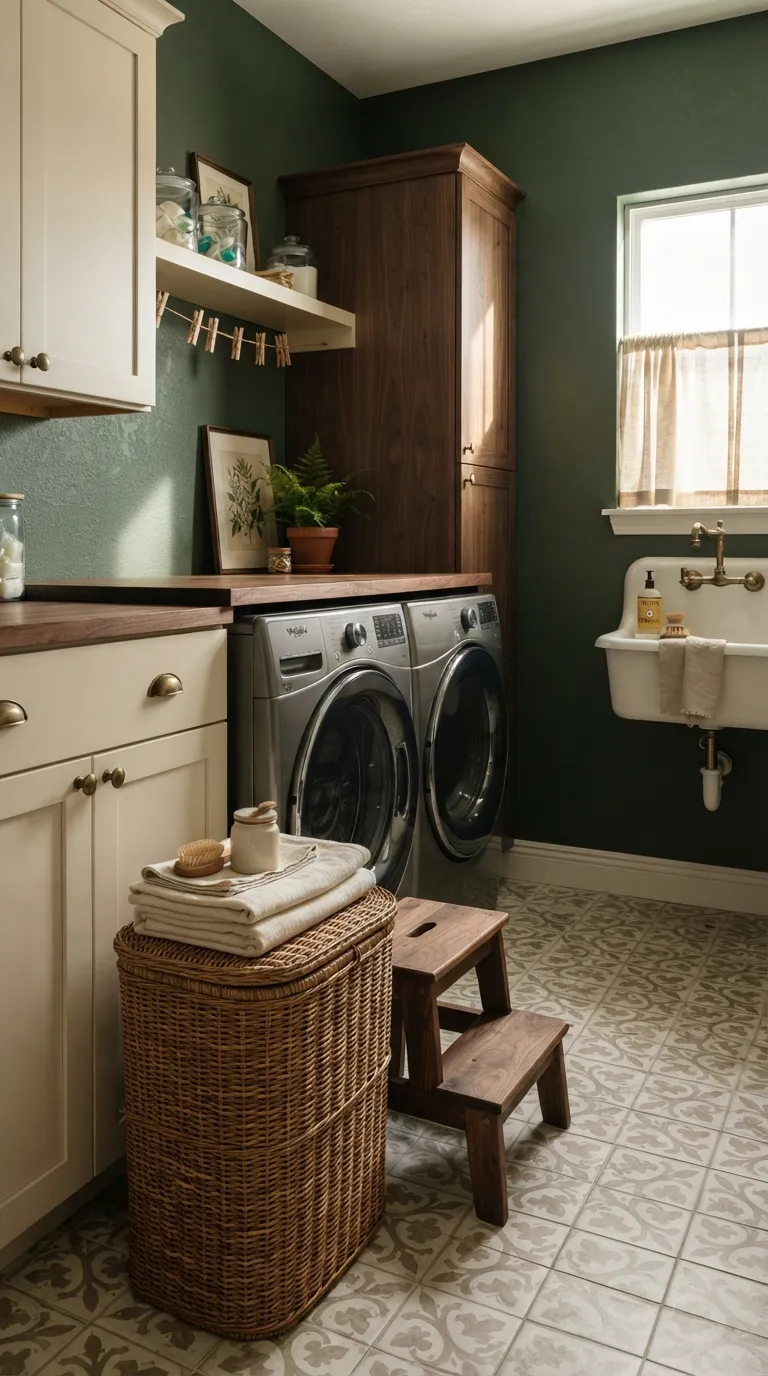
Deep forest green creates a cozy, tailored look for a laundry room with enough light and strong contrast. It looks especially good with ivory cabinets, walnut, brass, cream tile, and natural wicker.
Because this is a dark shade, room size and lighting matter more than they do with pale colors. A small laundry room can still use forest green, but pairing it with light cabinetry and a pale floor helps keep the space from feeling closed in. If you’re unsure about painting every wall, start with the wall behind the appliances for a focused color moment.
Warm Taupe
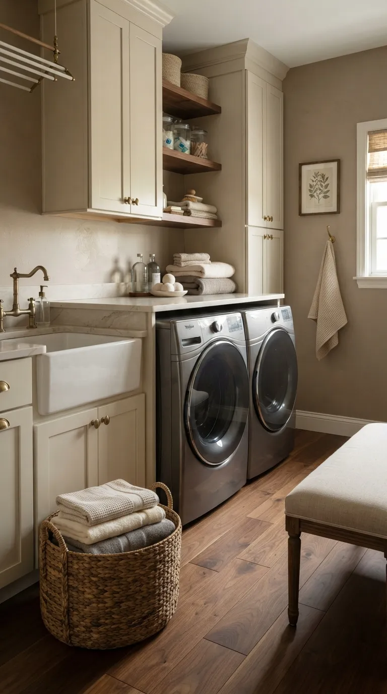
Warm taupe gives a laundry room a cozy neutral backdrop with more depth than plain beige. It works well beside cream cabinets, walnut, brass, white appliances, and natural linen accessories.
This color can suit a utility room that connects to warmer living spaces. If your room has dark flooring, choose a lighter taupe so the surfaces don’t visually blend together. Sample the paint near the ceiling and floor as well, since surrounding finishes can make the same taupe look lighter or deeper.
Soft Peach
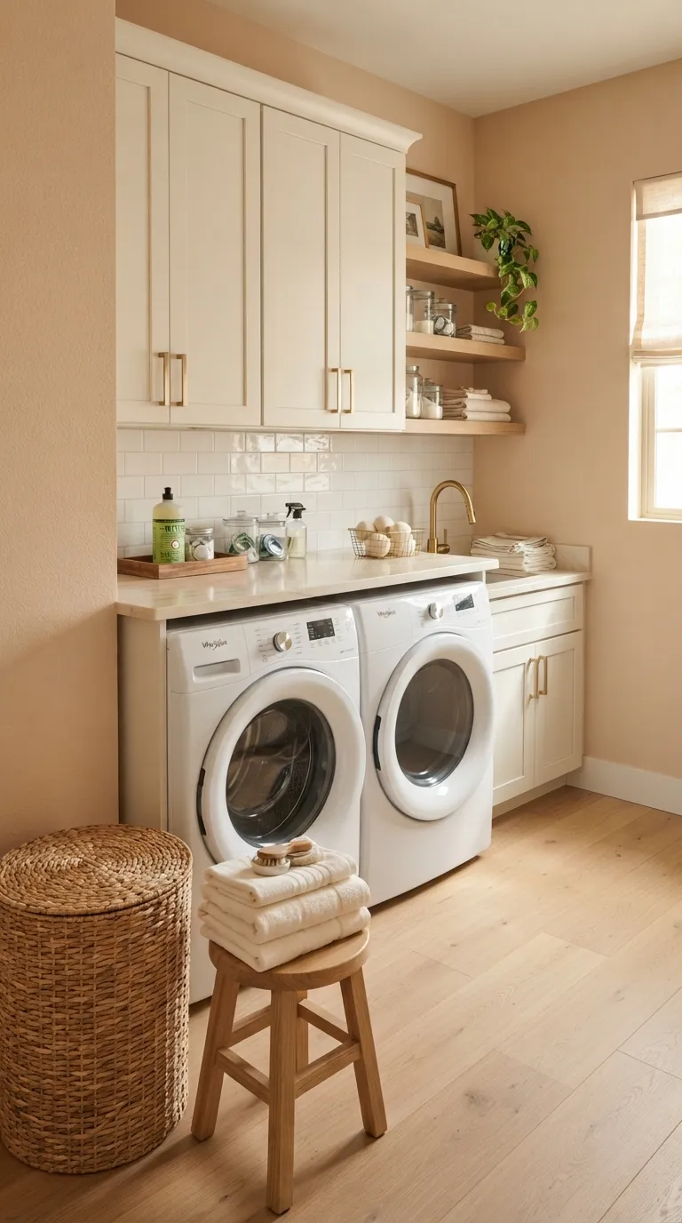
Soft peach adds warmth without making the laundry room feel heavily colored. A muted version pairs naturally with ivory, pale oak, rattan, cream stone, and brass, giving the utility space a gentle residential feel.
Use peach when you want a little color but prefer warm tones over blue or green. Keep the surrounding accessories simple so the wall remains the main accent. If your room has strong orange-toned flooring, compare several peach samples because some shades may pull too warm.
Light Sand
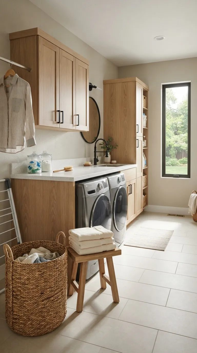
Light sand is a dependable choice when you want a warm neutral that doesn’t feel too beige. It pairs with white oak, black hardware, ivory tile, stainless steel, and white counters, making it easy to build a cohesive laundry room palette.
It’s also useful when the laundry room sits near other neutral rooms. Keep the wall color slightly lighter than your cabinetry if you want the storage to stand out. Before painting, place a sample beside your largest surfaces and check it in morning, afternoon, and artificial light.
A Fresh Color Plan for Laundry Day
Choosing among the best paint colors for laundry rooms gets easier when you start with the finishes you already have. Look at your cabinets, flooring, counters, appliances, and the amount of daylight before settling on a shade, then test a few large samples rather than judging tiny color chips.
For a bright room, soft white, dusty blue, pale mint, or sage can keep things light. For a warmer look, try creamy beige, taupe, sand, or greige, while charcoal, navy, and forest green can create stronger contrast. Pick the color that makes your utility space feel like a natural part of your home, then pair it with practical storage and finishes that you’ll enjoy seeing every day.
Clara Whitmore
Clara specializes in interior styling, seasonal home trends, and cozy living spaces. She loves combining classic design elements with modern touches to create homes that feel personal, welcoming, and effortlessly stylish.