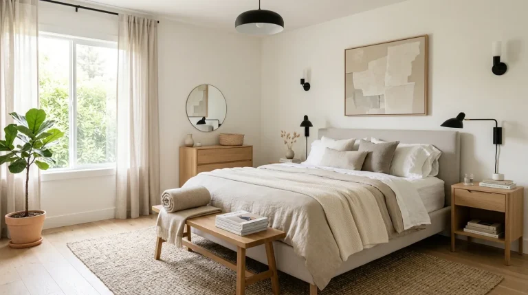
Bedroom Color Palette That Instantly Makes Your Room Feel Luxurious

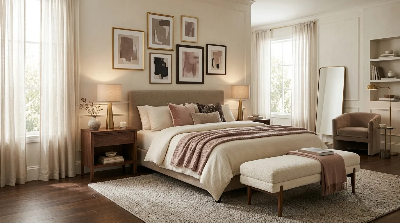
A beautiful bedroom often starts with the colors you see first. The right bedroom color palette can make a space feel calm, polished, and thoughtfully styled without filling it with expensive furniture. Soft neutrals, warm earth tones, muted pinks, rich browns, and carefully chosen accents can work together like a well-tailored outfit.
The trick is balance. Instead of picking several pretty shades at random, choose a main color, a supporting tone, and one deeper accent that gives the room visual weight. These bedroom color combinations can guide everything from wall paint and bedding to curtains, rugs, lamps, and small decorative pieces.
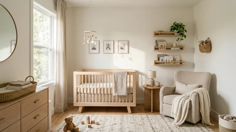
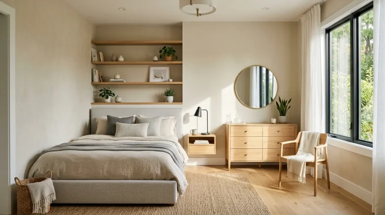
Warm Ivory Layers
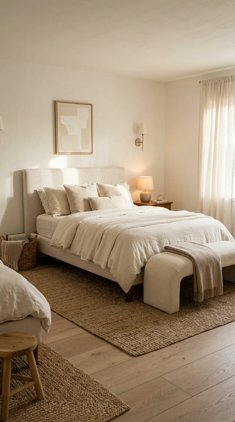
Warm ivory works when you want luxury without a cold, overly formal look. Pair creamy walls with slightly darker linen, pale wood, and soft beige so the room has enough contrast to keep every surface from blending together.
This bedroom color palette also gives you room to play with texture. Think washed linen, boucle, woven baskets, ribbed ceramics, and a nubby rug. When the colors stay close, texture becomes the detail that keeps the space from feeling flat.
Dusty Rose Contrast
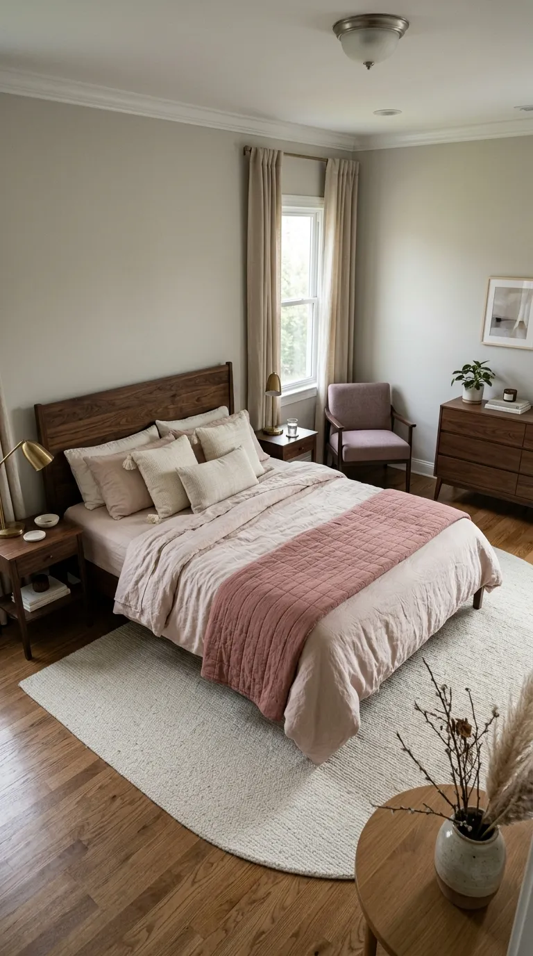
Dusty rose brings softness without making the room feel overly sweet. Keep the pink muted rather than bright, then ground it with greige walls, walnut furniture, or warm brown accents for a more grown-up bedroom.
Try using rose on the bedding or one upholstered piece instead of covering every surface. A small amount can create a focal point, while ivory sheets and neutral curtains give your eye a quiet place to rest.
Deep Brown Anchors
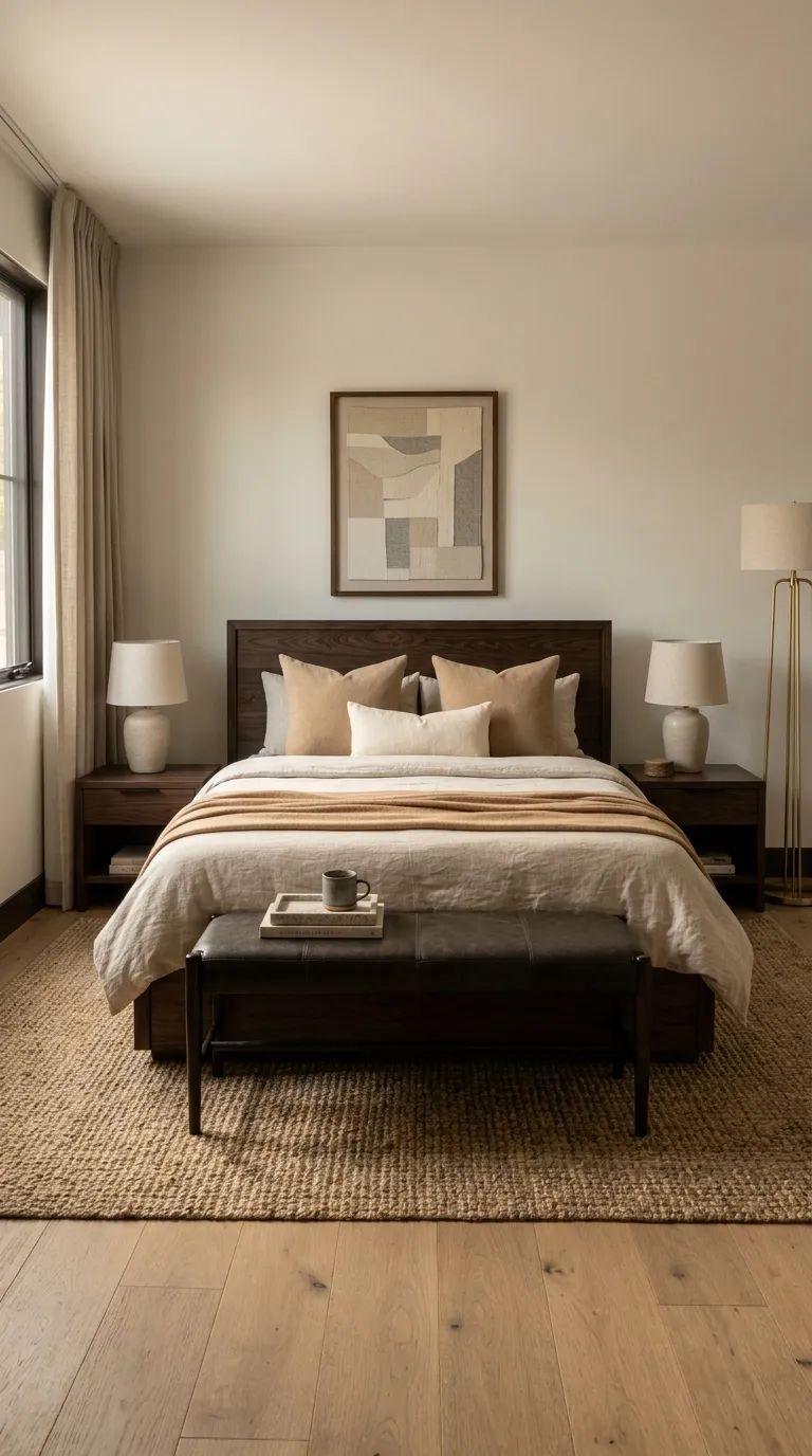
Deep brown gives a bedroom a grounded, intimate feel. It works especially well when the rest of the room uses lighter shades such as oatmeal, mushroom, cream, or soft tan. The contrast makes the furniture feel intentional rather than heavy.
Use brown in larger pieces when the room gets plenty of daylight. A dark wood bed, nightstand, or bench can anchor the space, while lighter bedding prevents the color from taking over. For smaller bedrooms, keep the deeper shade closer to the floor and use lighter walls above it.
Soft Greige Balance
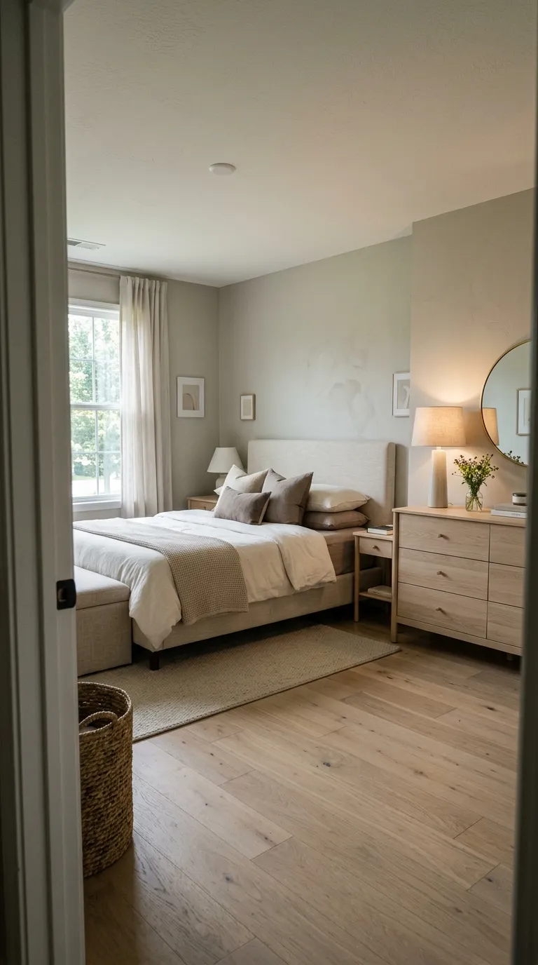
Greige sits between gray and beige, making it useful when you want a neutral bedroom with some warmth. It pairs easily with cream bedding, pale oak, taupe textiles, and brushed metal accents.
Watch the undertone before painting. A greige with a warm base can look cozy beside natural wood, while a cooler version may suit a room with charcoal or soft black details.
Moody Navy Tones
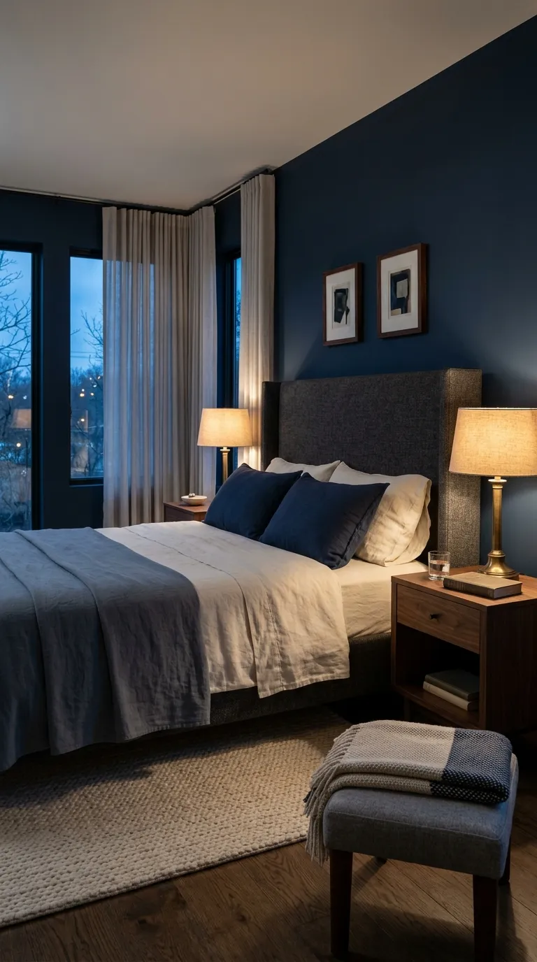
Navy can make a bedroom feel quiet and intimate, especially when paired with warm neutrals. Ivory bedding keeps the darker wall color from making the room feel too closed in.
For a polished result, repeat navy in two or three places instead of using it everywhere. A navy wall, coverlet, and small artwork detail can create a clear color thread without making the room look overly matched.
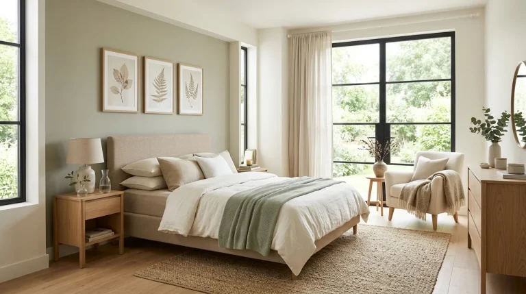
Sage Green Calm
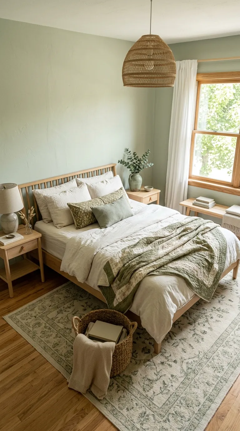
Sage green brings a soft nature-inspired note to the bedroom. It looks especially good beside ivory, warm white, natural oak, and muted olive because those shades keep the room grounded.
If you’re choosing sage paint, test a sample beside your flooring and curtains first. Green can look different throughout the day, so checking it in morning and evening light can prevent an unwanted color surprise.
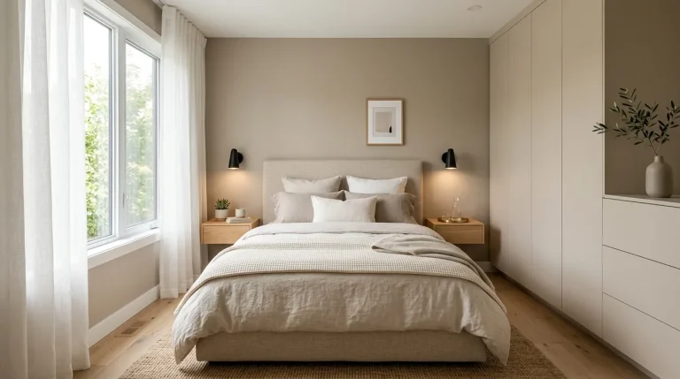
Warm Taupe Retreat
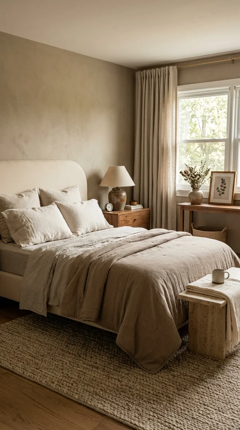
Warm taupe creates a cozy backdrop while still looking polished. It works well with walnut, cream, oatmeal, stone, and soft brass, giving you plenty of options for furniture and bedding.
For a balanced room, keep the walls and larger furniture within the same warm family. Then add contrast through darker wood, a textured rug, or a single deeper accent pillow.
Cream And Charcoal
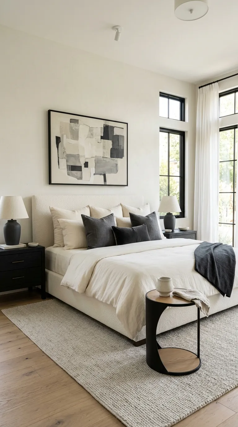
Cream and charcoal create a crisp bedroom color palette with plenty of visual contrast. Cream keeps the space soft, while charcoal gives the lighter surfaces a defined edge.
This pairing works best when charcoal appears in small but noticeable doses. Try a dark throw, framed artwork, lamp base, or accent chair rather than covering an entire wall in the deeper shade.
Terracotta And Sand
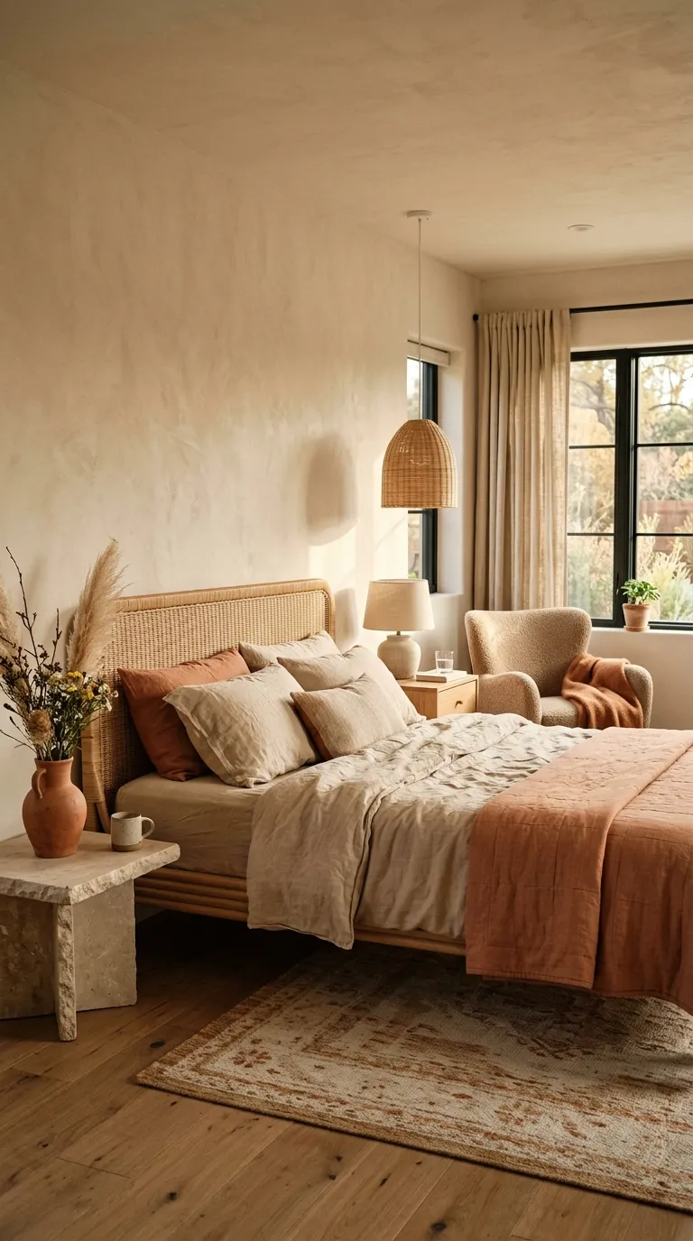
Terracotta adds warmth without requiring a bright red or orange wall. Pair a muted clay shade with sandy beige, cream, light wood, and natural woven materials for a relaxed look.
Keep the terracotta focused on one or two visible areas. Bedding, a ceramic lamp, artwork, or a small accent chair can provide enough color to make the room feel warm without becoming too busy.
Muted Blue And Cream
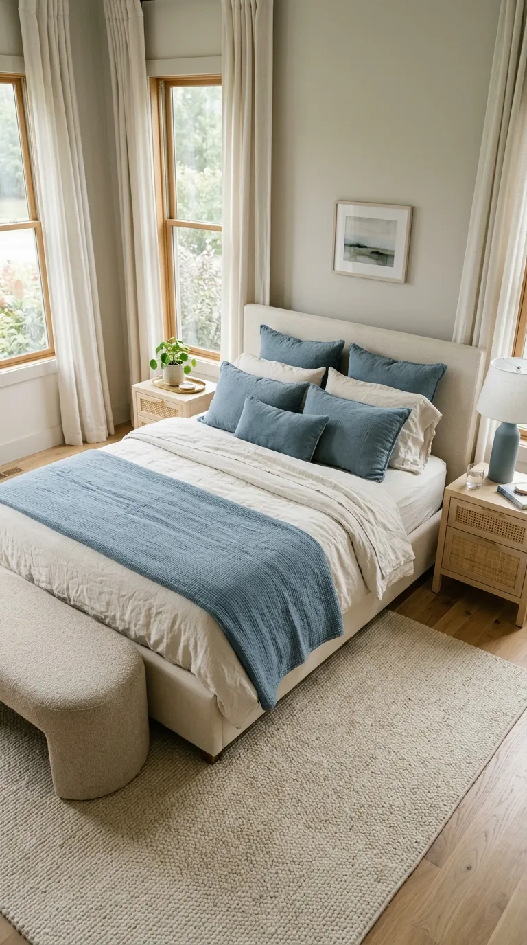
Muted blue gives a bedroom a calm, tailored look without the sharpness of brighter navy. Cream bedding softens the cooler shade and keeps the space welcoming rather than stark.
For a richer result, add one warm material such as oak, cane, or brass. This small contrast helps a cool bedroom color palette feel more balanced and lived-in.
Olive And Oatmeal
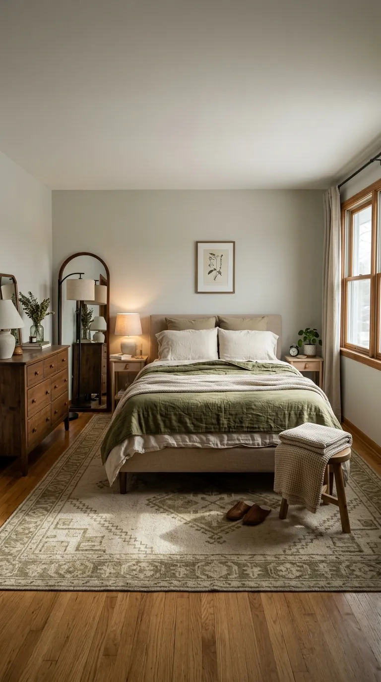
Olive feels earthy and collected when you pair it with oatmeal, cream, and warm wood. The muted green gives the room color while the neutral layers keep the overall look restful.
Use olive where you want the eye to land. A quilt, upholstered chair, or painted accent wall can carry the shade, while the remaining pieces stay within soft neutral tones.
Black And Warm White
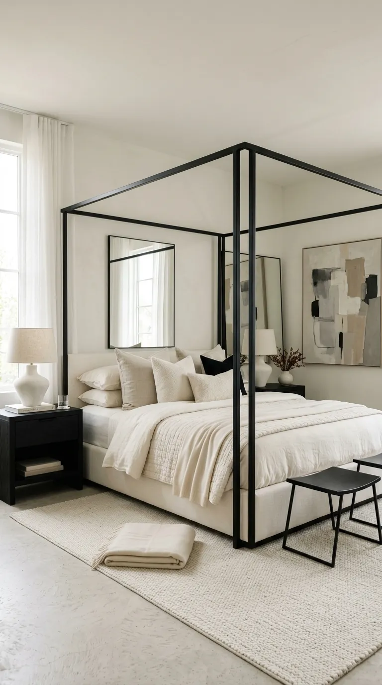
Black and warm white can create a clean bedroom with strong visual definition. The key is using warm white instead of a blue-toned white, especially when the room includes wood, linen, or brass.
Keep black limited to clear structural details. Bed frames, picture frames, lighting, and small tables can provide enough contrast without making the room feel heavy.
Blush And Mocha
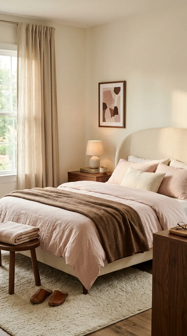
Blush and mocha make a soft pairing with enough depth to feel sophisticated. The pink brings gentle warmth, while the brown keeps the room grounded.
Try blush in textiles rather than permanent finishes if you like to refresh your bedroom often. A quilt, pillow covers, or upholstered bench can introduce the color without committing to a painted wall.
Stone And Espresso
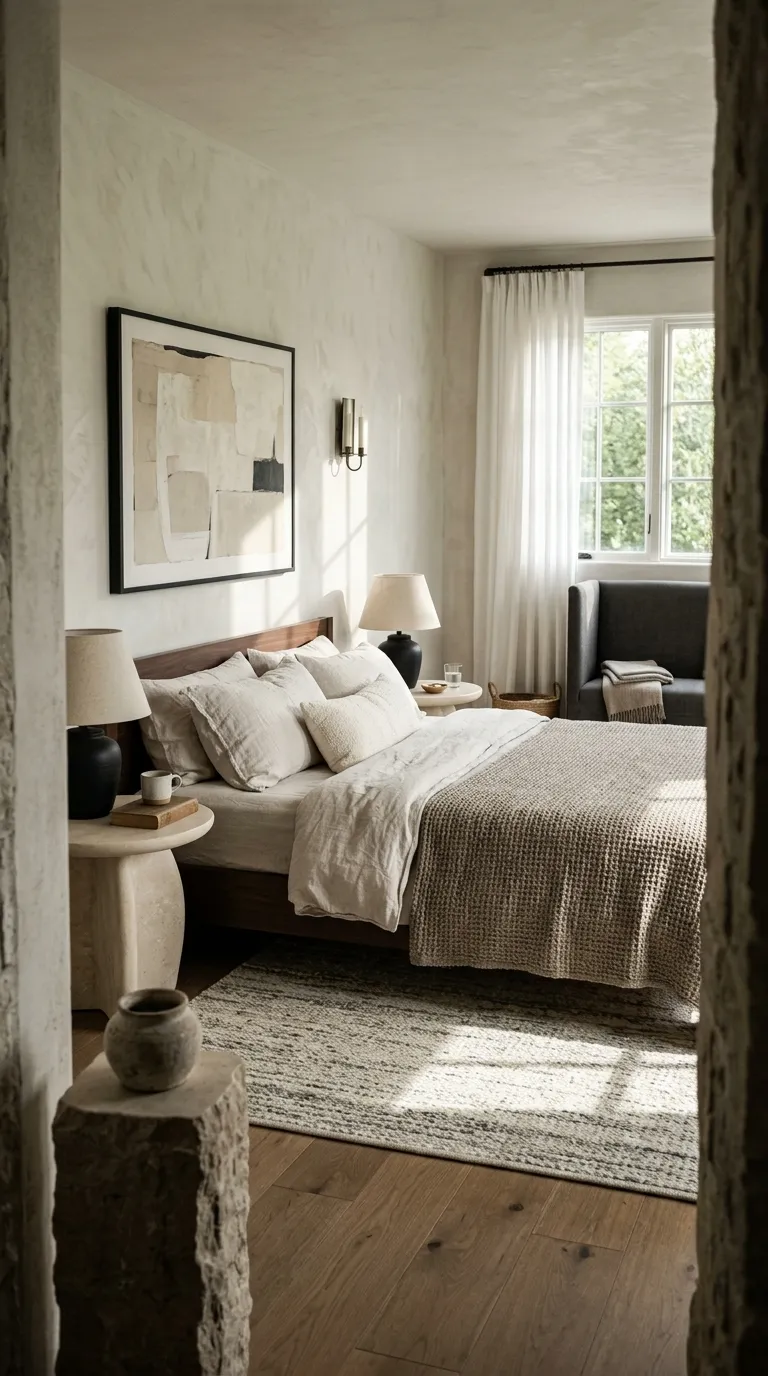
Stone shades work well when you want a neutral room that feels more layered than plain beige. Add espresso wood for contrast, then soften the mix with linen, wool, and light upholstery.
This pairing suits bedrooms with natural materials. If the room already has oak flooring or stone details, repeating those tones in smaller pieces can make the space feel connected without looking overly coordinated.
Soft Lavender Gray
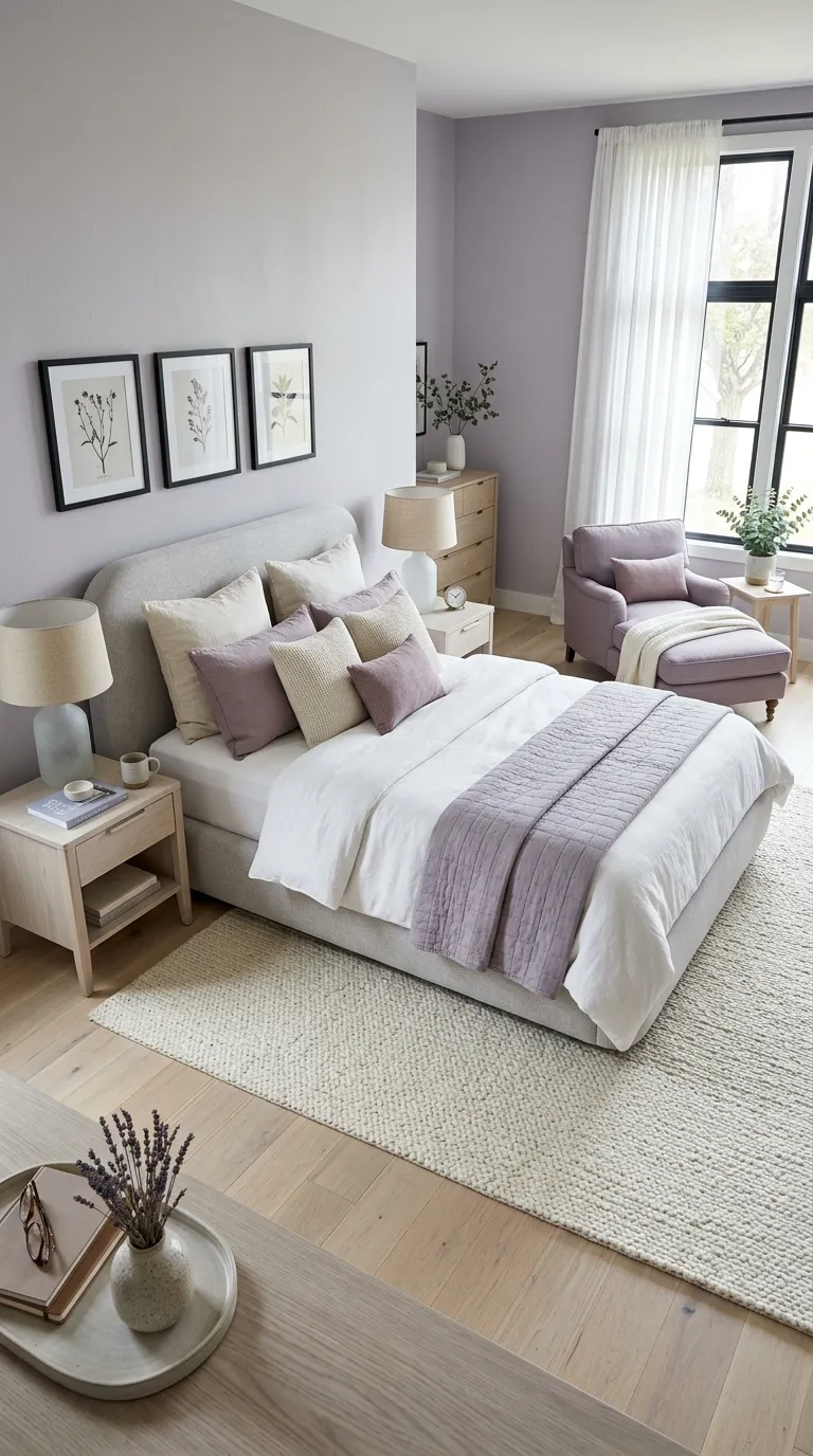
Lavender gray gives a bedroom a quiet hint of color without feeling bright or childish. It pairs naturally with soft white, cream, pale wood, and muted mauve.
Use this shade carefully if your room gets little daylight. A sample board can help you see whether the purple undertone stays soft or becomes more noticeable once the room’s lighting changes.
Cocoa And Linen
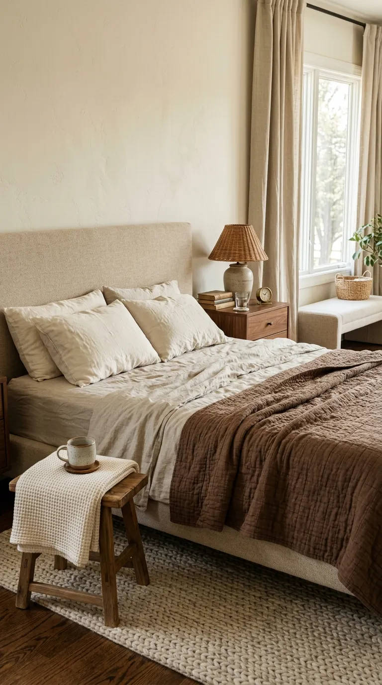
Cocoa brown adds warmth without the heaviness of near-black furniture. Natural linen keeps the darker shade soft, making this combination a good fit for bedrooms that need a cozy but polished mood.
Let the brown appear in one major textile and a few smaller details. A cocoa quilt, wooden furniture, and a ceramic accent can create enough depth while cream bedding keeps the room visually light.
Sandstone Neutrals
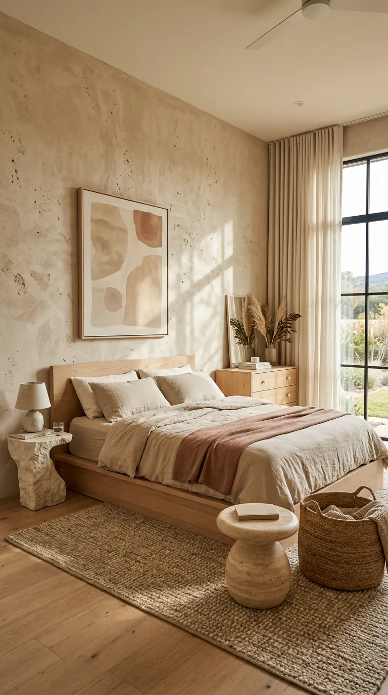
Sandstone-inspired shades create a warm neutral room without relying on plain beige. Mix sandy tan, cream, pale clay, and natural wood for a relaxed palette with enough tonal variety.
This look benefits from imperfect materials. Handwoven rugs, lightly textured plaster, stone accessories, and natural wood add character while keeping the colors quiet and connected.
Forest Green And Cream
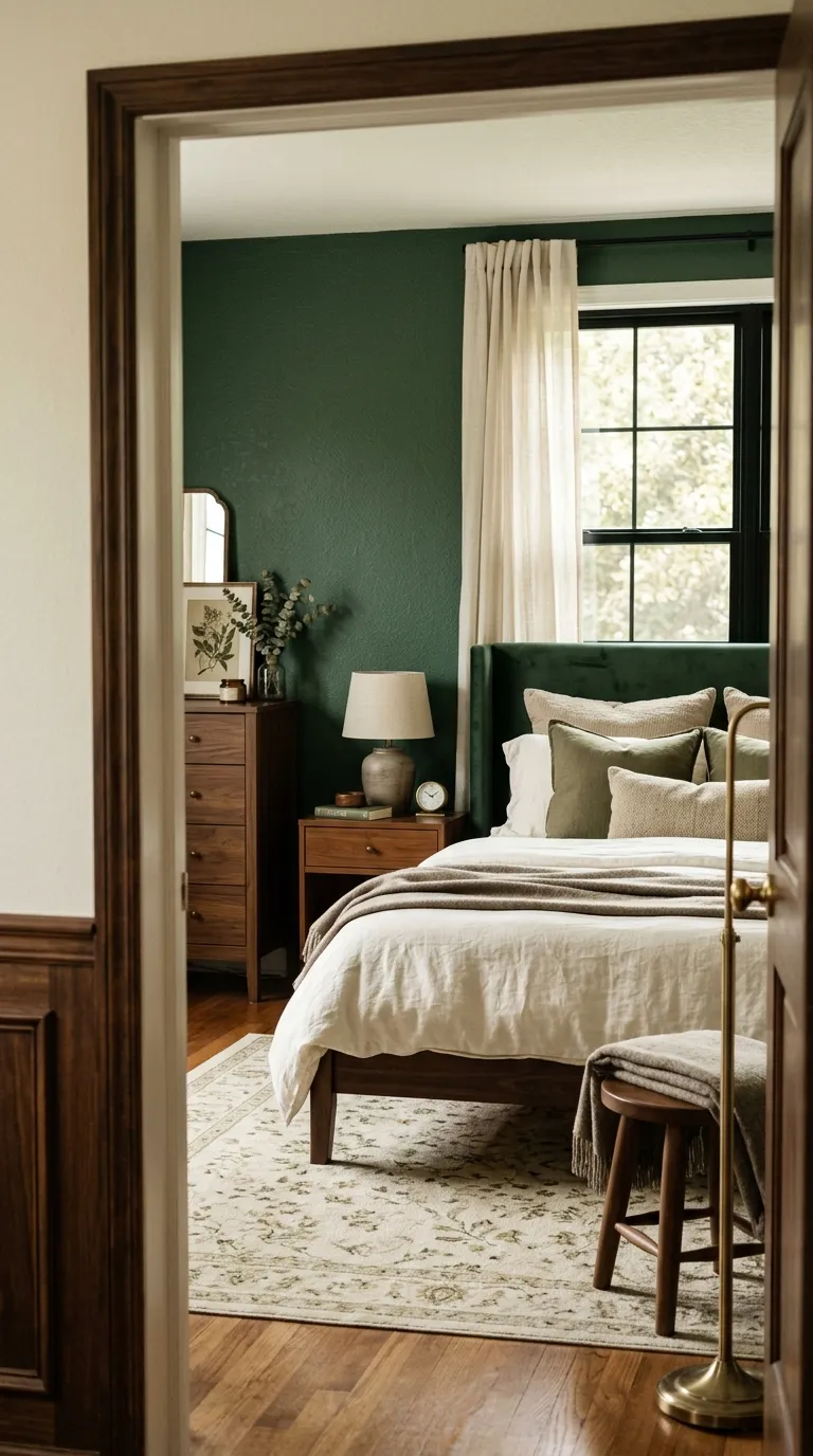
Forest green creates a rich backdrop that works especially well in bedrooms with good natural light. Cream bedding keeps the darker wall from making the room feel too enclosed.
Add warm wood rather than cool gray furniture when possible. Walnut, oak, or teak can soften the green and give the room a more natural visual connection.
Caramel And Ivory
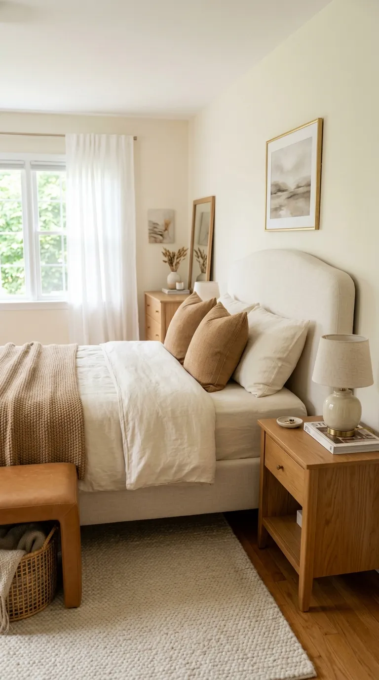
Caramel brings warmth to an ivory bedroom without making the room feel dark. It works especially well with honey-toned wood, cream textiles, soft beige walls, and small brass details.
Use caramel as a supporting shade rather than the main wall color. A leather stool, throw, accent pillow, or upholstered bench can add just enough richness while keeping the larger surfaces light.
Clay Pink And Beige
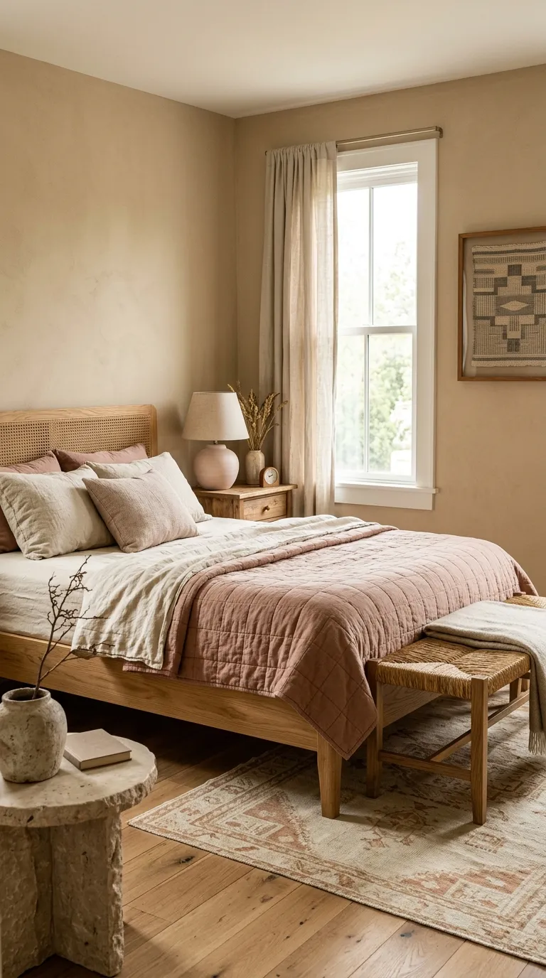
Clay pink feels warmer and more grounded than a clear pastel pink. Pairing it with beige and natural oak keeps the bedroom soft while giving the color a more mature feel.
This combination works nicely in rooms with warm flooring. If the floor already has golden or reddish undertones, repeat a small amount of that warmth in the bedding or accessories so the colors feel connected.
If you’re curious about this, Fall Bedroom Ideas is worth reading.
Slate Blue And Taupe
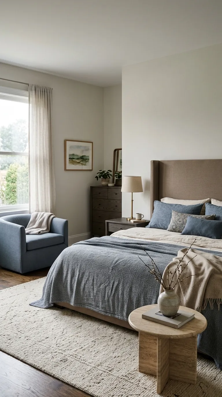
Slate blue gives taupe a cooler counterpoint while keeping the room calm. The pairing works well when you want color without the stronger contrast created by navy or black.
Keep the taupe on larger surfaces and use slate blue for bedding, an accent chair, or artwork. This simple balance lets the blue stand out while the neutral foundation keeps the bedroom restful.
Mushroom And Cream
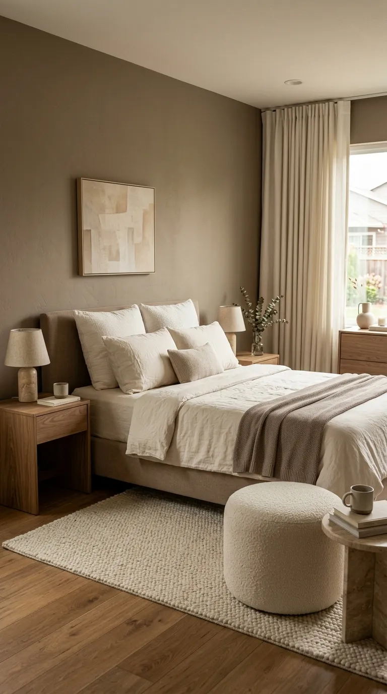
Mushroom sits between beige, gray, and brown, giving you a neutral shade with more depth than basic cream. It pairs naturally with ivory, walnut, travertine, and warm taupe for a layered bedroom that feels settled and refined.
Keep the tones close but not identical. A slightly lighter ceiling, cream bedding, and deeper mushroom upholstery can create subtle contrast without breaking the calm mood.
Rust And Warm White
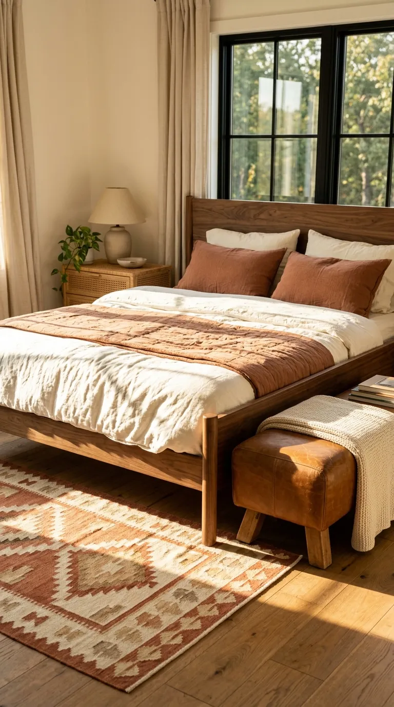
Rust brings a grounded warmth that works beautifully with warm white and natural wood. Because rust has an earthy base, it feels richer when used with walnut, leather, woven fibers, and muted tan.
Use rust as a focal accent rather than a full-room color. A quilt or upholstered bench can carry the shade, while warm-white walls and bedding give the eye enough breathing room.
Greige And Soft Black
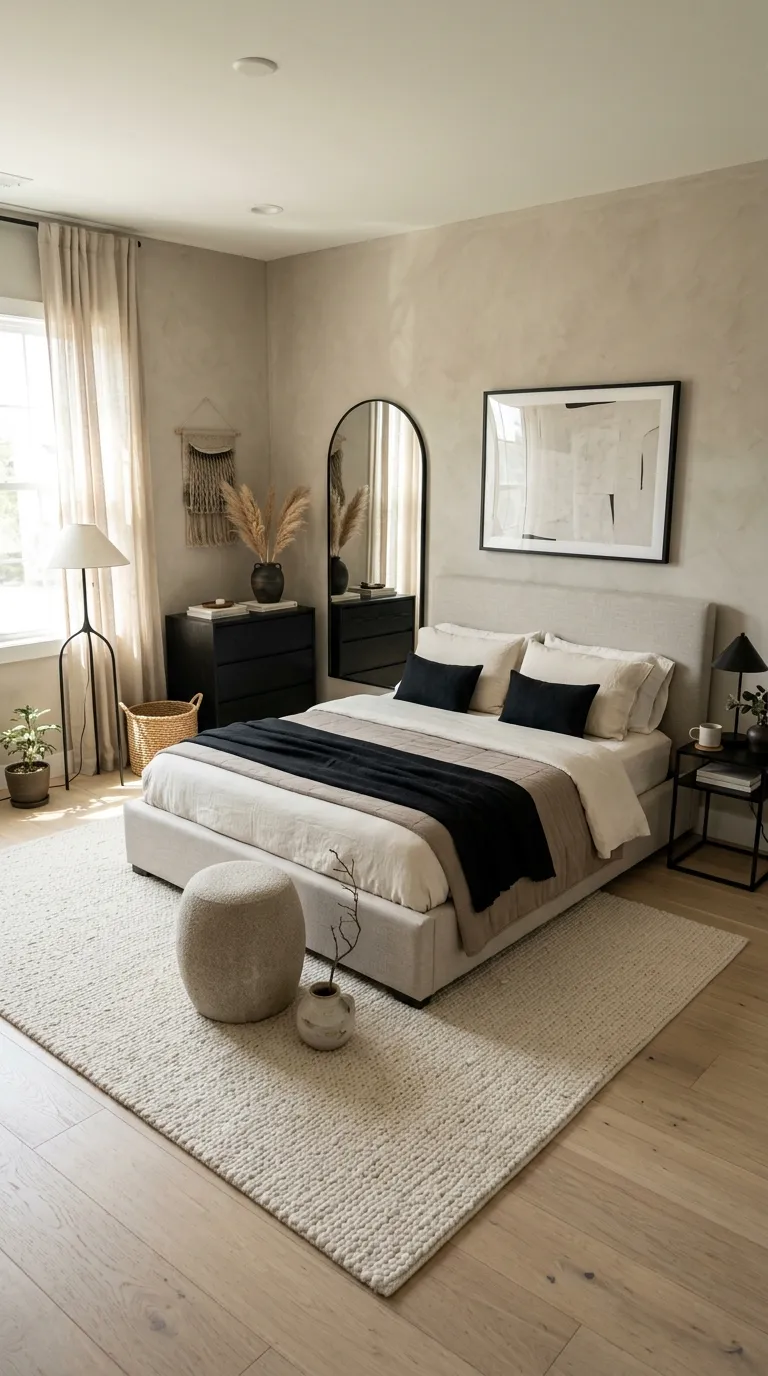
Greige and soft black give you a balanced mix of warmth and definition. Greige keeps the room relaxed, while black adds structure around furniture, lighting, mirrors, or artwork.
The amount of black matters. In a smaller bedroom, repeat it through several small details instead of one oversized piece so the contrast feels crisp rather than heavy.
Beige And Antique Gold
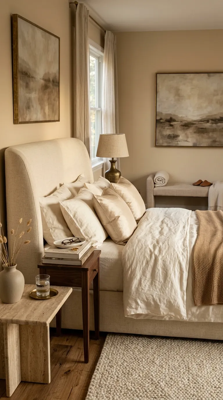
Beige becomes more polished when you add small antique-gold details. The warm metal catches light without creating the sharp shine that brighter brass can sometimes bring.
Keep metallic accents limited to lighting, drawer pulls, picture frames, or a small mirror. Let beige, ivory, and wood remain the main colors so the room still feels calm.
Charcoal And Camel
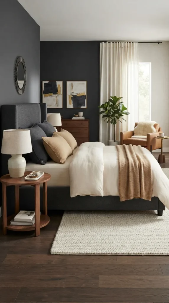
Charcoal and camel create a bedroom with strong contrast but plenty of warmth. The camel tone prevents charcoal from feeling too cold, while ivory bedding gives the darker elements space to stand out.
This pairing suits larger bedrooms where darker furniture won’t overwhelm the room. If your space is small, use charcoal on the bed or one accent wall and keep the surrounding surfaces light.
Pale Blue And Natural Wood
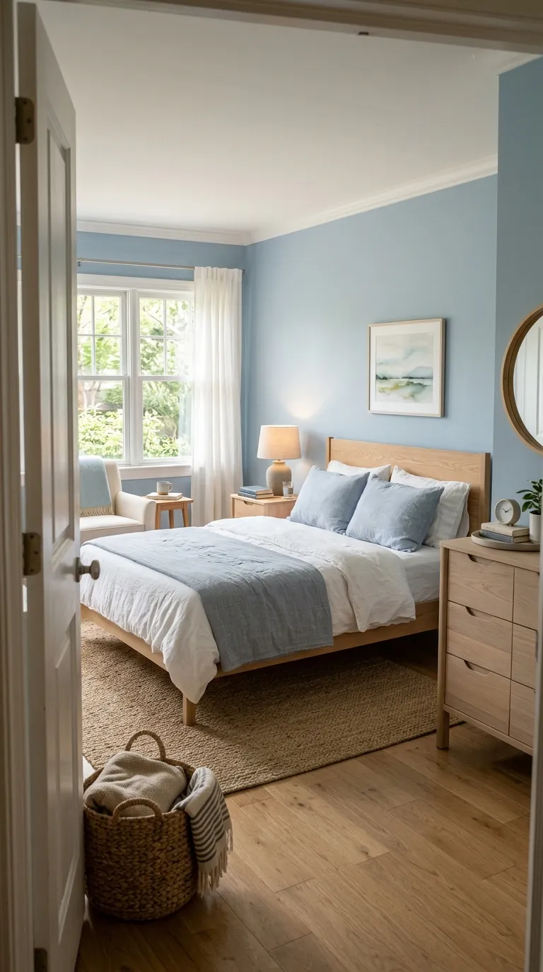
Pale blue feels fresh beside natural wood and crisp white. The wood adds warmth, so the blue doesn’t make the bedroom feel overly cool.
Choose a blue with a slightly muted base if you want a more sophisticated look. Then repeat the shade in bedding or artwork rather than matching every accessory to the walls.
Warm White And Walnut
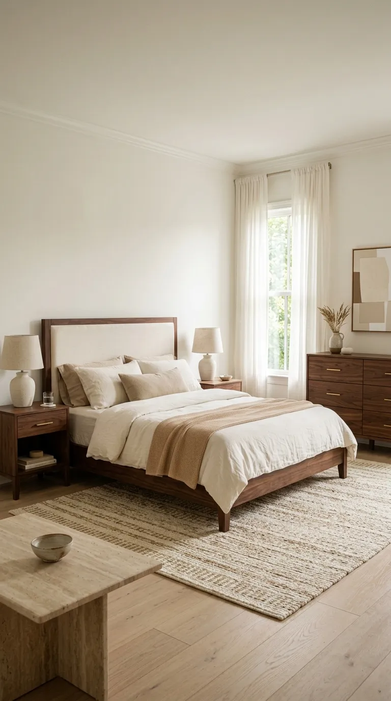
Warm white gives walnut furniture plenty of room to stand out. The combination feels classic because the light walls keep the darker wood grounded without making the bedroom look dated.
Build around three layers: warm white for the largest surfaces, walnut for furniture, and one soft accent such as caramel, beige, or muted olive. This simple formula makes it easier to choose bedding and accessories without creating a crowded color mix.
A Polished Palette That Feels Like You
The best bedroom color palette isn’t the one with the most colors. It’s the one that makes your furniture, fabrics, lighting, and personal pieces feel connected without making the room look overly planned.
Start with one shade you already love, then add a quiet neutral and one deeper accent. Test paint samples beside your flooring and natural light, and use bedding or small decor pieces to try stronger colors before making permanent changes.
Clara Whitmore
Clara specializes in interior styling, seasonal home trends, and cozy living spaces. She loves combining classic design elements with modern touches to create homes that feel personal, welcoming, and effortlessly stylish.