Two Tone Wall Paint Ideas That Make Any Room Look Expensive

Introduction:
Ready to make your home feel more stylish without a major renovation? Two tone wall paint ideas are one of the easiest ways to create a custom, high-end look using nothing more than carefully chosen colors. Whether you’re refreshing a bedroom, living room, or home office, the right color combination can instantly transform an ordinary wall into a beautiful design feature.
This collection is packed with modern, Pinterest-worthy inspiration that helps you add depth, balance, and personality to your space. Instead of overwhelming your room, these paint techniques highlight architectural details, define different areas, and create a polished finish that looks professionally designed. In my experience, even a simple change in wall color placement can completely shift how bright, spacious, and welcoming a room feels. I’ve also noticed that pairing soft, complementary shades often delivers the most timeless results, making it easier to update furniture and décor in the future. Whether you love subtle neutrals or gentle contrast, these ideas will help you create a home that feels elegant, inviting, and uniquely yours.
1.Color Block Accent
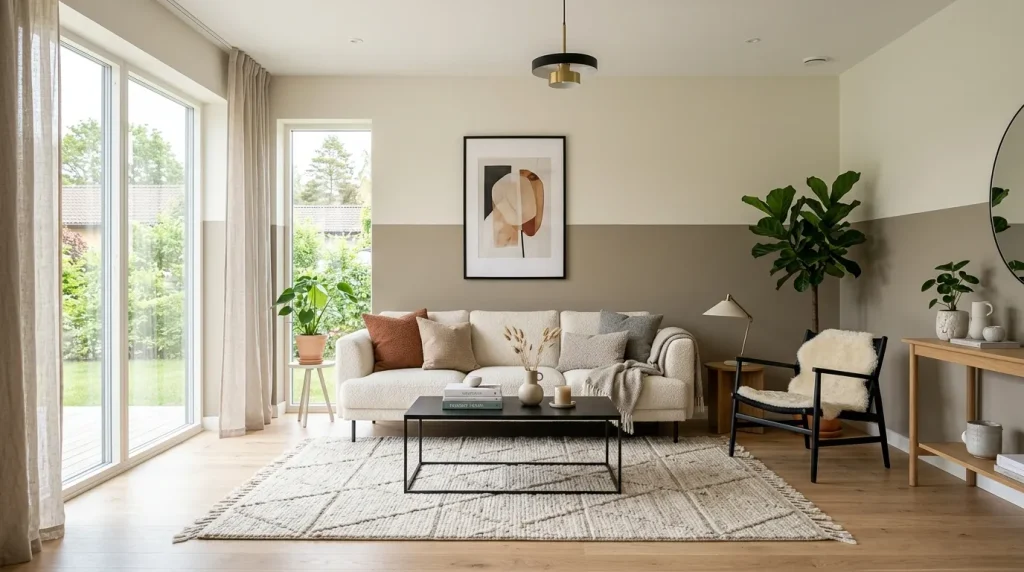
A simple color-block layout can completely reshape how a room feels without requiring expensive renovations. Using two complementary paint shades adds depth while keeping the overall look clean and refined. The contrast naturally draws attention to architectural lines and helps furniture appear more grounded. When exploring two tone wall paint ideas, this style stands out because it balances creativity with timeless appeal. Soft neutrals create a calming backdrop, while deeper lower tones hide everyday scuffs and keep busy living spaces looking fresh for longer.
One reason this design performs so well is its flexibility across different interiors and decorating styles. Whether paired with minimal décor or modern statement furniture, the layered color effect creates visual structure that feels carefully planned. In my experience, choosing shades within the same color family delivers the most elegant finish while avoiding harsh transitions. The result is a room that feels brighter, more spacious, and thoughtfully styled. Even simple accessories gain more presence because the painted backdrop naturally frames everything with subtle sophistication.
2.Half Wall Contrast
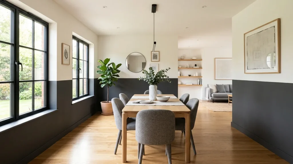
Large blank walls often feel unfinished, but a horizontal paint division instantly gives them more personality. Painting the lower section in a richer shade creates visual weight, while the lighter upper portion keeps the room bright and open. This combination works beautifully in family spaces where durability matters as much as style. Many homeowners searching for two tone wall paint ideas appreciate this solution because it delivers a designer-inspired appearance while remaining practical for everyday living and easy to refresh over time.
Beyond its visual appeal, this paint technique improves how the entire room is perceived. The contrast naturally guides the eye around the space, making ceilings seem taller and furniture arrangements appear more cohesive. In my experience, choosing a matte finish enhances the sophisticated effect while minimizing glare throughout the day. Decorative artwork, shelving, and plants also stand out more clearly against the layered backdrop. The finished result feels thoughtfully curated, creating a welcoming atmosphere that remains stylish even as décor changes over the years.
3.Monochrome Split
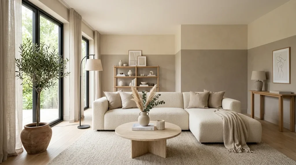
Sometimes the most elegant makeover comes from choosing colors that are only a few shades apart. Instead of relying on dramatic contrast, this layered approach creates quiet sophistication that feels timeless. The gentle transition between tones adds depth while maintaining a calm atmosphere, making even simple rooms appear professionally designed. Homeowners often overlook this option because the change feels subtle, yet the finished space looks noticeably more refined. The effect is especially beautiful in modern homes where clean lines and balanced color palettes take center stage.
Using similar tones also makes decorating much easier because nearly every furniture finish blends naturally with the walls. Soft textiles, light wood, matte black accents, and stone surfaces all feel cohesive against this balanced backdrop. I’ve seen this work well in apartments where maintaining an open, airy feeling is important. The layered paint creates visual interest without making compact rooms feel crowded. As natural light changes throughout the day, the gentle color variation becomes even more noticeable, giving the space quiet dimension and lasting designer appeal.
4.Ceiling Wrap Effect
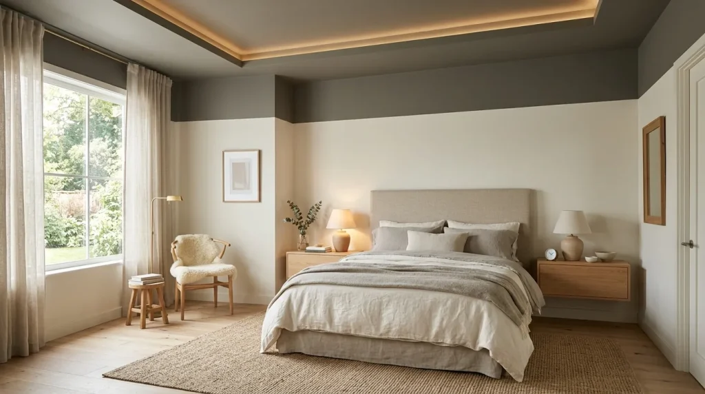
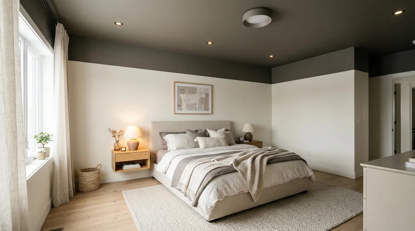
Looking upward is one of the easiest ways to make a room feel custom designed. Extending the upper wall color onto part or all of the ceiling creates a seamless transition that wraps the space in warmth. Rather than stopping at a sharp paint line, the continuous color draws the eye naturally around the room. This technique feels especially inviting in bedrooms where comfort is the priority. The finished look appears intentional, modern, and far more expensive than the effort required to achieve it. This kind of soft, layered wall finish is often achieved using techniques like diy limewash paint, which adds natural depth and movement to surfaces instead of a flat, uniform look.
This approach also helps soften awkward ceiling heights by creating visual continuity instead of abrupt separation. In my experience, muted earthy tones and warm grays deliver the most sophisticated effect because they reflect light gently throughout the day. Paired with simple furnishings and layered fabrics, the painted ceiling becomes part of the overall design rather than an overlooked surface. The room feels calm, balanced, and visually complete, proving that thoughtful paint placement can transform an ordinary interior into something memorable.
5.Door Frame Blend
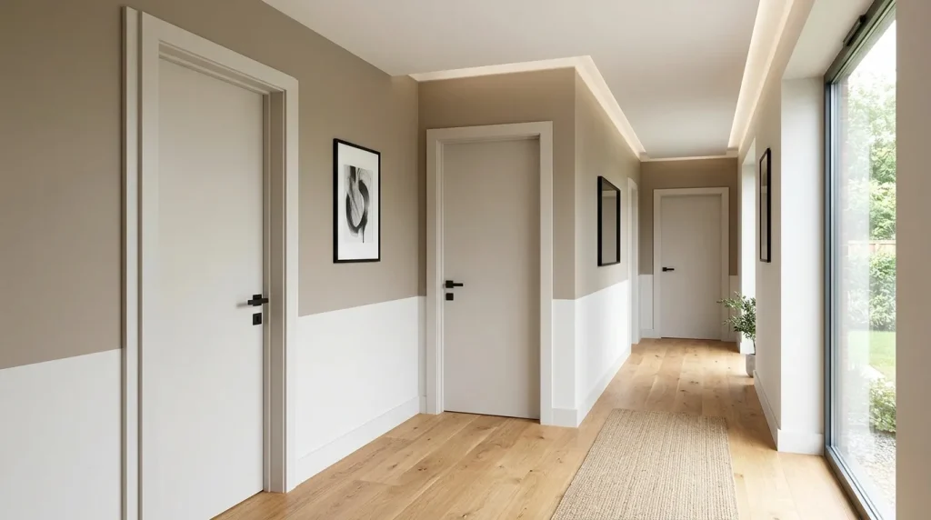
Small details often separate ordinary interiors from spaces that feel professionally designed. Painting door frames to coordinate with one section of the wall creates a seamless transition that instantly elevates the room. Instead of standing out as disconnected elements, the trim becomes part of the overall composition. This subtle design choice works beautifully in hallways, bedrooms, and living spaces where clean lines are important. It also helps surrounding décor feel more intentional without adding extra furniture or decorative accessories.
When paired with complementary wall colors, matching trim creates visual flow from one area to the next. Many designers recommend this technique because it removes unnecessary visual breaks and allows architectural features to stand out naturally. I’ve noticed even modest homes feel more luxurious after this simple update because every surface appears connected. Matte finishes further enhance the effect by reducing glare and emphasizing texture. The completed space feels streamlined, balanced, and effortlessly modern while remaining easy to maintain for everyday family life.
6.Vertical Color Divide
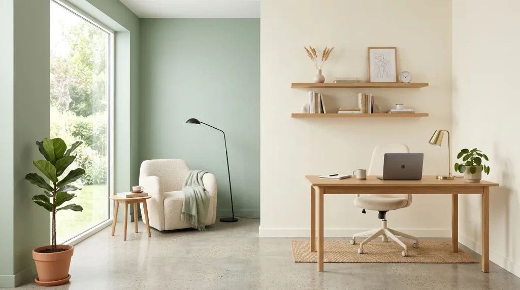
A vertical paint division introduces a fresh perspective that instantly changes how a room is perceived. Instead of stretching color across the wall, the upward design naturally draws attention toward the ceiling, making spaces feel taller and more open. This idea works particularly well in multifunctional rooms where subtle zoning improves both style and practicality. Carefully selected shades create a balanced look that feels modern without becoming overwhelming. The clean division also adds architectural interest while keeping the overall space bright and inviting.
Beyond aesthetics, this layout helps organize open interiors without building physical partitions. One side can visually define a workspace, reading nook, or dining area while the remaining wall keeps the room feeling spacious. I’ve noticed neutral combinations paired with light wood furniture create one of the most timeless finishes. Soft lighting enhances the painted contrast throughout the day, allowing the colors to shift naturally with changing sunlight. The result is a sophisticated room that feels intentional, functional, and beautifully curated from every angle.
7.Warm Earth Layers
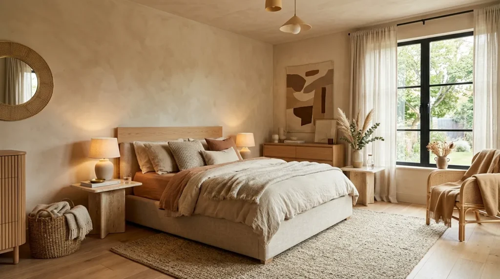
Warm earthy tones never feel outdated because they create comfort while maintaining a clean, modern appearance. Combining clay, sand, mushroom, or beige shades adds quiet depth that instantly softens any room. The layered palette feels sophisticated yet approachable, making it suitable for bedrooms, living rooms, and cozy reading spaces. If you’re collecting two tone wall paint ideas, this combination offers an elegant alternative to high-contrast color schemes while still creating noticeable visual dimension that enhances everyday living.
The beauty of earth-inspired colors is how naturally they interact with wood, stone, woven textures, and soft fabrics. In my experience, these combinations also adapt easily to seasonal décor changes without needing another repaint. Warm lighting enhances the richness of the paint, while daylight keeps the room feeling fresh and airy. Even minimal accessories appear more intentional against this layered backdrop. The finished interior delivers a welcoming atmosphere that feels luxurious, relaxed, and thoughtfully designed without becoming visually overwhelming.
Conclusion:
A thoughtful paint design can completely change the mood of a room without stretching your decorating budget. These two tone wall paint ideas show how simple color placement, balanced palettes, and modern finishes can make any space feel brighter, more stylish, and professionally designed. Start with the idea that fits your home best, then build your look one wall at a time. I’ve seen how small updates like these can create a surprisingly dramatic transformation. If you found inspiration here, save this post on Pinterest, share it with someone planning a makeover, and enjoy bringing these beautiful ideas to life.
Clara Whitmore
Clara specializes in interior styling, seasonal home trends, and cozy living spaces. She loves combining classic design elements with modern touches to create homes that feel personal, welcoming, and effortlessly stylish.