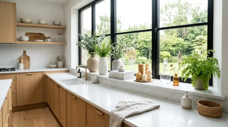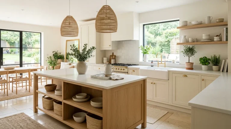
Kitchen color palettes: Easy 22 stress-free combinations for a calm modern kitchen makeover

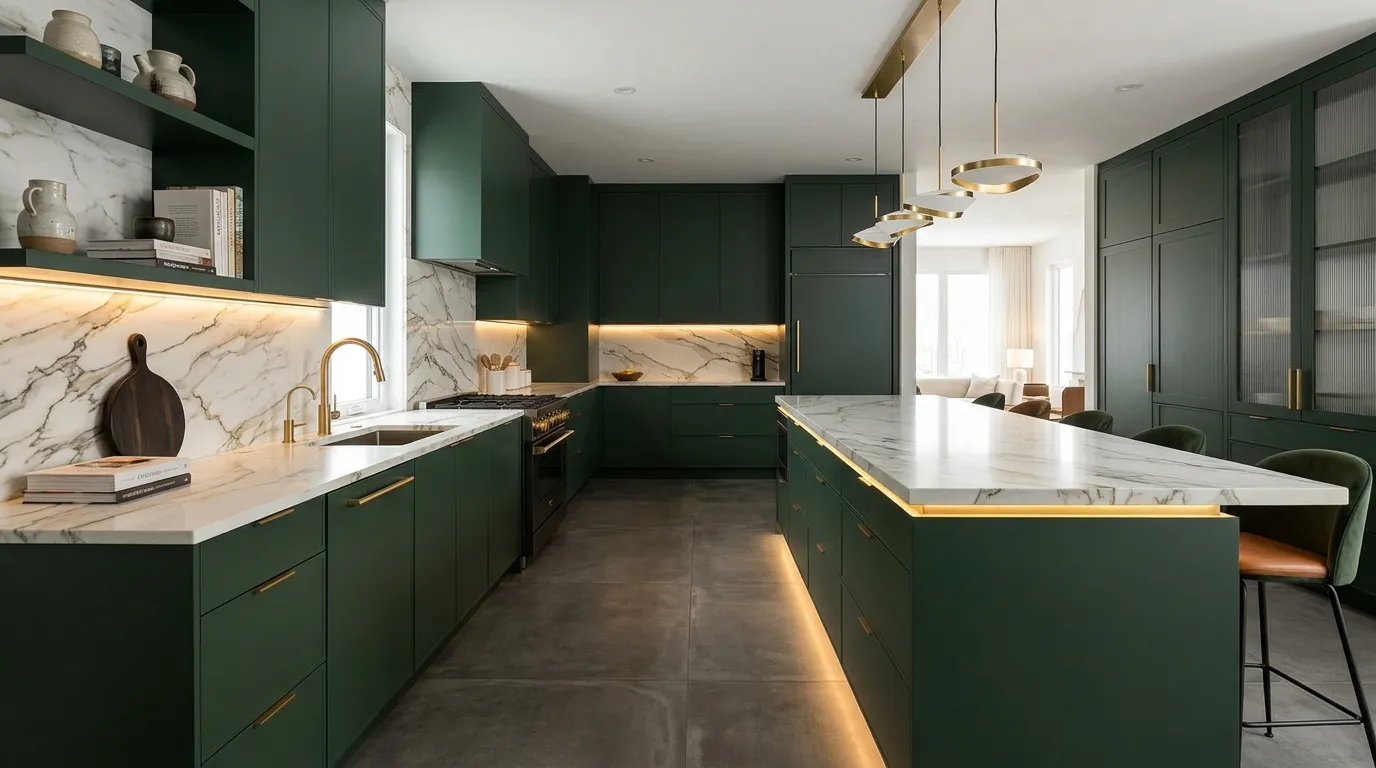
Introduction:
Your kitchen doesn’t need a full renovation to feel brand new. The right kitchen color palettes can completely shift the mood, making your space feel calmer, brighter, and more modern in ways you didn’t expect.
If your kitchen feels dull, outdated, or just not inspiring anymore, color is often the easiest place to start. I’ve noticed that even small changes—like updating cabinet tones or pairing the right neutrals—can make a space feel instantly refreshed without major effort. This guide brings together simple, stress-free combinations that are easy to imagine and even easier to try.
Whether you love soft neutrals, warm tones, or subtle contrast, these ideas are designed to help you create a kitchen that feels both stylish and comfortable. Think of this as your visual roadmap to a space you’ll actually enjoy spending time in every day.
1.Soft White & Oak
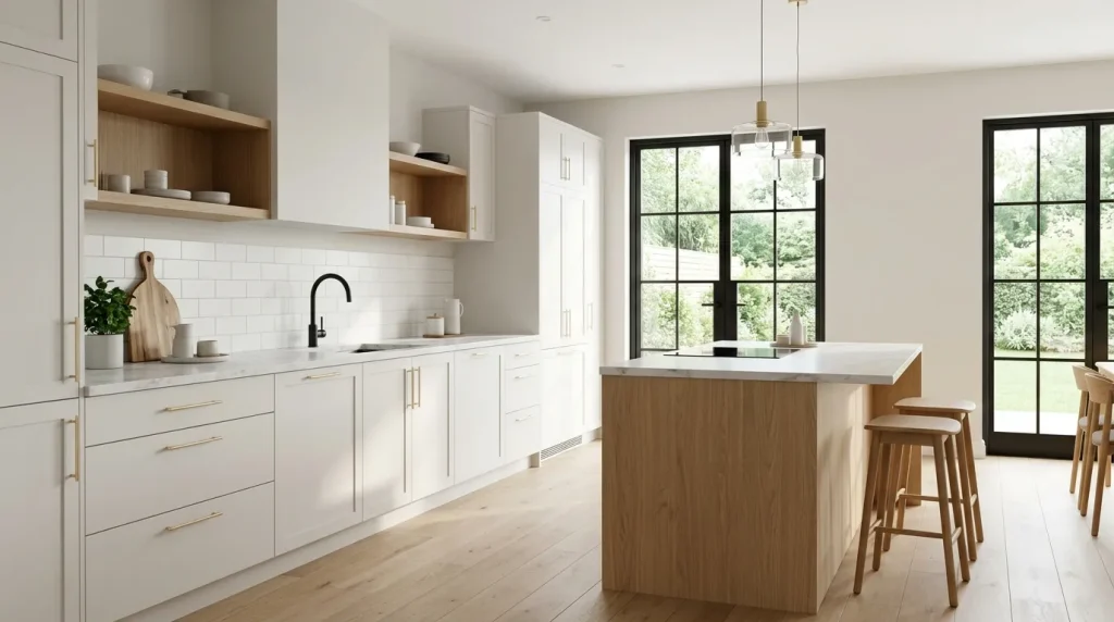
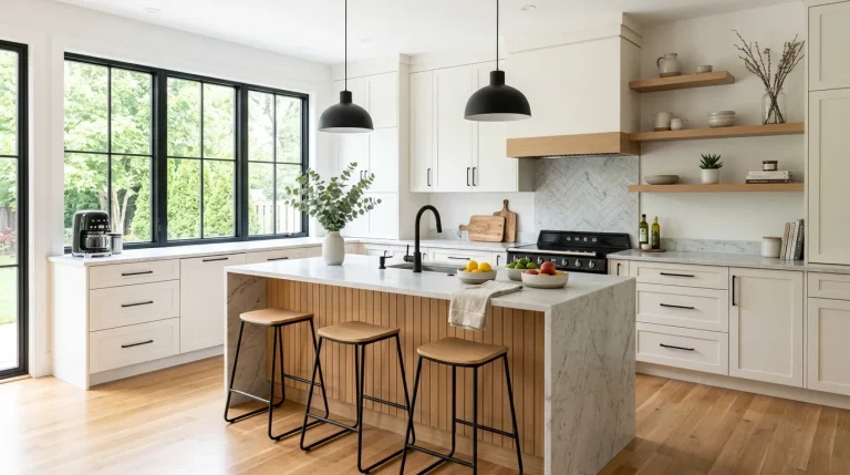
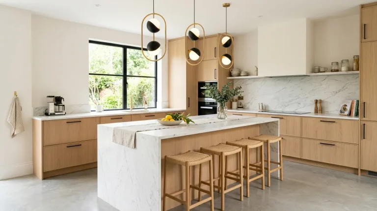
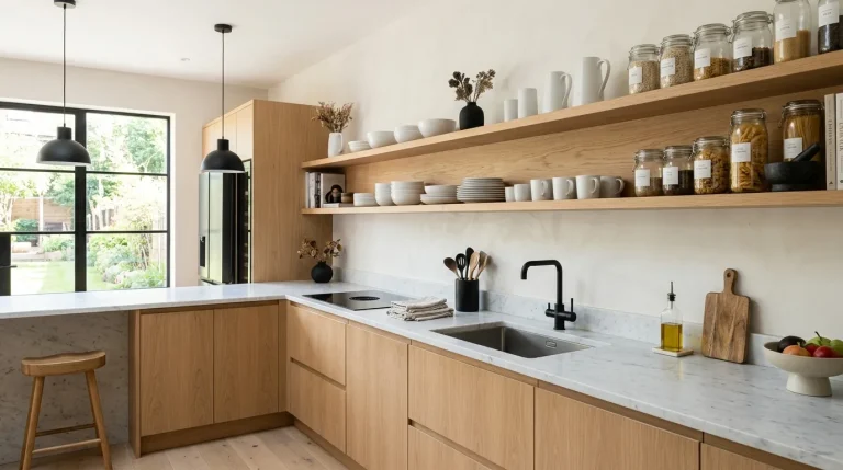
This combination instantly makes a kitchen feel brighter and more open without trying too hard. Soft white surfaces reflect light beautifully, while oak tones bring in just enough warmth to avoid a cold or sterile look. In my experience, this pairing works especially well in compact kitchens where every visual detail matters. It creates a seamless flow that feels clean but still welcoming. When exploring light and natural kitchen design ideas, this balance between brightness and warmth often becomes the easiest and safest choice for a modern refresh that still feels personal and inviting.
What makes this setup stand out is how effortlessly it blends simplicity with comfort. The natural wood grain adds subtle texture, preventing the space from feeling flat or overly minimal. I’ve noticed that homeowners tend to gravitate toward this look because it stays timeless while still feeling current. It also pairs well with soft textiles, greenery, and neutral decor pieces. The overall result is a kitchen that feels calm, uncluttered, and easy to maintain, making everyday cooking and living feel more relaxed and enjoyable.
2.Charcoal & Warm Beige
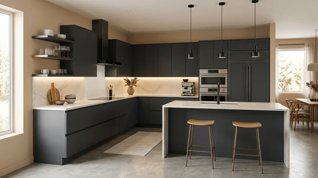
This pairing brings a rich contrast that feels grounded yet inviting from the moment you walk in. Charcoal adds depth and structure, while warm beige softens the overall look, preventing it from feeling too dark. I’ve seen this work especially well in homes where people want a bold kitchen without sacrificing comfort. The darker tones anchor the space visually, while lighter hues maintain balance. It’s a practical choice for those exploring balanced kitchen color combinations that feel modern, stylish, and still completely livable for everyday use.
The real strength of this combination lies in its ability to hide imperfections while still looking polished. Darker cabinets are more forgiving with daily use, especially in busy households. At the same time, beige tones keep the room feeling approachable and warm. That’s why many designers recommend this mix for families or high-traffic kitchens. The result is a space that feels stylish but not fragile, allowing you to enjoy both aesthetics and functionality without constant maintenance concerns.
3.All-White Layers
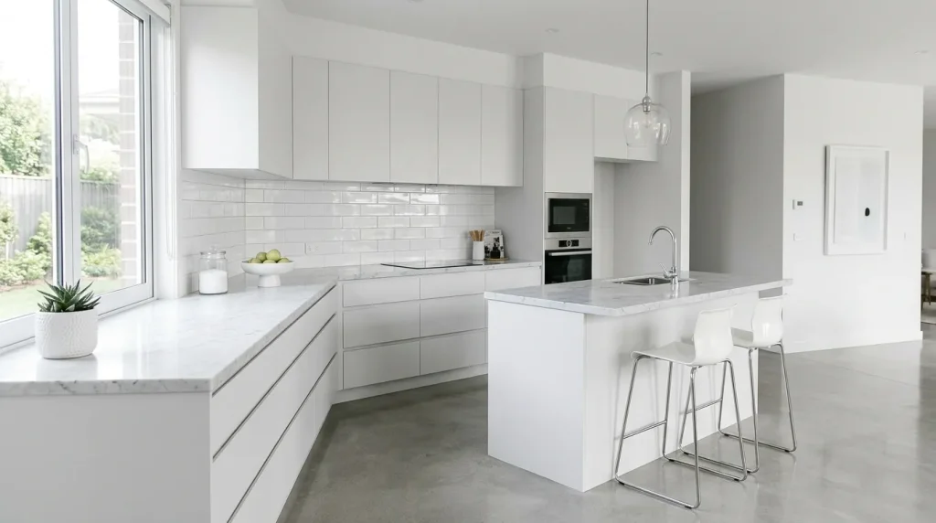
A layered white kitchen might sound simple, but when done right, it feels incredibly refined and high-end. Instead of using one flat tone, mixing finishes like matte cabinets, glossy tiles, and marble surfaces adds depth without introducing new colors. I’ve tried this approach in smaller spaces, and the transformation is immediate. The kitchen feels bigger, brighter, and more open. When working with monochrome kitchen design ideas, this approach proves that simplicity doesn’t mean boring—it actually creates one of the most visually calming and elevated environments.
What makes this design so effective is how it shifts focus from color to texture and light. Every surface reflects and interacts with light differently, creating subtle visual movement throughout the day. I’ve noticed this style also makes decorating easier because you can switch accents anytime without clashing. Whether you add greenery, metallic finishes, or soft fabrics, everything fits naturally. The result is a kitchen that feels fresh, adaptable, and effortlessly modern without needing constant updates.
4.Sage Green & White
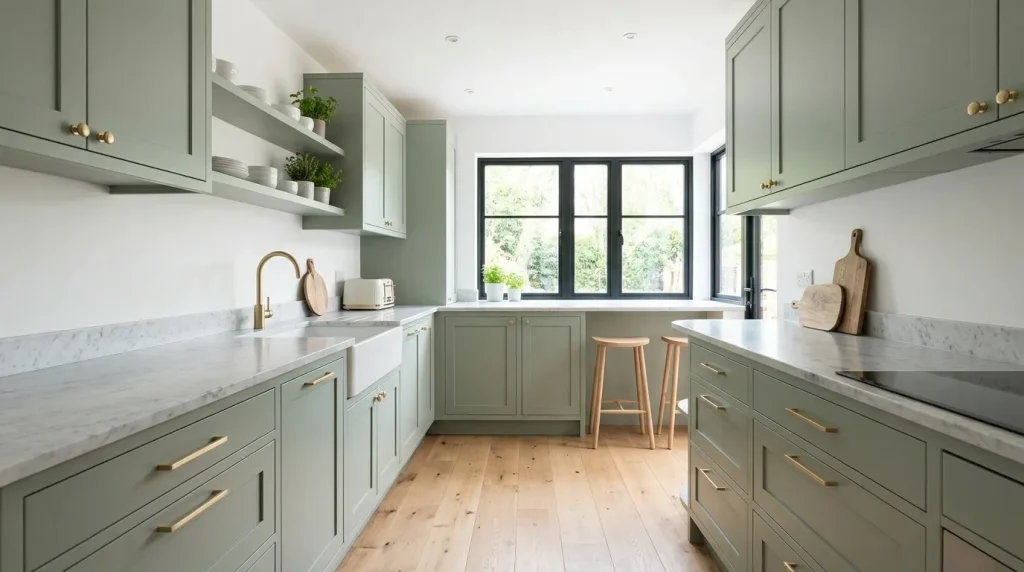
This color pairing instantly introduces a sense of calm that feels refreshing and grounded. Sage green has a soft, muted quality that blends seamlessly with white, creating a space that feels light yet full of character. I’ve seen this work especially well in kitchens that get good natural light, where the green tones shift subtly throughout the day. It’s one of those choices that feels intentional without being loud. For anyone exploring calming kitchen color combinations, this pairing strikes a perfect balance between modern style, natural comfort, and a peaceful, lived-in atmosphere.
What makes sage green so effective is its versatility and timeless appeal. It doesn’t go out of trend quickly because it sits between neutral and color. I’ve noticed that it also hides minor wear better than pure white, making it practical for everyday use. When paired with simple decor like wooden boards or ceramic pieces, the space feels thoughtfully styled without extra effort. The result is a kitchen that feels fresh, relaxed, and effortlessly put together, making daily routines feel calmer and more enjoyable.
5.Black & Light Wood
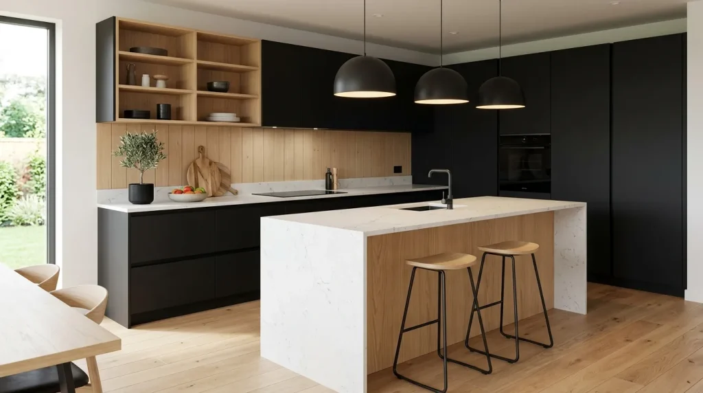
This pairing creates an instantly striking visual that feels both modern and grounded. Black cabinets bring depth and structure, while light wood softens the overall look, preventing it from feeling too heavy. In my experience, this combination works beautifully in open kitchens where you want a clear focal point without overwhelming the space. It draws attention in a clean, intentional way. Among many modern kitchen design palettes, this one stands out for its ability to feel bold while still maintaining warmth, balance, and everyday approachability.
The contrast between dark and light elements also helps define different areas within the kitchen. I’ve noticed this is especially useful in homes with open layouts, where visual separation matters. The wood tones add texture and comfort, making the space feel livable rather than overly sleek. That’s why many designers recommend this mix for people who want a strong visual identity without sacrificing coziness. The end result is a kitchen that feels modern, balanced, and effortlessly sophisticated.
6.Cream & Soft Gray
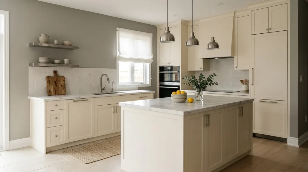
This combination creates a gentle, welcoming atmosphere that feels calm from the moment you step in. Cream tones soften the space, while soft gray adds just enough contrast to keep things visually interesting. I’ve noticed that this pairing works especially well in homes where people want a neutral kitchen without the starkness of pure white. It creates a balanced look that feels lived-in yet polished. For those exploring soft neutral kitchen ideas, this option feels incredibly easy to live with, offering comfort, simplicity, and effortless everyday elegance.
What makes this setup so appealing is how adaptable it is over time. The neutral base allows you to change decor, lighting, or accents without needing a full redesign. I’ve seen this work well in both modern apartments and larger homes because it doesn’t rely on trends. Instead, it builds a timeless foundation that evolves naturally. The overall effect is a kitchen that feels soft, cohesive, and effortlessly stylish while still being practical for everyday use.
7.Navy & Brass
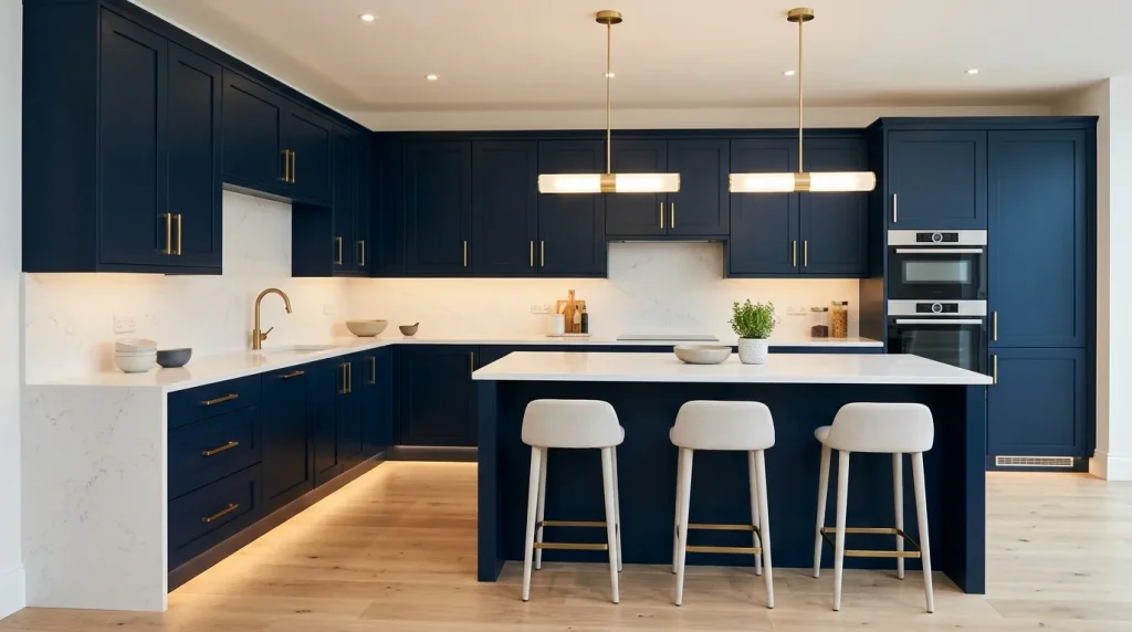
This pairing brings a refined, confident look that instantly upgrades the feel of any kitchen. Navy adds depth without the harshness of black, while brass accents introduce warmth and a soft glow. I’ve seen this work especially well in kitchens that need a focal point without becoming overwhelming. The balance feels intentional and polished. When exploring bold kitchen color combinations, this mix stands out for its ability to feel striking yet controlled, delivering impact while still maintaining a calm, cohesive atmosphere.
The beauty of navy and brass lies in how light interacts with the surfaces throughout the day. Brass subtly reflects light, preventing the darker tones from feeling too heavy. I’ve noticed that even small touches like handles or fixtures can make a big impact here. That’s why many designers recommend this combination for people who want a touch of luxury without going over the top. The result is a kitchen that feels rich, modern, and thoughtfully styled.
8.Greige Minimal
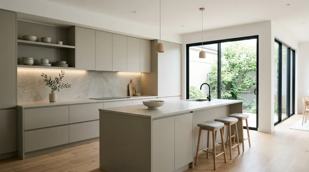
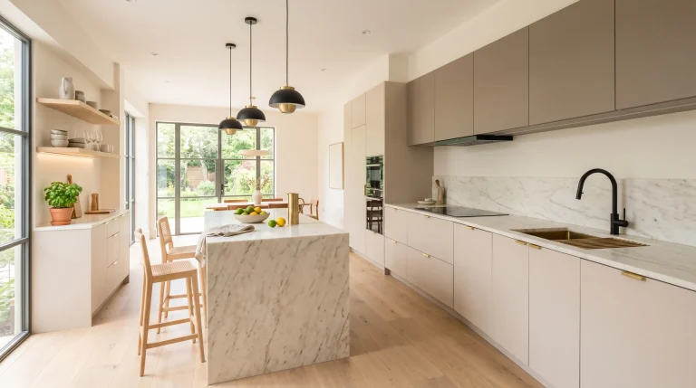
This style creates a quiet, understated look that feels effortlessly modern. Greige sits perfectly between gray and beige, offering the best of both worlds without leaning too cold or too warm. In my experience, this is one of the easiest palettes to live with because it adapts to different lighting conditions throughout the day. It keeps the kitchen feeling calm and cohesive without drawing too much attention. For those exploring neutral kitchen design ideas, this option delivers a clean, balanced aesthetic that feels simple, flexible, and timeless.
What makes greige minimal so effective is how it reduces visual noise while still feeling complete. I’ve noticed that even with fewer decorative elements, the space never feels empty. Instead, it feels intentional and refined. This approach works especially well for busy households where a clutter-free environment makes daily routines smoother. The result is a kitchen that feels organized, modern, and quietly stylish without needing constant adjustments or updates.
9.Terracotta & Cream
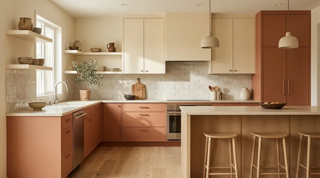
This combination brings a grounded, earthy warmth that feels both inviting and modern. Terracotta adds a subtle richness that stands out without overpowering the space, while cream tones keep everything soft and balanced. I’ve noticed this works especially well in homes that want a bit of color without going too bold. It creates a welcoming atmosphere that feels relaxed and natural. Among different warm kitchen color schemes, this one offers a unique way to introduce earthy character while still maintaining a clean, contemporary look.
The strength of this palette comes from its ability to feel cozy without looking heavy. Natural textures like wood or stone enhance the effect, making the kitchen feel connected to its surroundings. I’ve seen this work beautifully in spaces with good natural light, where the colors feel even more vibrant and alive. That’s why many designers suggest this pairing for creating a warm yet modern kitchen. The final result feels comfortable, stylish, and easy to enjoy every day.
10.Matte Black & White
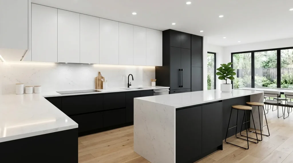
This combination delivers a sharp, clean aesthetic that feels instantly modern and intentional. Matte black grounds the space, while white elements lift and brighten the overall look, creating a strong visual balance. In my experience, this setup works particularly well for people who prefer a structured and uncluttered kitchen environment. It naturally draws the eye without needing extra decoration. When exploring high-contrast kitchen design ideas, this pairing stands out for its ability to create impact while still maintaining simplicity, clarity, and a strong sense of visual order.
What makes this design so effective is its ability to highlight clean lines and architectural details. The contrast naturally separates different areas, making the kitchen feel more organized and functional. I’ve noticed that this style also photographs beautifully, which is why it’s so popular on Pinterest. It gives a polished, high-end feel without requiring overly complex elements. The end result is a kitchen that feels bold, modern, and effortlessly put together.
11.Dusty Blue & White
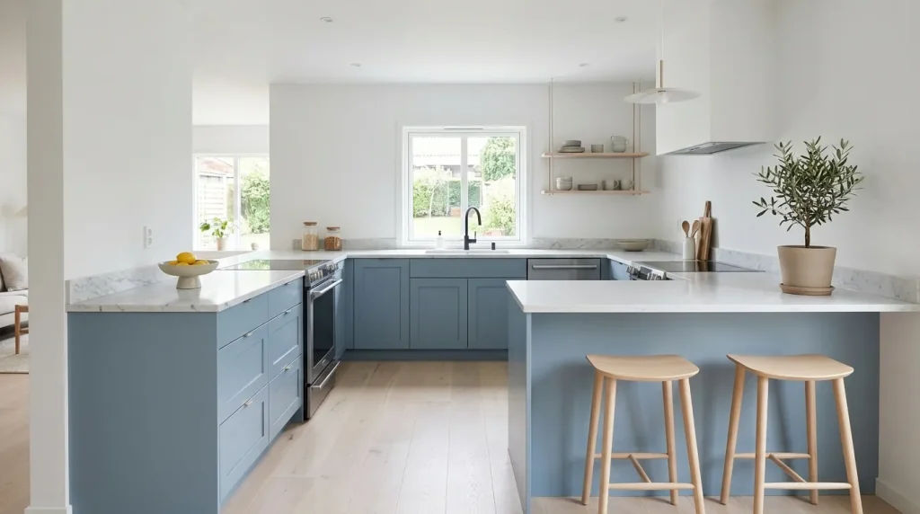
This combination delivers a sharp, clean aesthetic that feels instantly modern and intentional. Matte black grounds the space, while white elements lift and brighten the overall look, creating a strong visual balance. In my experience, this setup works particularly well for people who prefer a structured and uncluttered kitchen environment. It naturally draws the eye without needing extra decoration. When exploring modern kitchen color ideas, this pairing stands out for its ability to create strong visual impact while still maintaining simplicity, clarity, and a refined sense of order.
The real appeal lies in how adaptable this palette is over time. Dusty blue pairs easily with wood, metal, or stone elements, making it simple to update the look without major changes. I’ve noticed that it also helps create a relaxed atmosphere, which makes everyday tasks feel less rushed. That’s why many designers recommend it for homes focused on comfort and balance. The result is a kitchen that feels soft, fresh, and effortlessly inviting.
12.Warm Taupe Blend
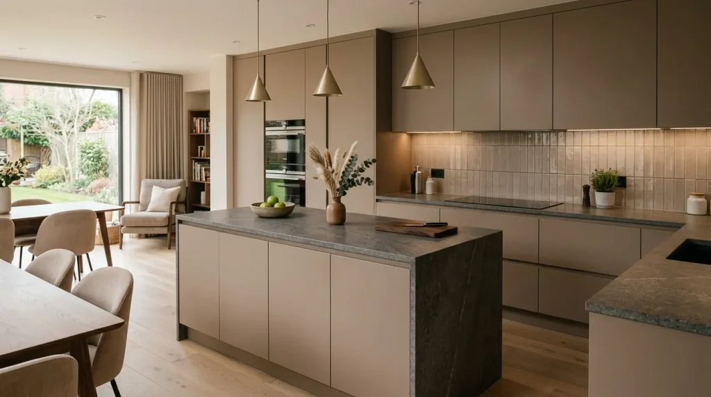
This palette creates a smooth, balanced look that feels both modern and comfortable. Warm taupe sits perfectly between brown and gray, offering a soft tone that doesn’t feel too cool or too heavy. I’ve noticed this color works especially well in kitchens where consistency and calm visual flow are important. It creates a seamless, easy-on-the-eyes atmosphere that feels naturally cohesive. When considering kitchen color trends, this option stands out for its subtle elegance and strong everyday practicality.
What makes this blend so effective is how it adapts to different lighting conditions and materials. It pairs effortlessly with wood, stone, or metal, making styling simple and flexible. In my experience, this is a great choice for people who want a long-lasting look without frequent updates. The space feels calm and cohesive without trying too hard. The final result is a kitchen that feels warm, modern, and naturally put together.
13.Olive & Sand
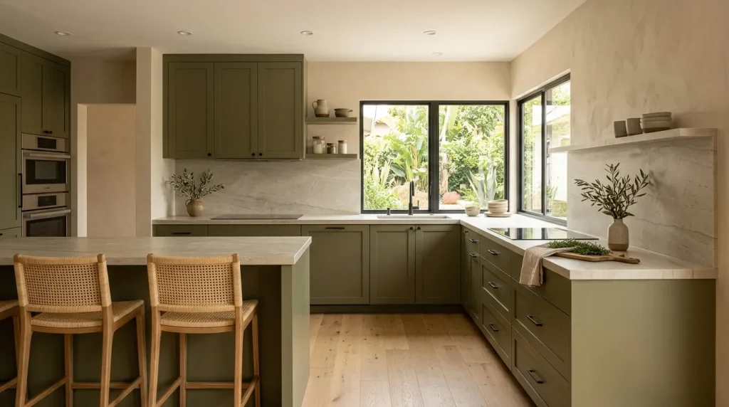
This pairing creates a naturally calming kitchen that feels connected to the outdoors without leaning too rustic. Olive tones add depth and character, while sand keeps the space light and balanced. I’ve noticed this works especially well in kitchens with warm sunlight, where the tones shift beautifully throughout the day. It creates a relaxed, easygoing environment that feels comfortable to live in. Among kitchen color inspirations, this combination offers a perfect balance between soft color and understated neutrality.
What makes olive and sand so effective is their ability to soften the overall visual experience. Nothing feels too sharp or overwhelming, which makes the kitchen more comfortable for daily use. I’ve seen this work well in homes where people want a cozy yet modern feel without relying on bold contrasts. The natural tones also pair easily with simple decor like ceramics or wooden pieces. The result is a kitchen that feels calm, balanced, and effortlessly inviting.
14.Blush & Gray
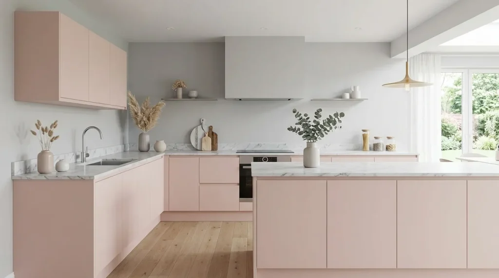
This palette introduces a soft warmth that feels delicate yet modern. Blush tones bring a subtle hint of personality without overpowering the space, while gray keeps everything grounded and balanced. In my experience, this combination works beautifully in kitchens where you want something unique but still understated. The overall look feels fresh, calming, and easy to live with. When exploring kitchen color ideas, this option stands out for its gentle visual appeal and quiet, refined elegance.
The beauty of blush and gray lies in its ability to create a welcoming space without strong contrast. I’ve noticed that even small touches of blush can completely shift the mood of a kitchen, making it feel more relaxed and inviting. It also pairs well with soft lighting and minimal decor, enhancing the overall aesthetic. That’s why many designers recommend this for those who want a unique yet timeless look. The result feels light, modern, and effortlessly stylish.
15.Deep Green & Gold
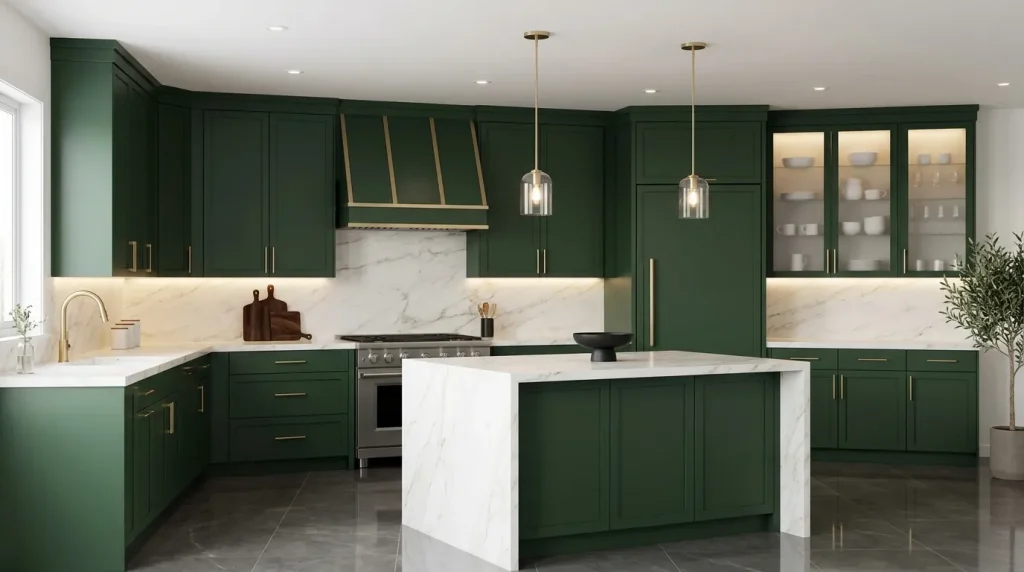
This combination creates a dramatic yet refined kitchen that feels instantly high-end. Deep green brings richness and depth, while gold accents add warmth and a subtle touch of shine. I’ve seen this work especially well in kitchens where a bold look is desired without losing sophistication. The contrast feels intentional and polished. Among different kitchen color schemes, this option stands out for its ability to deliver a luxurious feel while still remaining practical for everyday use.
What makes this pairing so impactful is how it plays with light and texture. Gold elements catch the light beautifully, softening the darker tones and adding dimension. I’ve noticed that even small gold details can elevate the entire space. That’s why many designers recommend this combination for creating a statement kitchen that still feels livable. The result is a space that feels rich, modern, and effortlessly elegant.
16.Cool Gray Layers
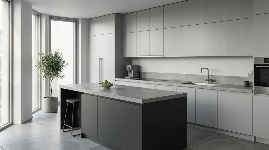
This layered gray approach creates a calm, structured kitchen that feels effortlessly modern. By combining multiple shades of gray, the space gains depth without relying on bold contrast or strong colors. I’ve noticed this works especially well in urban homes where a clean, refined aesthetic is preferred. It keeps the environment visually quiet while still visually engaging. When exploring kitchen color combinations, this method proves that subtle variations can create a strong visual impact without overwhelming the space.
What makes this style so practical is how forgiving and adaptable it is. Gray tones hide minor wear and blend easily with different materials like metal, glass, or stone. In my experience, this is one of the easiest palettes to maintain long-term because it doesn’t go out of style quickly. It also allows you to update decor without clashing. The result is a kitchen that feels polished, modern, and consistently put together.
17.White & Marble Touch
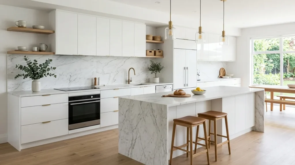
This combination creates a bright, elegant kitchen that feels both simple and refined. White surfaces keep the space open and airy, while marble introduces natural texture and soft visual movement. I’ve seen this work beautifully in homes where a clean look is important but still needs to feel elevated. The subtle veining in marble keeps the design from feeling flat or one-dimensional. This pairing stands out for its ability to blend minimal simplicity with a quiet sense of luxury, creating a space that feels polished yet effortlessly inviting.
The real strength of this setup lies in its timeless appeal and versatility. Marble pairs easily with different finishes, allowing you to refresh the space without major changes. I’ve noticed that even small marble elements can elevate the overall design. That’s why many designers recommend incorporating it as a focal detail. The result is a kitchen that feels bright, elegant, and effortlessly sophisticated while remaining practical for daily use.
18.Beige & Black Accents
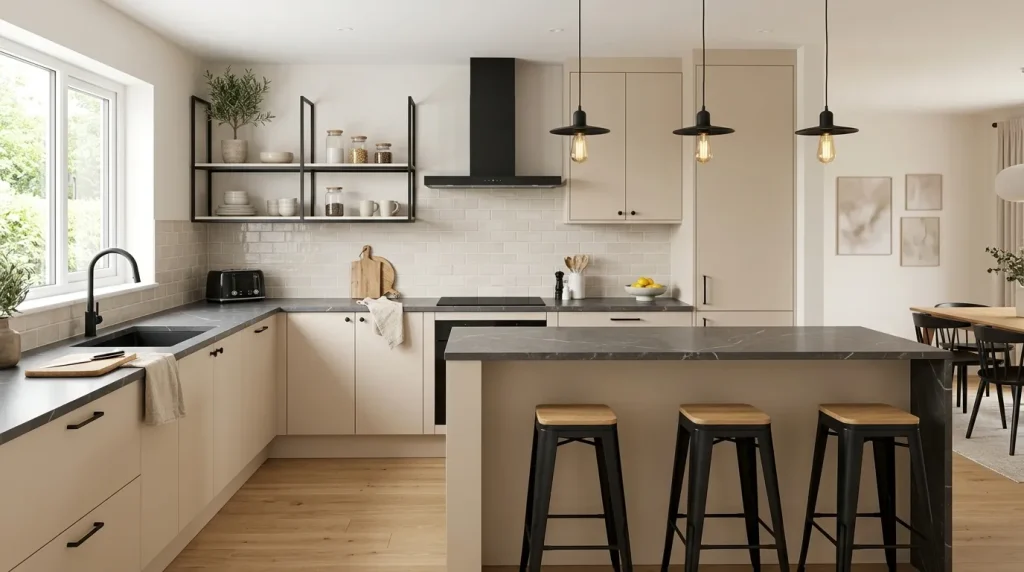
This pairing creates a balanced kitchen that feels both warm and well-defined. Beige tones soften the overall look, while black accents introduce contrast and structure. I’ve noticed this approach works especially well in homes that want a modern feel without becoming too dark or heavy. The combination feels natural, grounded, and easy to live with. It offers a simple way to bring in contrast while keeping the space comfortable, inviting, and effortlessly stylish.
What makes this design so effective is how small details can make a big difference. Black handles, fixtures, or lighting elements instantly sharpen the overall look without overwhelming the space. In my experience, this is a great choice for people who want subtle sophistication without a full redesign. It allows flexibility while still feeling intentional. The final result is a kitchen that feels warm, modern, and visually balanced.
19.Soft Blue & Oak
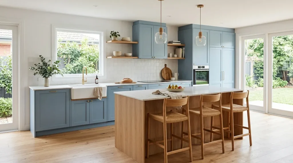
This pairing creates a peaceful kitchen that feels light, fresh, and easy to enjoy every day. Soft blue brings a gentle touch of color, while oak adds warmth and natural texture that keeps the space from feeling cold. I’ve seen this combination work beautifully in homes where a calm, relaxing atmosphere matters without going fully neutral. The balance feels effortless and welcoming. This combination stands out for its ability to blend softness with warmth in a way that feels natural, airy, and quietly inviting.
What makes this design so appealing is how it evolves with light throughout the day. The blue tones feel brighter in sunlight and softer in the evening, creating a dynamic yet subtle effect. I’ve noticed that this palette also pairs easily with simple decor, making styling stress-free. That’s why many designers recommend it for creating a relaxed, modern kitchen. The result is a space that feels fresh, welcoming, and consistently comfortable.
This pairing creates a peaceful kitchen that feels light, fresh, and easy to enjoy every day. Soft blue introduces a gentle hint of color, while oak adds warmth and natural texture that keeps the space from feeling cold. I’ve seen this combination work beautifully in homes where people want a calm environment without going completely neutral, much like the relaxed, layered aesthetic you’ll find in Boho Bedroom Decor Ideas: 22 Easy Stress-Free Boho Bedroom Makeover Ideas for Cozy Relaxed Spaces. The balance feels effortless and inviting. When exploring kitchen color combinations, this option stands out for its ability to blend softness with warmth in a naturally balanced way.
What makes this design so appealing is how it evolves with light throughout the day. The blue tones feel brighter in sunlight and softer in the evening, creating a dynamic yet subtle effect. I’ve noticed that this palette also pairs easily with simple decor, making styling stress-free. That’s why many designers recommend it for creating a relaxed, modern kitchen. The result is a space that feels fresh, welcoming, and consistently comfortable.
20.Monochrome Gray Scale
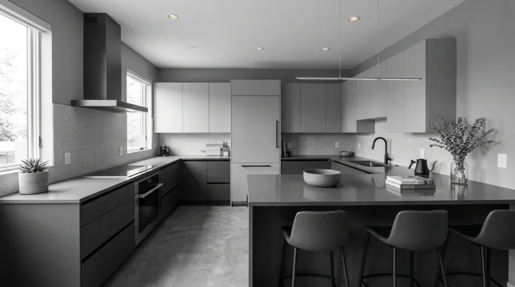
This palette focuses entirely on tonal variation, creating a sleek and cohesive kitchen without introducing extra hues. By layering different shades of gray, the space gains depth while maintaining a clean, modern look. I’ve noticed this approach works especially well in minimalist homes where simplicity is everything. It builds a strong visual identity without feeling heavy or overdone. This style stands out for its ability to rely purely on tone and texture rather than bold contrasts, making the overall space feel calm, refined, and effortlessly balanced.
The beauty of this approach lies in its precision and balance. Each shade plays a role in defining the space, making it feel structured and intentional. In my experience, this is a great option for those who prefer a polished, no-distraction environment. It also makes decorating easier since everything naturally fits within the same tone range. The result is a kitchen that feels sharp, modern, and effortlessly cohesive.
21.Ivory & Warm Wood
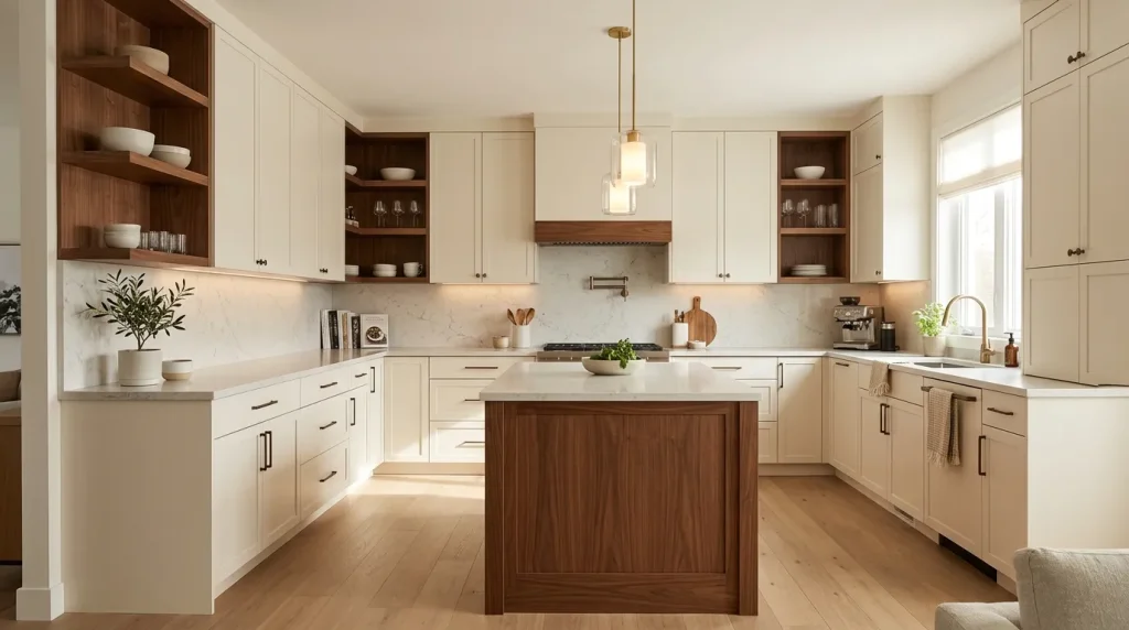
This combination creates a kitchen that feels instantly warm and welcoming without losing its modern edge. Ivory tones soften the brightness of white, while warm wood introduces richness and natural texture. I’ve seen this work beautifully in homes where comfort matters just as much as style. The balance feels relaxed and lived-in rather than overly designed. This pairing offers a timeless look that blends coziness with quiet elegance, making the space feel both refined and genuinely inviting.
What makes this pairing so effective is how it blends comfort with simplicity. The wood elements bring a sense of familiarity, while ivory keeps the space light and open. I’ve noticed that this combination also works well with different lighting conditions, maintaining its warmth throughout the day. That’s why many designers recommend it for creating a welcoming kitchen. The result is a space that feels calm, practical, and beautifully balanced.
22.Muted Mint & White
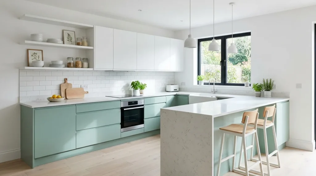
This color combination brings a refreshing and light energy into the kitchen without overwhelming the space. Muted mint feels soft and calming, while white keeps everything bright and clean. I’ve noticed this works especially well in smaller kitchens where you want a sense of openness but still crave a hint of color. The effect feels airy and cheerful without being distracting. When exploring fresh kitchen color ideas, this option offers a playful yet controlled approach that still fits beautifully into modern design.
What makes muted mint so effective is its subtle personality. It adds visual interest while remaining easy to live with over time. In my experience, this palette pairs effortlessly with light wood, simple decor, and natural textures, making styling very flexible. It also reflects light well, which helps the kitchen feel larger and more inviting. The result is a space that feels fresh, modern, and quietly uplifting for everyday use.
Conclusion:
A beautiful kitchen doesn’t have to be complicated or overwhelming. With the right kitchen color palettes, even small changes can create a space that feels calm, modern, and truly yours. Each idea you’ve explored is designed to be simple, practical, and easy to bring into real homes without stress.
I’ve seen how even a subtle color shift can completely change how a kitchen feels and functions. Now it’s your turn to try it. Save your favorite ideas, bring one into your own space, and share this with someone who’s ready for a fresh start.
Elira Montclair
Elira writes about timeless home decor, kitchen styling, and practical interior ideas. Her work blends warm, inviting aesthetics with simple decorating tips that make everyday spaces feel beautiful and comfortable.